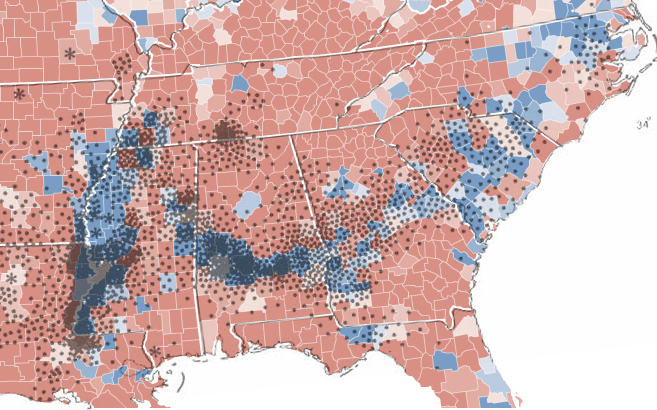
Strange Maps posts this very interesting two-part map. The red and blue are the county-level results from the 2008 presidential election. The overlayed black dots represent where 2,000 bales of cotton were produced in 1860 (larger image):

Strange Maps posts this very interesting two-part map. The red and blue are the county-level results from the 2008 presidential election. The overlayed black dots represent where 2,000 bales of cotton were produced in 1860 (larger image):