Earlier this month, CNN launched new lower-third graphics for all of their shows. On CNN, lower-third graphics (so named because they occupy the lower-third region of the television screen) display what story is being shown as well as the name and titles of anchors, reporters, interviewees, etc., the location of the report, and any other flags, such as breaking news, developing story, etc. The new graphics on CNN give a unified look across each show, but while they are an improvement on the old look, they have faults of their own.
To start off, here are the old lower third graphics (via Media Matters):

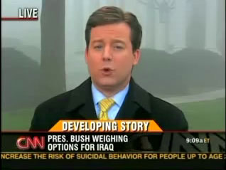
One of my biggest issues with these graphics was when the story topic was long and would run into the show logo on the right there were visual proximity issues:
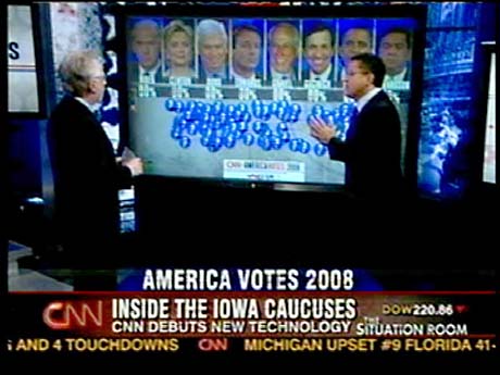
And here are the new graphics (all via Newscaststudio.com):
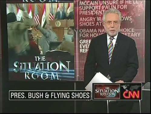
Here are the graphics in action:
As you can see, the CNN logo has moved to the bottom right corner to the left of the show logo, a story topic is now only one line, and, as you’ll see below, a story flag color change occurred. What makes the new graphics partly successful is the simplicity a bordered, solid black rounded rectangle, and the animation is quick and simple, too. What makes the new graphics undesirable, however, is much more.
(But before I list the faults of the new graphics, I first have to issue a disclaimer. Anything I may say is wrong with the graphics could very well been proposed or discussed internally at CNN but shot down by the creative team or some higher-up-the-totem-pole executive. A coworker of mine recently completed work on a major update to a popular weekly sports event, and there were some creative elements that were ridiculed in online forums. What forum users suggested had internally been suggested to higher-ups by my coworker but were dismissed. So, for all I know, anything I comment on here may very well have been discussed at CNN.)
First, the show logo and CNN logo bug is too huge. Do we need to be constantly reminded what show were watching? I’m assuming veteran watchers of Larry King Live or The Situation Room or Lou Dobbs Tonight know what show they’re watching by a) the host of the show and b) the time the show is airing. Taking out the show logo would give story titles and other information more horizontal room to be displayed. What happens now is any text is horizontally-scaled to fit inside the space allotted. For example, in the Wolf Blitzer “Pres. Bush & Flying Shoes” image above, if president were spelled out instead of abbreviated, since the text would be longer, it would horizontally-scale to fit inside the same black rectangle.
Second, the CNN logo carrier (black, rounded rectangle) needs some work. Here is the CNN logo with “Live”:
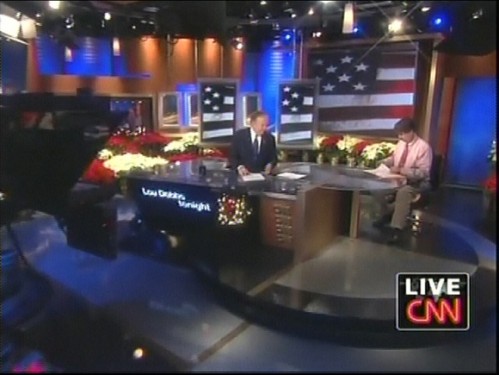
The left edge of the ‘L’ hangs slightly over the left edge of the ‘C.’ The discrepancy is hard to see in this image, but on TV, it’s definitely there. And because of this hang-over, when the “Live” text disappears, there’s another discrepancy:
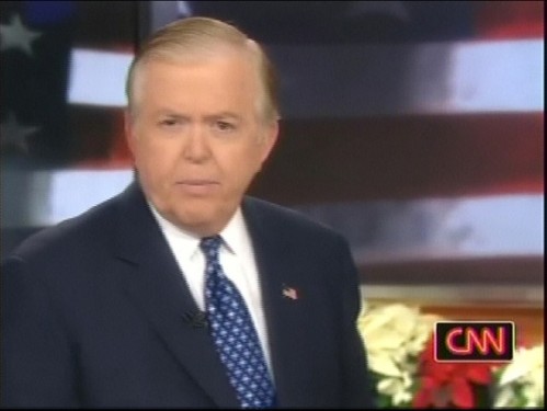
The CNN logo carrier shrinks down to the logo’s size (plus padding), but there is more padding on the left side of the logo than there is on the right side. If you look at the previous image with the “Live” text and compare with the above image, you can see the padding on the left and right of the CNN logo is the same in both images. If the “Live” text were scaled down to fit exactly over the CNN logo, the padding could be uniform on both sides whether or not the “Live” were there.
Third, the displaying of someone’s name and title, for example being interviewed for a story or for commentary, can be excessive. Here’s someone’s name and title displayed:
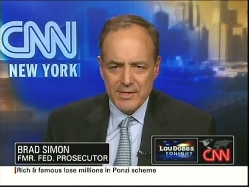
If the story caption is displayed, for instance the “Pres. Bush & Flying Shoes” text, and the next shot is a commentator, the story caption wipes off and the person’s name and title wipes on. After a while, the name and title wipes off and the story caption wipes back on. This part is fine. Where the problem creeps in is when the person commenting has more than one title. For instance, a show I was watching last week had someone on who was a “CNN Contributor,” “Republican Strategist,” and the author of some book (the YouTube clip above has this many-titles problem, too). Well, the director of the show thought, rightfully, all three titles needed displaying. So, the story caption wiped off, his name and the first title wiped on and off, his name and the second title wiped on and off, his name and the third title wiped on and off, and finally, the story caption wiped back on. The amount of animation for the small change of text (the name was the same each time) was excessive. Even just animating from the story caption to a commentator’s name and title back to the story caption is a bit much. Adding one or two extra titles is way too much.
To fix this excessiveness, the carrier for the story caption and the name and title of a commentator should never fully wipe off if it merely is switching text inside of it. Instead, text should wipe off like it currently does but the carrier should remain with the same dimensions. Once the text is fully animated off, the carrier should morph to the size of the new text and then the new text should wipe on. Let’s look at an example to make this clearer. Let’s say our story caption is “Pres. Bush & Flying Shoes” and we want to then display “Brad Simon / Fmr. Fed. Prosecutor” next. The name/title text is horizontally shorter than the story caption. The caption text would wipe off, but the carrier would remain the same size. When the caption text finished wiping off, the carrier would adjust its horizontal and vertical size to fit the invisible name/title text. When this animation finishes, the name/title text would wipe on. This approach would give greater fluidity to the transitions and eliminate the excessive animation that is currently in place. This approach would also eliminate the noticeable hitch when a carrier wipes off and a new carrier of a different vertical size wipes on.
Because CNN uses the real-time 3D rendering program Viz Artist to create their graphics, these new graphics likely employ the Viz technology called Transition Logic. Basically, Transition Logic allows certain elements to remain or animate into new elements when other elements change. So, using Transition Logic, the approach outlined above could be accomplished with a Noggi geometrical shape adjusted to be a rounded rectangle and with a center point in the lower left corner. The width and height properties of the Noggi plugin could be adjusted and animated using Viz scripts (I know this because I’ve done it before).
Finally, this isn’t really a problem but rather a curiosity:
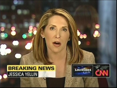
The “Breaking News” text now receives a yellow background, changed from red in the older graphics. I’m curious how the creative decision came to be to change the color. Red is now for “Developing Story.” Red seems like a more urgent color for a more urgent breaking story, not an ongoing, developing story.
In addition to the new lower-third graphics, the bottom of the screen received a major update. Instead of the egregiously annoying news ticker that served to only distract viewers from watching, listening, and focusing on the story being aired, there is a “flipper” that displays more information on the current story and periodically switches to updates on top stories. A fabulous and much needed change.
Overall, the new CNN lower-third graphics are an improvement on their predecessors. The simplicity of the design and animations are excellent examples for other broadcast graphics developers. But while they enjoy success in their simplicity, they have several faults that detract from an overall success.