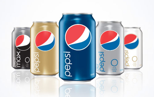
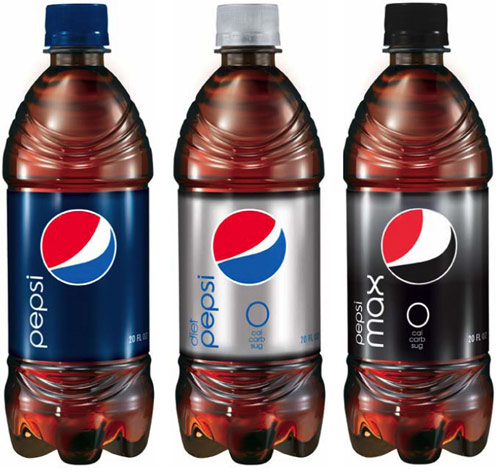
Pepsi recently revamped its logo and beverage container design. The new logo clearly retains the spirit of the old logo but injects a different feeling. But what is more intriguing to me is the design of the beverage containers.
Cans (from pepsigallery.com and ignoring the awful faked reflections):

And the bottles (from Brand New):

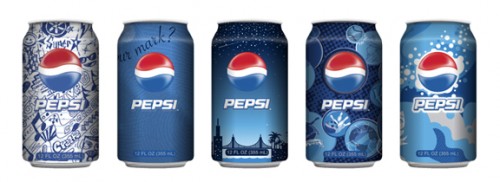
The new look fizzes with excitement. Not the excitement of a million things going on in the design at the same time; rather, it’s the excitement of a minimal design allowing greater, more focused communication of the brand and message. The new can and bottle designs are incredibly clean. While I may not think the product inside is refreshing (I’m an avid water, tea, and milk drinker), the design on the outside is remarkably refreshing compared to over-saturated designs of previous Pepsi cans and other soft drink designs (from Kitsune Noir):

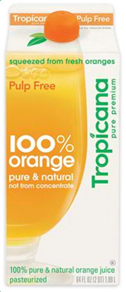
In conjunction with the new Pepsi container designs, Tropicana, a PepsiCo company, launched new containers (from Tropicana):

Alex Bitterman, a former design professor of mine, writes about the Tropicana redesign:
Perhaps this is only the tip of the iceberg, and maybe, just maybe, we’ll begin to see some truly functional and well-designed consumer product and food packaging, rather than decorative visual noise that simply panders to masses of overstimulated and bored American consumers.
I absolutely agree, and I think the same words can be applied to the Pepsi redesign. The cleaner designs of Tropicana and Pepsi and specifically the minimal design of the Pepsi containers are a very welcome change in beverage packaging, proving once again less really is more.