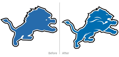
On Monday, the Detroit Lions revealed a “new comprehensive brand” that included a new team logo. From the press release:
“We will consistently present the Lions as a first-class organization with a clear sense of mission and direction,” [Lions President Tom] Lewand said. “We have made several significant changes this offseason in accordance with that commitment. The introduction of this new brand identity is another element of that process. Today is an exciting and historic day for this franchise.
“The new identity retains many important aspects of our history in terms of our primary mark and our colors. However, the evolution allows us to present our Lions brand and visual identity in new, versatile and distinctive ways. We stand firmly committed to improving the team on the field. That success is always the most determinative factor of any NFL brand.”
The old logo was awful and in desperate need of an update as it sort-of had the shape of a lion, but the head was more of a blob trying to evoke a lion-like animal. A huge improvement, the new logo is merely an update rather than an overhaul, but it adds much-needed definition throughout the illustration: which legs are in the foreground and which are in the background are clear, the paws have discernible digits, the lion can see now with its new eye, and the lion can now take a bite out of something or someone.
The new logo is a definite improvement, but did it go far enough? If the aim of the “new comprehensive brand” were to revitalize the team, perhaps an overhaul was needed in the logo instead of these refinements that make the new logo more of an evolutionary change and not a revolutionary change.
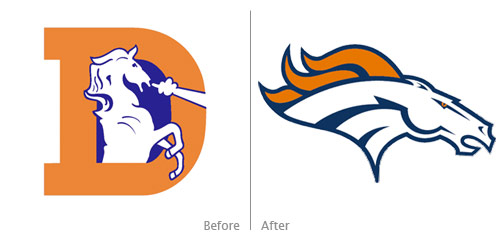
Past revolutionary changes to NFL logos include the Denver Broncos:

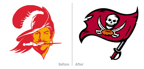
and the Tampa Bay Buccaneers:

The evolutionary refinements to the Lions logo were badly needed, and they help make the logo more successful overall. I still wonder, though, if a revolutionary overhaul to the Lions’ brand might roar some life and vigor into the struggling team. A new logo can’t solve all the team’s problems, but the freshness could go a long way as the Lions prey for more success next season.
(Old Lions logo and Broncos and Buccaneers logos from sportslogos.net; new Lions logo from The Wiki)