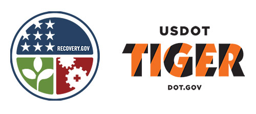
Last week, President Obama unveiled logos for two new administration programs, Recovery.org, aka American Recovery and Reinvestment Act (ARRA), and TIGER (Transportation Investment Generating Economic Recovery):

NPR interviewed creative director Steve Juras about the logos. Juras provides a nice overview and insight to the Recovery.gov logo development.
Armin at Brand New writes:
The ARRA emblem feels decidedly American, it might just be the stars and the blue, but it definitely has an American pride aura to it. The design is clean and simple and touches on three key aspects: America (of course), the environment, and the industry. The design of each element could probably be discussed ad nauseam and hundreds of alternative drawings could have been made, but as quick signifiers these work great. I’m not a fan of the rounded corners of the quadrants, but that’s just me. This logo probably looks kick-ass in all black too.
The logo for the U.S. Department of Transportation’s TIGER (Transportation Investment Generating Economic Recovery) program may feel a little corny, with its tiger stripes. But, let’s face it, sometimes it’s too tempting to forego the obvious and this logo creates a very identifiable visual. The thing I love about it is the combination of dark gray (or is it black?) that could stand for the asphalt that millions of people drive on each day throughout the U.S. and the orange that is emblematic of all the workers that are regularly out there working the roads. The type choice for TIGER is odd though: Kabel (slightly modified).
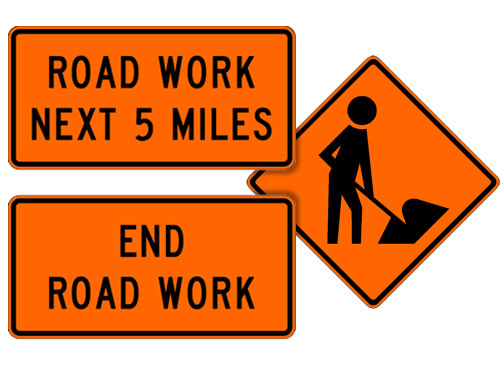
I can’t argue with clean and simple, and I particularly enjoy the symbolism in the TIGER logo. Construction road signs are what colors? Orange and black, so using these two colors in the logo representing the U.S. Department of Transportation (you know, the road crew folks) is fitting (images from the Manual of Traffic Signs):

If this is just the start of the high level of design the Obama Administration is going to introduce to the federal government, hats off to them, because good graphic design was one of the many things missing from the Bush White House. Steven Heller, graphic design extraordinaire, blasted the Bush Administration’s use of fonts on the banners that appeared behind the president during major speeches (the “Mission Accomplished” variety) in an article for AIGA:
Whatever one thinks about [the Bush] administration’s domestic and foreign policies, the White House’s garish type selections are so thoughtless they trivialize rather than enhance the rhetoric of our POTUS (no, not a synonym for doofus or that substance he used to smoke but rather the Secret Service’s acronym for President of the United States). While his handlers would never allow the leader of the free world to go out in public wearing a rayon leisure suit and white bucks, they nonetheless use clownish shareware typefaces with hokey beveled edges and cheesy drop shadows to represent his ideas.
So here’s to more good design work from the Obama Administration in the future. And do the jobs of creating the logos count as stimulus-related job creation? If so, the stimulus is already working.