WWDC 2021 Wish List

WWDC 2021

I was so focused on finishing up and releasing the big Timery 1.2 update that I hadn’t given much thought about what I want to see from WWDC 2021. But I finally made a wish list of some things from my list last year along with some new things.

Several things actually came off my wish list last year, so I’m hoping for the same this year. Most of these are for iOS and iPadOS, but there are a few other things here as well.

Here’s my list in no particular order (well except for maybe the first six):

  • Interactive widgets. Allow widgets to perform actions without having to open their associated app like how the Shortcuts widget can. Since an app’s widgets are powered by the same framework as its Shortcuts actions, at the very least maybe they can run other Intents in the background? Also: an increase to the frequency widgets can update.
  • TestFlight for Mac. Please, Apple, I’m begging.
  • 16-inch Apple Silicon MacBook Pro. Even if I have to say goodbye to the Touch Bar (I think I’m one of three people who like it), I will be elated to be rid of this utterfly keybbbbboard.
  • Catalyst improvements. Allow some more things out of the box: Adding a menu bar button and associated view like AppKit can do, more toolbar options like custom views and a search bar, and setting the tab order and keyboard focus for views.
  • WeatherKit. With Apple’s acquisition of Dark Sky, it would make sense to allow developers to access weather data for their apps. Doesn’t even have to be free. (Maybe it shouldn’t be free because of antitrust issues?)
  • Shortcuts for Mac. Lots of Catalyst apps support Shortcuts on iPhone and iPad, so instantly there would be a good amount of apps supporting it.
  • Screen sharing on iPhone and iPad. My use case for this is family tech support instead of “okay, we’ll FaceTime on your iPhone, and then flip the camera around and point it at your iPad so I can see what you see”.
  • Third-party automation triggers. Allow developers to define automation triggers for Shortcuts. For example, Timery could alert the system whenever a time entry is started or stopped, and users could set up automations around these events.
  • Alternate app icons on Mac. iPhone and iPad apps can set alternate app icons. Let Mac apps too—especially Catalyst apps that allow this already.
  • Drag and drop between apps on iPhone. I can drag, say, a photo from one app to another on iPad. Why not on iPhone too?
  • More conditional Shortcuts parameters for developers. Currently, Shortcuts parameters can be defined as: if Parameter A is Value 1, show Parameter B. I’d love the flexibility to say something like: if Parameter A is Value 1 OR Value 2, show Parameter B.
  • Shortcuts filtering options for developers. Give developers filtering options for parameters similar to the native filtering that Apple actions can do. For example, in the Find Calendar Events action, events can be filtered for specific dates (including today), between two dates, and in the last X days, months, etc. Third-party developers have to create their own filtering parameters that are far clunkier than what Apple actions can do.
  • Else If action in Shortcuts. So many times I’m building a shortcut and have to build nested if/otherwise actions to get around not having an actual “else if” action.
  • Emoji stickers in Messages. Like with sticker packs, allow emoji to be dragged from the emoji keyboard and resized and dropped anywhere in the thread.
  • Cards/sheets API. A built-in way for developers to create cards/sheets like Maps and Find My.
  • Keychain app. Bring the passwords section out of Settings into a stand-alone app to store passwords, credit card and bank info, notes, two-factor codes, and more.
  • Smart media rotation: When iPhone is locked in portrait orientation, allow full screen photos and videos to rotate if iPhone is rotated. Like how Christian Selig does it in Apollo.
  • Multitasking overhaul. An easier way to change the apps in Slide Over and Split View (like how prior to iOS 11 there was an app picker to select an app for multitasking). Also let us do it from context menus and an external keyboard.
  • Better indication of what app in Split View has keyboard focus.
  • Show Split View pairings. When dragging into Split View an app that is already paired with another app, show any pairings in the view that shows all available windows so that the windows already paired can be differentiated from the ones not paired. Currently there’s no indication of what window is already paired, so we’re guessing which window is which.
  • Three apps in Split View. Allow three apps to be run side by side. Bonus: showing three at a time but allowing more to be added and then slid back and forth like in this mockup from Daniel Korpai.
  • Better Control Center placement. Perhaps it could live in the multitasking app switcher UI as an app card.
  • Third-party Control Center buttons and controls.
  • Improvements and modernizations in Mail. If a big focus of Apple is privacy, don’t force people into using questionable third-party email apps. Make the native app better than “good enough”.
  • More SF Symbol options for Reminders lists.
  • Ability to create smart playlists in Music. Why do I need to use a Mac to do this?
  • iCloud backup improvements. Allow selectively restoring from an iCloud backup rather than having to restore the entire device. Imagine in iCloud settings being able to browse the contents of backups and selectively and directly restore things from them like a single app that went wonky or an old version of a document.
  • End-to-end encrypted iCloud backups. Perhaps make it opt-in so less tech-savvy people don’t accidentally get locked out of their stuff, but make it an option for those who want it.
  • Make Apple Watch notifications opt-in instead of opt-out.
  • Keyboard navigation. A system for navigating apps with keyboard arrow and tab keys that developers can use and customize if needed. Catalyst already has a good foundation for this with the ability to navigate table views and collection views with the keyboard.
  • Global keyboard shortcuts. Could be customized to run apps, specific actions in apps (perhaps that would require developers to expose possible actions to a new API), and Shortcuts shortcuts.
  • More robust developer analytics. Apple should provide developers with a robust, privacy-focused analytics framework to use instead of questionable third-party frameworks.
  • App Store Connect stats and sales improvements. Related, more immediate stats and sales info in App Store Connect even if they are a couple hours delayed. Like the above item, Apple should provide more robust reporting and analytics so developers aren’t pushed to using something that could possibly violate user privacy.

So, just a few things on my wish list again! Hah! Here’s hoping some of these things get announced next week!

Timery 1.2

Timery 1.2 is now available on the App Store—and on the Mac App Store! It’s the biggest update yet: Timery for Mac, time entry suggestions, new global keyboard shortcuts, multi-window support, duration rounding, & more.

Timery 1.2

Timery is now available on Mac! Start saved timers, edit time entries, manage projects, view your time tracked in widgets, and more—now on Mac too. Your Timery Club subscription unlocks the same features there as well.

Timery 1.2

Selecting the description field when starting, editing, or adding time entries shows suggestions of saved timers and recent time entries matching what you’re typing. Select a suggestion to set the time entry’s parameters.

Timery 1.2

New keyboard shortcuts are available to start a new current time entry, add a new time entry, add a new saved timer, and to edit current time entry parameters like project, description, and start & stop times.

Up to 30 saved timers can be started with keyboard shortcuts (based on the order of the saved timers list). And for any of them, you can also press Option to start the saved timer at the last stop time today. Or hold Option and tap a saved timer.

And not only are there new keyboard shortcuts, they’re all now global keyboard shortcuts, so they’re available everywhere in the app. Hold ? anywhere to see the full list of available keyboard shortcuts.

Timery 1.2

The iPad gains two additional improvements: a sidebar to access the main sections as well as your workspaces, projects, tags, and clients; and multi-window support allowing you to have Timery paired with multiple other apps in Split View.

Timery 1.2

For quicker access to the new time entry suggestions, the description field can be auto-selected when starting, editing, and adding time entries. When the view appears, suggestions will immediately show.

Timery 1.2

Time entry durations can be rounded when editing the time entry and automatically when stopping the current time entry. The rounding mode (round up, round to nearest, or round down) and the rounding interval (1 min, 15 min, 30 min, etc.) can be configured in a new Settings menu.

Timery 1.2

Timery 1.2

I hope you enjoy Timery for Mac as well as all these new features to speed things up and help you track your time.

As always, thank you for using and supporting Timery! I really appreciate all the support.

Happy time tracking!

Joe

I get that today and Joe Biden don’t magically solve everything.

But having a president who cares, understands, and is competent… that’s an important and so very welcomed first step to addressing our problems.

And it fills me with hope—something I’ve not felt for so very long.

biden

Here’s to You, Grandpa

This week I lost another important person in my life: my other grandpa. Both grandpas now this year. I’m so grateful he’s been in my life for so long and for all the happy memories with him and of him.

grandpa

He was often a goofball, and always caring to his grandkids, and I’m so thankful to have spent so much time with him. Though I don’t know how it originated, his name for me was “Chewie” as in Chewbacca. I wish I could hear him exclaim it one more time.

grandpa

Growing up, we sometimes would play hide-and-seek where he would hide us and someone else (my grandma for instance) would come find us. He was the hide-and-seek champion and would find the most obscure places around the house to hide us.

Please spare a thought for my grandma who was fortunately able to be with him in his final days. They were together for 64+ years.

grandpa

When I call on Sundays, my grandma usually answers. But a couple weeks ago, my grandpa did because he said she was snoozing on the couch. Though it was only for a brief time, I’m so glad I got to chat with him one more time.

I think about this Wait But Why post a lot & the important people in my life:

“If you’re in your last 10% of time with someone you love, keep that fact in the front of your mind when you’re with them and treat that time as what it actually is: precious.”

As when I lost my other grandpa earlier this year, I can’t be with my family because it isn’t safe to travel and be with them. We can’t be together, grieve together, laugh together, heal together. That makes all this so much more painful.

The president’s absolute failure to take Covid seriously and take action to control it has robbed us all of precious time with family and friends. When it’s finally safe to be with them again, cherish that time together.

(Please don’t travel for Thanksgiving and don’t gather with people outside your household. I know it’ll be hard. I know it’ll suck. It’s just not safe to do right now. We can celebrate next year. You aren’t canceling time with family and friends you’re just postponing it.)

Until I can be with my family again, at least we can FaceTime and help each other through everything and recount our favorite stories with everyone. I’m grateful for that.

And I’m grateful for all the time I had with both my grandpas. Thank you both for the laughs, warmth, and happy memories. I hope you’re once again fishing together on the other side. I miss you both very much.

grandpa

iOS 14 Wish List

WWDC20

With everything going on [gestures wildly into the air] and with WWDC going virtual this year, I almost forgot to make an iOS/iPadOS 14 wish list. But I threw this together mostly so I could look back next year and see if anything actually made it into iOS or iPadOS like some of my wish list items did last year (like dark mode, Shortcuts input and output, and easier modal dismissing). Most of these items were also on my iOS 13 wish list last year, but of course there are some new things.

Here’s my list in no particular order:

  • Allow shortcuts saved to the Home screen to run directly on the Home screen and not launch Shortcuts. They would present their lists and menus and ask for input like they do when run from the My Shortcuts view in the app and like how some shortcuts do in the widget already.
  • In Shortcuts, allow copying and pasting actions both within the same shortcut or between shortcuts. Back in the Workflow days, I mocked up what both copying actions and running a workflow from another workflow might look like. Run Workflow (and then Run Shortcut) eventually came to the app. Hopefully copying actions will too!
  • Shortcuts actions to control Apple Watch things like starting and stoping workouts, setting Theater Mode, changing watch faces so automations could run at certain times of the day to change faces, etc.
  • Updated Reminders actions in Shortcuts. Right now, it’s not possible to add a reminder with a due date but NOT an alert. And it’s also not possible to add a URL to a reminder with Shortcuts. I would love to be able to do both!
  • Give developers filtering options in Shortcuts actions similar to the native filtering that Apple actions can do. For example, in the Find Calendar Events action, events can be filtered for specific dates (including today), between two dates, and in the last X days, months, etc. Third-party developers have to create their own filtering parameters that are far clunkier than what Apple actions can do.
  • Shortcuts for macOS (okay, this isn’t an iOS thing, but while I’m taking about Shortcuts…).
  • Oh, one more Shortcuts wish: Folders.
  • WeatherKit. This may be a 2021 thing, but with Apple’s purchase of Dark Sky, allow developers to access weather data for their apps.
  • A built-in way for developers to create cards/sheets like Maps and Find My.
  • A Keychain app to store passwords, credit card and bank info, notes, and more. Like 1Password but built in to iOS.
  • Replace the incoming call screen that takes over iPhone and iPad with a less-intrusive notification banner or something similar.
  • Smart media rotation: When iPhone is locked in portrait orientation, allow full screen, landscape photos and videos to rotate if iPhone is rotated. Like how Apollo now does it.
  • An easier way to change the apps in Slide Over and Split View (like how prior to iOS 11 there was an app picker to select an app for multitasking). Perhaps if the drag indicator at the top of Split View and Slide Over apps were dragged down slightly (similar to how dragging up from the Home indicator works to show multitasking) it could expose a panel with a grid of recently used apps that support multitasking (perhaps also with a search and the ability to favorite apps). If the drag indicator were dragged down further, perhaps then the current functionality of releasing the app from its Split View or Slide Over position would remain.
  • Some kind of indication what app has keyboard focus in Split View. And the ability to better Command-Tab between the two apps.
  • When dragging an app into Split View that has a window already paired with another app elsewhere, show the pairing in the view that shows all of the app’s windows so that the windows already paired can be differentiated from the ones not paired.
  • Allow three apps to be run side by side in Split View. Bonus: showing three at a time but allowing more to be added and then slid back and forth like in this mockup from Daniel Korpai.
  • Better Control Center placement. Perhaps it could live in the multitasking app switcher UI as an app card. On iPhone, it would be to the right of the active app. And like how you can swipe the Home indicator right as a shortcut to switch from the active app to the previously active app, perhaps swiping left on it could be a shortcut to show Control Center.
  • Allow third-party apps to add Control Center launcher buttons or controls.
  • Improvements and modernizations in Mail. Here are some basic ideas I had in 2018. If a big focus of Apple is privacy, don’t force people into using questionable third-party email apps. Make the native app better than “good enough”.
  • Sorting options in Reminders lists.
  • An option for the Reminders Today list to either group items by list or show a label with each item noting what list they belong to.
  • More SF Symbol options for Reminders lists.
  • Ability to create smart playlists in Music. Why do I need to use a Mac to do this?
  • Picture-In-Picture on iPhone.
  • Drag and drop from one app to another on iPhone.
  • Ability to selectively restore from an iCloud backup rather than having to restore the entire device. Imagine in iCloud settings being able to browse the contents of backups and selectively and directly restore things from them like a single app that went wonky.
  • Make Apple Watch notifications opt-in instead of opt-out.
  • Searchable emoji keyboard.
  • Keyboard navigation system (and API for developers) to navigate an app with an external keyboard.
  • Global keyboard shortcuts that can be customized to run apps, specific actions in apps (perhaps that would require developers to expose possible actions to a new API), and Shortcuts shortcuts.
  • More robust developer analytics. Apple should provide developers with a robust, privacy-focused analytics framework to use instead of questionable third-party frameworks.
  • Related, more immediate stats and sales info in App Store Connect even if they are a couple hours delayed. Like the above item, Apple should provide more robust reporting and analytics so developers aren’t pushed to using something that could possibly violate user privacy.

So, just a few things on my wish list again! Hah! Here’s hoping some of these things make it into iOS and iPadOS 14!

Indie Sticker Pack

We can’t swap stickers in person this year, so we’re doing it remotely. And we’re inviting everyone to join us.

100+ stickers from 90 indie iOS and macOS developers.

All while helping two good causes: the World Health Organization’s COVID-19 Solidarity Response Fund and the Equal Justice Initiative.

There’s both a physical sticker pack and an iMessage sticker pack available at http://indiestickerpack.com.

I’m so happy to be part of this project with Timery and Partly Sunny and to be among some awesome developers. A huge thank you to Sam Henri Gold and Nathan Lawrence for organizing this and making it happen.

And thank you to Charlie Chapman for making the fantastic promo video.

Here’s to You, Grandpa

Here’s to my grandpa who I lost yesterday to Covid-19. I’m so grateful to have had him in my life for so long to have so many happy memories with him and of him.

grandpa

From backyard cookouts to holiday gatherings to weekend sleepovers and day trips growing up, we spent a lot of quality time together, and I am dearly thankful for it.

For the past couple months, he was in and out of the hospital and rehab facilities for non-Covid health issues, but somewhere at one of these places he picked up the virus. And now he’s gone. But so too is his suffering.

I feel especially bad for my grandma who wasn’t able to see him and be with him throughout everything because visitors weren’t allowed. I feel so bad that she didn’t get to talk to him one more time to hold his hand one more time to give him a kiss one more time.

Please spare a thought for her. They would have been married 67 years next month. I just want to give her a hug and my mom a hug, but I can’t. I’m thousands of miles away, and traveling is not an option right now. It’s so hard.

I’m so fortunate to have such a loving family, and I’ve been so fortunate to have had all four of my grandparents still around this far into my adult life. So this is all so much harder for those reasons.

I don’t know if having a competent president who took this seriously and took extensive action months ago could have saved the life of my grandpa, but it could have saved the life of someone else’s grandpa, someone else’s dad, someone else’s husband, someone else’s friend.

I do know I can never forget and never forgive everyone who has somehow downplayed this virus or called it a hoax or just the flu and those who continue to do so.

Please please please take this seriously. Stay home unless you absolutely need to go somewhere for something absolutely essential. And if you do, wear a mask. You’re potentially not just saving the lives of you and your loved ones but also the lives of other people’s loved ones.

Though I didn’t get to say goodbye, I’m comforted knowing my grandpa will live on in all the happy memories we had with him: Visiting, chatting, playing games, dancing (he and my grandma were smoooooth dancers), going out for breakfast, going out for lunch and a chocolate malt.

grandpa

A few years ago, I lived near a place I would go hiking high enough where I could see out to the ocean. Since then, on our weekly FaceTime chats, he would always ask me, “Did you see the ocean today?” I wish I could hear him say that one more time.

grandpa

Though the beaches are closed and I couldn’t actually go to the ocean, I took a drive yesterday and got close enough so I could say, “I saw the ocean today, grandpa. And I will always think of you every time I see it.”

grandpa

Thank you, grandpa, for all the good times and happy memories. You will be so dearly missed. Life will be different, but we’ll be okay because we have each other and the warmth of your memories with us. Here’s to you.

grandpa

Favorite Scores of 2019

Every year, I listen to and enjoy a lot of orchestral film and television scores. Some resonate with me more than others and stick with me throughout the year with listens upon listens. These are those scores, my favorites of 2019.

This year’s post follows those from last year and from 2015, 2013, 2012, and 2011. Like last year, rather than try to rank them as I did previously, I’m listing them alphabetically.

In years past, my lists have been all or nearly all film scores. But this year I have some entries that come from the lands of TV, games, and even theme parks. Let’s begin!

AVENGERS: ENDGAME — Alan Silvestri

I was pretty surprised when Alan Silvestri was announced as the composer for INFINITY WAR. He didn’t score AGE OF ULTRON or the Russo Brothers’ two Captain America films, so I was not expecting him to score it. But he did, and then ENDGAME too, and I’m so very glad.

I love his Avengers theme, and it’s all over this score. Superhero themes can be tricky in that they can sound a bit hokey. John Williams wrote *the* superhero theme in 1978 for SUPERMAN: THE MOVIE, and I think some heroic themes since then that try to emulate it just sound hokey. But rather than having an overt, bright sound that could stray toward hokey, Silvestri’s Avengers theme has more of a bravado sound that feels heroic but also ready to get down to business.

Aside from the Avengers theme, this score has some exciting and driving action music as well as some touching heart. It really feels like he put his all into this. AVENGERS: ENDGAME and READY PLAYER ONE are his best scores in years and a return to the Alan Silvestri style I love.

CARD OF DARKNESS — Stemage

The first of a few non-film-score entries here, this is for the creative and quirky card-based iPhone and iPad game released on Apple Arcade. I quickly became a bit obsessed with the game to the point where the musical themes for each of the levels would be playing in my head when I wasn’t playing the game. Much to my delight, I discovered the retro-esque music—by someone new to me, which is always fun—was available outside the game too. So I’ve been listening to it long since I finished the game. If you haven’t played it yet, I highly recommend it!

GOOD OMENS — David Arnold

Another non-film-score entry, this is for the Amazon/BBC show about an angel played by Michael Sheen and a demon played by David Tennant trying to save the world from Armageddon. It was delightfully, charmingly weird, and I absolutely loved it and didn’t want it to end.

I also loved the score by David Arnold, one of my favorite composers with credits including INDEPENDENCE DAY, TOMORROW NEVER DIES, and CASINO ROYALE. Apart from the Benedict Cumberbatch SHERLOCK, he hasn’t had too many credits recently. But here he is with this, and it’s so very good to have new music from him.

My love of GOOD OMENS begins with the brilliant theme. It’s a waltz that’s part comedic and part serious but fully delightful and quirky that so perfectly fits its source material. I love that in the opening credits the theme is formed by two different instruments working in tandem just like Aziraphale and Crowley do throughout the story. There are themes that are great fits for their source, and there are themes that are perfect fits. This is one of the latter, and I can’t imagine a different theme working as well. It’s also incredibly ear-worm-y; I can’t listen to the theme without it being in my head for the next few hours.

The many variations and styles the theme goes through is by itself an immense joy. Each episode’s end credits (except for the final episode) has a different rendition of the theme: there’s a Queen-infused rock version (above), a string quartet version, a surf-style version, a carnival-esque version, and a version with pipe organ and chanting. Elsewhere throughout the score are more renditions: there’s a Victorian version, an acoustic guitar version with some Spanish flavor, and even one that takes on the style of an Ennio Morricone spaghetti western. The theme is so malleable and so good.

The rest of the score builds on the musical world established by the theme: there’s some warm music for the group of friends, comedic music for the shenanigans of our two main characters as well as Michael McKean’s witchfinder character and his antics, dramatic and ominous music for when things get tense with the arrival of a certain four characters, heartfelt music for some touching scenes, and more.

I don’t know if you can tell, but I absolutely adore this score (if I were ranking these, I’m pretty sure this one would be atop the list). I hope this marks the beginning of David Arnold’s return to more regular scoring because that would make me ineffably happy.

HOW TO TRAIN YOUR DRAGON: THE HIDDEN WORLD — John Powell

Back to finish the trilogy of films is John Powell delivering yet again a masterful score. His 2010 HOW TO TRAIN YOUR DRAGON score remains my favorite of his (and it absolutely should have won Best Original Score that year), and his sequel score is high on my list of favorite Powell scores. Add this one to the list too.

What I wrote about his SOLO score last year and his PAN score previously is 100% accurate here too: Strong thematic material, rich orchestrations, and sheer fun. These are all things I hope for in a John Powell score. And he yet again didn’t disappoint. He really has a knack for writing this kind of big, bold adventure music. More please!

KNIVES OUT — Nathan Johnson

I’m not familiar with Nathan Johnson’s other work, so I didn’t have any preconceived idea of what the score might sound like. But(!) I had an idea of what I *wanted* the score to sound like. And this was exactly it.

Normally, I like scores with big, memorable themes, and while this score doesn’t really have one, it makes up for it with the mysterious, murdery aura it exudes (sort of like John Ottman’s THE USUAL SUSPECTS score which I also love). I love the movie and the score and wish they were both nominated for more things.

THE LION KING — Hans Zimmer

I don’t think there will ever be a better Hans Zimmer score than his 1994 THE LION KING score. That score had focus, originality, and themes & orchestrations that could be both strong and delicate. He just doesn’t write music like that anymore.

When I heard he was returning to score the remake, I was part excited and part nervous. Excited because it’s my favorite Zimmer score, and I was eager to hear him expand on it. But nervous because he’s a very different composer than he was 25 years ago.

The end result, though, is everything I was hoping it would be. It’s much of the same score but with a fuller, richer sound. All the original themes are back, and most of the same music for particular scenes is the same—but everything sounds just a little better. I can never be sure if the instruments heard in Zimmer scores are real instruments or samples, and this score is no different. If these are actual musicians performing, the recording allows for that fuller, richer sound. If they’re samples, well, they’re damn good samples.

While Zimmer may never write a better score than his original LION KING score, he still has it in him to write one as good.

LITTLE WOMEN — Alexandre Desplat

Desplat is exactly the composer you go to for music like this. That’s 100% a compliment because he’s so good at it and can produce such beautiful results.

Like KNIVES OUT, there really isn’t a strong, central theme, but the overall mood of the score more than makes up for it. Here, there’s a jaunty levity throughout most of the score as the memories of happy times are relived.

The score is so expertly crafted with so much care and heart that once I listened to it, I kept coming back to it.

THE MANDALORIAN — Ludwig Göransson

Ludwig Göransson continues to be a composer to watch after punching onto the scene with his score for CREED and winning an Oscar for his marvelous BLACK PANTHER score. Now he flies into the Star Wars universe with this score.

Some of the music is a little too sound-design-y (and thus a little too un-Star-Wars-y) for me, but the theme is strong and memorable, and the high points of the score are so good. Disney released an album for each of the show’s episodes, so it was easy to compile a playlist of all my favorite tracks from each episode making quite a nice collection of music.

I know this music is contentious among some fans of John Williams’s Star Wars music for not having enough of that established sound. But I think it’s great and fun music. That’s good enough for me. I have spoken.

SPIDER-MAN: FAR FROM HOME — Michael Giacchino

This score is a good example of a composer returning for a sequel and revisiting & improving upon the original. Some sequel scores are sort-of rehashes of the original. Not this one. Yes the themes and style are the same, but there’s a certain drive in some of the tracks and a certain almost maturity in the music compared to SPIDER-MAN: HOMECOMING. That score was great, but there’s a little something extra here. Plus the new themes are so enjoyable. The track “Far From Home Suite Home” above is easily one of the best Michael Giacchino tracks there is (I’ll say again how much I love his pun-filled track titles).

I’m glad Spider-Man gets to swing in for one more adventure in the Marvel Cinematic Universe because that means Michael Giacchino gets to as well.

STAR WARS: THE RISE OF SKYWALKER — John Williams

What began in 1977 concludes eight films later in 2019. Along for that entire 42-year ride was the legendary John Williams providing the musical soul that propelled the story and the characters—music that really became an integral character itself. I can’t imagine what Star Wars would be without him. And I’m glad I don’t have to. His music will live on as some of the best film music in all of film music.

What’s striking about this score in particular is that here he is at 87 still composing circles around some of his peers. The action is crisp and driving, the tender moments heartfelt, and the heroic moments soaring (there’s a delicious moment not on the official album where Williams morphs Kylo Ren’s menacing theme into a forceful, hopeful rendition). Of course this isn’t THE EMPIRE STRIKES BACK, but it’s still superb music.

And with the end of the Skywalker saga also comes and end to the Williams saga. He’s said this will be the last time he scores a Star Wars film. This is a long shot, but I’d love for the Academy to award him Best Original Score as a sort-of career achievement award that they sometimes do. With him having scored all nine Star Wars films since 1977 and this being his last, it would be a lovely—and deserving—send-off.

Some More

There are two other pieces of music I wanted to call special attention to. These aren’t scores per se, but they’re still music written for a special thing.

STAR WARS: GALAXY’S EDGE — John Williams

THE RISE OF SKYWALKER wasn’t the only new Star Wars music from John Williams last year. He also provided a suite of music for Galaxy’s Edge at Disneyland and Walt Disney World. I like how the music is rooted in the Star Wars sound but feels slightly on the outskirts of it. Fitting!

VOYAGE — Michael Giacchino

This piece of music was written for the 50th anniversary of the Apollo 11 moon landing. There’s some early exploration of the theme, some dissonance, and some calm before the theme blasts off and then comes in for a landing. Fitting!

Something in particular I love about Michael Giacchino is that it often feels like not only is he writing music for something he respects or appreciates, he’s writing music for something he’s a big fan of; the joy he seems to have for the thing comes across in his music. See TOMORROWLAND (my favorite Giacchino score) as a prime example. This piece fits that billing too. He’s a self-professed nerd: his Twitter bio currently includes “nerd composer who sometimes composes for nerds”. The theme blasting off at 6:04 with that propulsive drive underneath is what I mean. He’s having fun writing music for something he loves.

It’s often easy to tell when a composer is just collecting a paycheck on a score when they don’t seem to put any effort or joy into it. But it’s also easy to tell the opposite, and Michael Giacchino is a great example of that. He’s nerding out on the things he loves.

Even More

The scores above weren’t, of course, the only 2019 scores I listened to throughout the year. While the following scores weren’t among my favorites, they still had some standout tracks I enjoyed listening to repeatedly.

ALADDIN — Alan Menken

CAPTAIN MARVEL — Pinar Toprak

DUMBO — Danny Elfman

GODZILLA — Bear McCreary

HIS DARK MATERIALS — Lorne Balfe

JOJO RABBIT — Michael Giacchino

MARRIAGE STORY — Randy Newman

OUR PLANET — Steven Price

PARASITE — Jung Jaeil

RIM OF THE WORLD — Bear McCreary

1917 — Thomas Newman

Onward

Thank you to all of these composers and many more for entertaining me throughout the year. I hope this has inspired you to check out some of these scores and that you find some joy in them like I did. Here’s to more orchestral delight in 2020!

Update 14 Feb: I added “The Belt of Faith” from Jung Jaeil’s PARASITE score to the “Even More” section.

My Home Screen Setup: December 2019 Edition

I haven’t posted about my iPhone Home screen since last December because not much had changed since then. My arrangement is pretty similar, and the apps on it are nearly all the same.

After listening to the Thanksgiving episode of Connected where Federico Viticci, Myke Hurley, and Stephen Hackett mentioned some apps they were thankful for, I thought about doing the same with some utility apps I use frequently but aren’t prominently displayed on my Home screen. Then I decided to do that plus a Home screen post. And then I started experimenting with having launchers from Shortcuts app on my Home screen. So this post will cover all those things!

My Home Screen

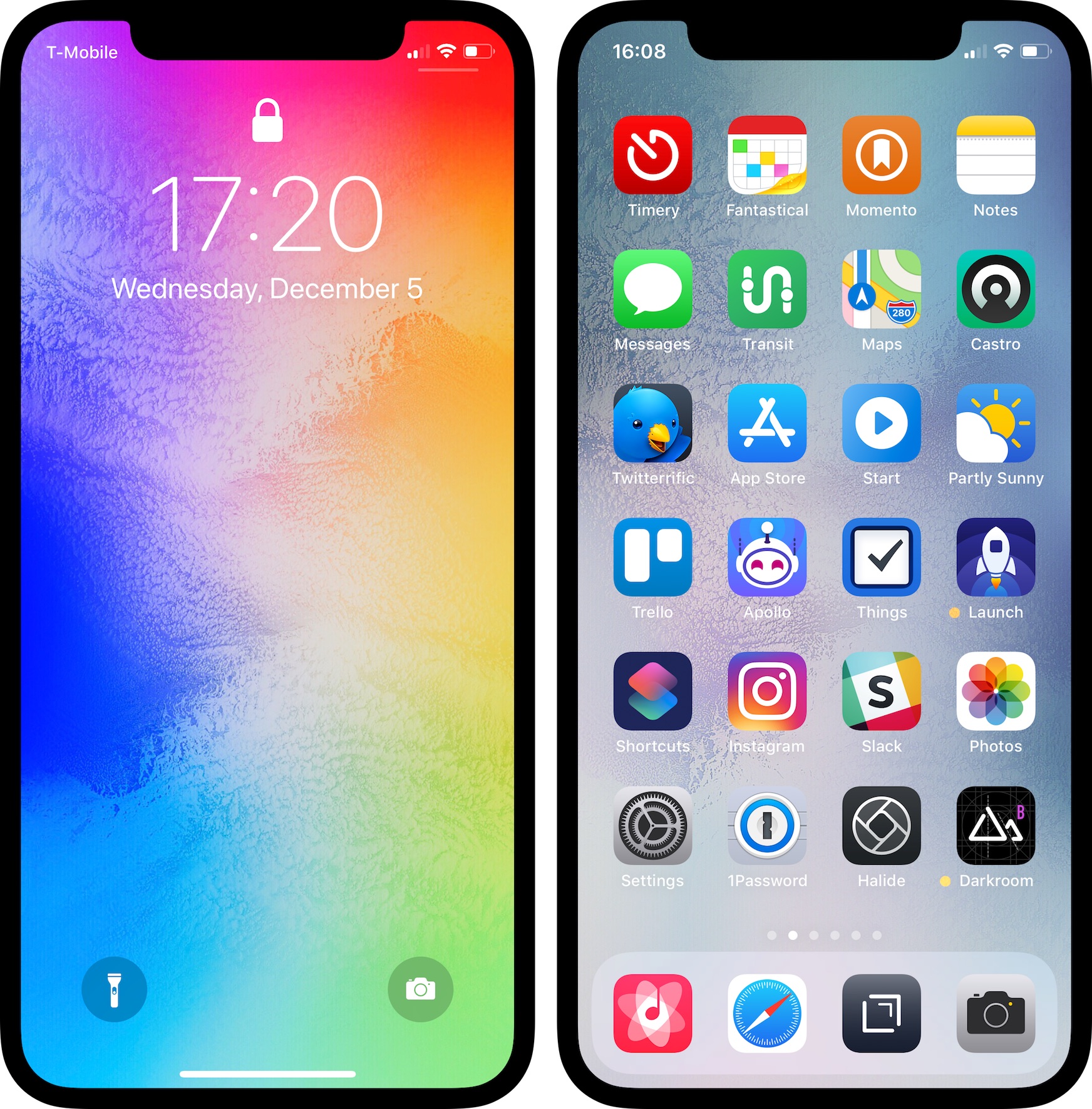
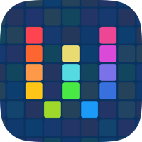
Here’s my Home screen as of December 2019. A while back I was inspired by the iOS Setups subreddit to arrange my apps by color, and I’ve stuck with it. I tried earlier this year going back to an arrangement where similar types of apps were grouped together, but I quickly reverted because color order is much more visually pleasing to me. So here it is (select to view a larger version):

home screen december 2019

These are the apps I use the most or I want easy access to. My wallpaper is “gradient special edition 1” by AR72014. I like how the icons pop against the black background, but I like the color emanating from the dock. Below are a few notes on why I use these apps and what I like about them.
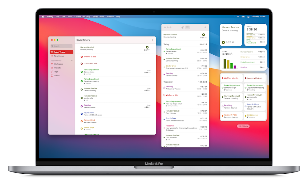
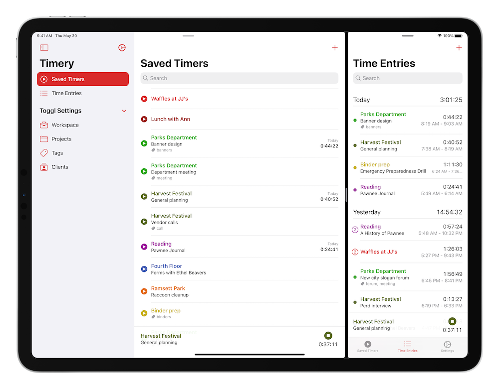
timery

Timery
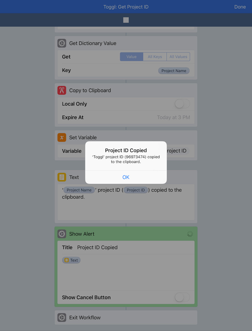
I use Toggl to track my time on various things. Originally, I used various Workflow workflows to interface with the Toggl API, but I eventually outgrew them, so I made Timery and released it earlier this year. It started as an app for me, but I’m so pleased to hear how it’s helped so many others besides me, and I continue to be blown away by the response to it. From starting favorite timers with one tap to managing time entries, projects, and tags to using Siri and Shortcuts to automate tasks, my goal was to make time tracking with Toggl easy.

fantastical

Fantastical
I don’t usually have many calendar entries, but when I need to add one, I enjoy Fantastical’s, well, fantastic natural-language parsing. And I like seeing both my calendar events and my reminders in the same view.

momento

Momento
This is a journaling app that collects manual thoughts and media and also automatically imports tweets, Instagram and Facebook posts, and other social-media feeds. I’ve been using Momento for almost ten years now, and looking back at memories and what I was doing, thinking, and even tweeting years ago is something special.

notes

Notes
I don’t do a whole lot of writing, so Notes is good enough for me. I appreciate my notes being available on all my devices and the easy sharing of notes if I ever need to.

transit

Transit
Despite living in the sadly car-centric Los Angeles, I regularly use the public transportation system, and I use Transit to help me navigate. Many public transit lines run infrequently or have earlier-than-ideal-end-of-service times, and Transit has some key features to help with that: its active-trip mode lets me know when to get off, whether or not I’ll make a connection, and what my ETA is so I can plan accordingly if necessary.

maps

Maps
Since I rarely drive, I mostly use Maps to look up points of interest and for checking traffic on major streets to help plan which public transit routes to take. But on those rare occasions I do drive, I appreciate the lane guidance and speed-limit icons as well as the turn-by-turn haptic feedback that I get on my Apple Watch. Also, I really dig the iOS 13 dark mode map.

castro

Castro
I’ve been using this as my podcast app for a while now. One thing in particular I appreciate is in the chapter list for episodes, I can tap the chapters to jump around as well as deselect them to skip certain chapters (especially useful to queue up what I’m listening to before I go for a run).

twitterrific

Twitterrific
I started using Twitterrific as an experiment a while ago, and it stuck. Some of the things I like about it: muffling people or things (unlike muting, which can be done too, I can still see a muffled person tweeted or a muffled thing was tweeted about, but if I don’t want to actually see the tweet, I don’t have to), synced feeds between my iPhone and iPad, permanent chronological feed, customizable tabs, and being able to create my own themes for the app. I’ve made a light theme, a dark theme, and a black theme to suit my tastes. Plus the icon is so darn cute.

mail

Mail
There are no perfect mail apps because perfect for one person is terrible for someone else. But Mail is good enough for me. While some of the interactions have degraded a bit in iOS 13 (I’m looking at you, swipe actions) and there is still room for improvement, I still would rather have my mail not routed through some third-party company’s servers.
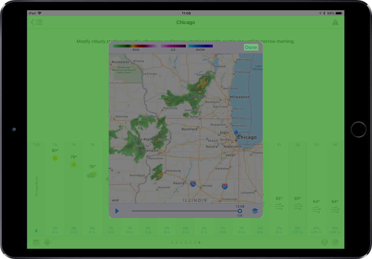
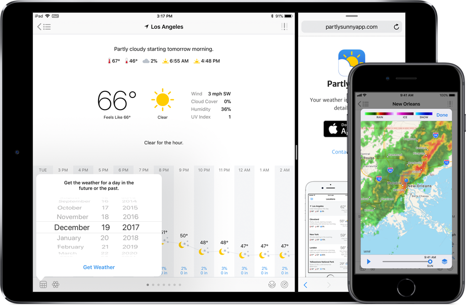
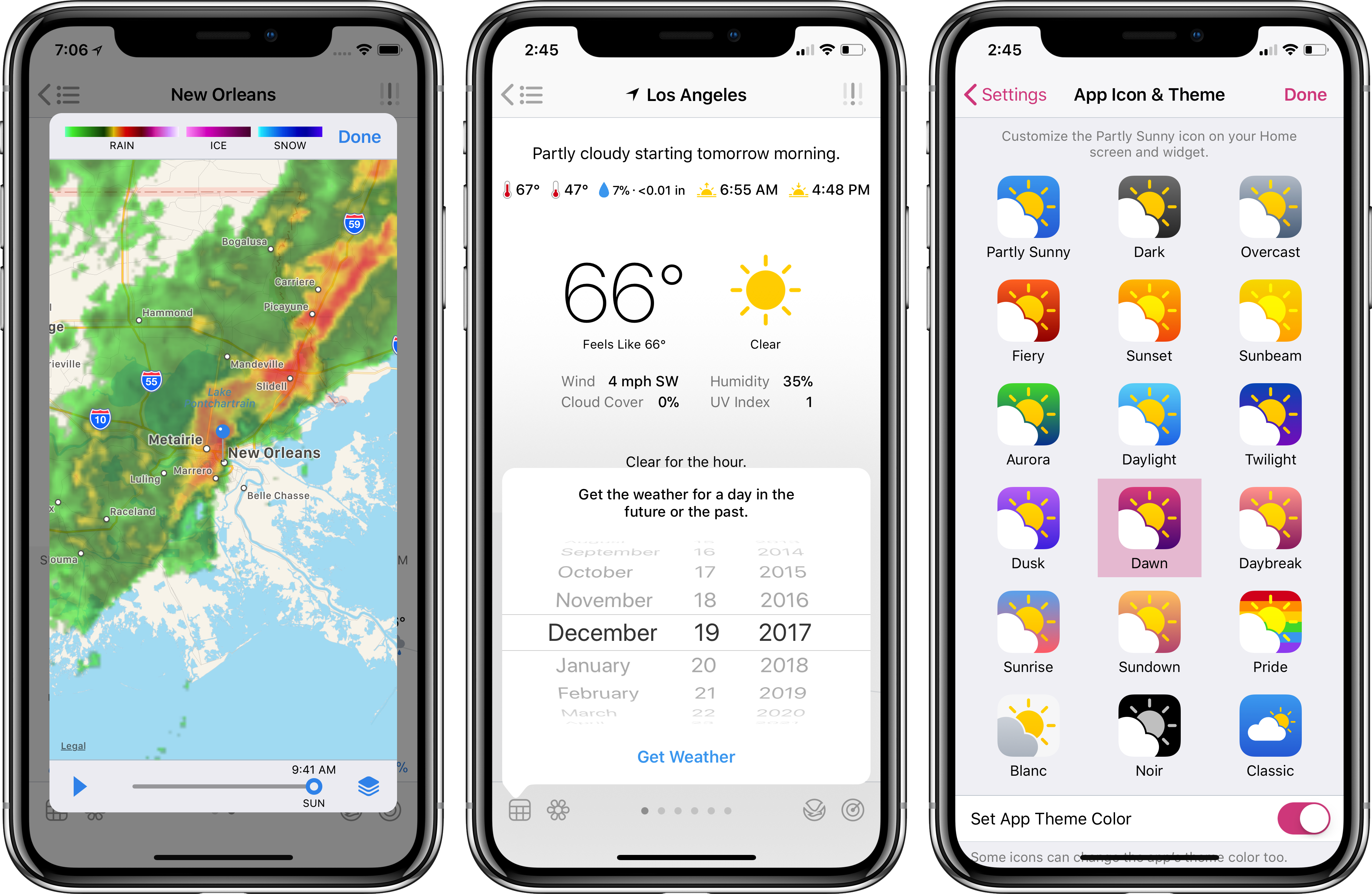
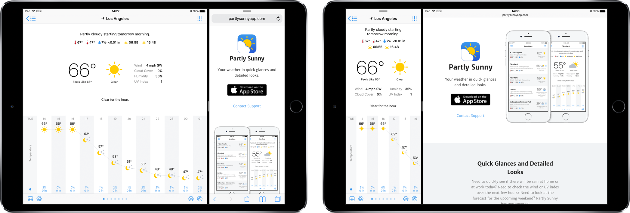
partly sunny

Partly Sunny
This is my weather app that shows quick glances and detailed looks at weather. I like having both a visual and textual representation of weather (having both graphs and written summaries), so both exist throughout the app. I’ve tried to design everything so the details are there if you want them but don’t get in the way if you don’t.

things

Things
I feel like every few years I reach a point with my to-do app of choice where I’ve put too many things in it that for one reason or another I keep putting off, and then I have to manage my to-do app more than I should. Eventually I give up and move to a new app. I’ve been using Things for a while, and have been enjoying it (though I wish I could complete a recurring to-do before it’s due!), but I think I’m at that point with it. iOS 13 came along with the big Reminders update, and I’m now experimenting with using Reminders as my to-do app. I still really like Things and its design, so I’m not sure how this will play out. Perhaps I use Things more for project tasks and Reminders more for day-to-day stuff. We’ll see!

apollo

Apollo
With its many customization options, gestures, and the jump bar, Apollo is such a delight to use (it’s easy to tell much thought and love has been poured into the app). And it feels at home on iOS (always a bonus for me when apps do).

launch center pro

Launch Center Pro
Though Shortcuts, widgets, and Home screen quick actions have largely taken over what I previously used Launch Center Pro for over the years, it’s still great for launching into deeper parts of apps. And usually a few times a day I’m launching other apps from the app-icon widget.

shortcuts

Shortcuts
Shortcuts is so integral to my day-to-day iOS usage I can’t imagine iOS without it now. From previewing my day and the weather tomorrow to adding reminders to adding device frames for screenshots to presenting menus to start time tracking and check my tracked times, the automations I’ve set up save me so much time and effort.
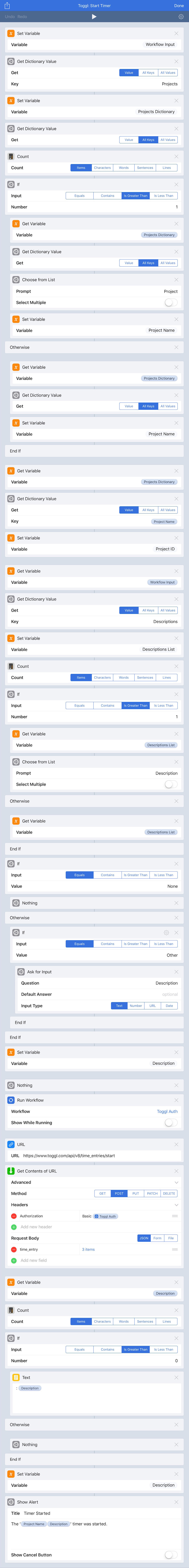
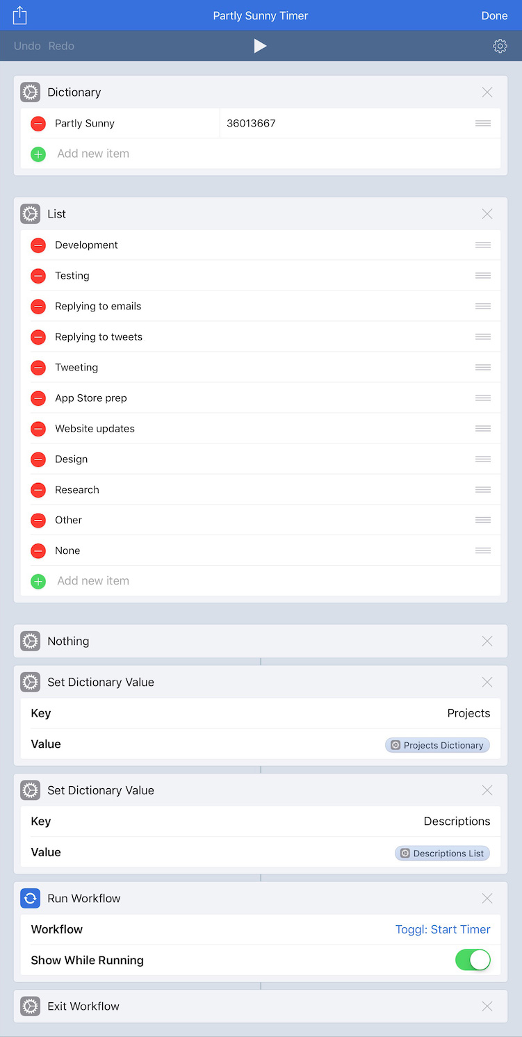
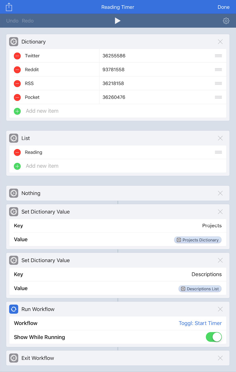
timers

Timers
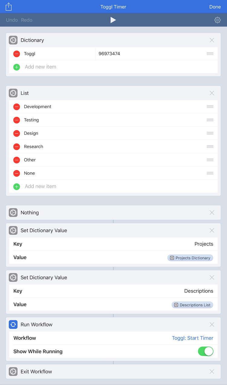
As mentioned at the start of this, I’m experimenting with having launcher shortcuts on my Home screen. This particular shortcut shows me a menu of projects I choose from, and depending on my choice, it runs other shortcuts to show another menu of things I work on for the chosen project. Once I’ve made my selections, this shortcut system uses my selections to fill in parameters (huzzah to iOS 13 Shortcuts parameters!) in a Timery action to start a time entry. This shortcut as well as the other two use icons from the MacStories Shortcuts Icons.

shortcuts

Shortcuts
Another shortcut launcher. This one presents a menu of other shortcuts I use frequently. When I select one, it runs that shortcut.

reminders

Reminders
As discussed with Things, I’m experimenting with Reminders in iOS 13. While of course there are still improvements that can be made (I’d like to see better organizing & grouping in the Today list and have more robust Reminders actions in Shortcuts (why can’t I set a due date without a time?) for example), this is a big and welcomed change from the previous version of the app.
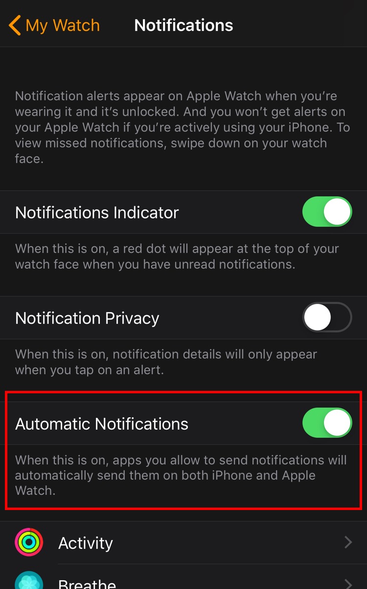
settings

Settings
Another shortcut launcher. This one is adapted from Federico Viticci’s Settings launcher he built after finding the URL schemes to launch into specific menus and submenus throughout Settings. My tweak (more on this below) is to show icons in the menu Shortcuts presents.

lire

lire
My RSS client of choice. I’m partial to lire because of its text previews in each subscription’s list. Plus it feels right at home on iOS.

darkroom

Darkroom
A polished, powerful photo editor. I appreciate being able to copy the edits from one photo to another so if I’m editing multiple photos taken in the same environment, I don’t have to make my adjustments on the first and then repeat them all on the others.

halide

Halide
A polished, powerful manual camera app. One of my favorite features is when in manual-focus mode, I can turn on highlighting of what’s in focus in the frame—immensely helpful when I’m trying to compose a shot with a particular thing in focus. Something I like about Halide in particular over other manual camera apps is that it doesn’t overwhelm me. Some manual camera apps have so much going on they become intimidating or convoluted. But Halide keeps things simple while still being powerful.

And in my Dock:

marvis

Marvis
I maintain a local library synced from my Mac, and since the focus of Apple’s Music app is on Apple Music, it isn’t for me. I want faster access to playlists, albums, etc.—what used to be in tabs in Music. So I’ve been using a third-party music app for several years. I had been using Cs Music Player (formerly Cesium), and I still like it. For the past couple months or so, I’ve been trying out Marvis. I particularly like the home screen with its customizable content and layout. From changing how views are displayed to how lists are sorted and what metadata is displayed, customization is at the forefront in the app.

safari

Safari
If you hadn’t gathered from Notes, Maps, and Mail, I’m all-in on the Apple ecosystem, and that, of course, includes my browser. The privacy focus, content blockers, Keychain sync and auto-fill, 1Password auto-fill, synced bookmarks, showing open tabs across my devices, and more keep me on Safari.

drafts 5

Drafts
This is my go-to app for jotting down a quick note or writing longer texts that I later plan on doing something with or sending somewhere else. I often write tweets and tweet threads in it, and I wrote most of this post in it too. And I love having my drafts available on Mac now too.

camera

Camera
I’ve kept this in my dock for easy access since iPhone X moved Control Center to the top of the screen. If my phone is unlocked and I want to quickly take a photo, it’s far easier to hit the icon in the dock than reaching up for the icon in Control Center.

A Few More

These apps aren’t on my Home screen, but I use them frequently and am thankful they exist.

1password

1Password
You’re using a password manager with unique passwords for all your logins, right? If you aren’t already, please do! The system integration since iOS 12 allowing easy filling of passwords has been such a great improvement.

adaptivity

Adaptivity
A great resource for iOS developers & designers as well as for people who are iOS curious. Check sizes & margins, see how things change in Slide Over & Split View, check system colors, search & inspect all the SF Symbols, and more.

dark noise

Dark Noise
A really good-looking ambient-noise app with great Shortcuts support. The shortcut I run before bed starts the “Airplane Interior” noise for my flight to dreamland every night. And the shortcut I run when my flight lands in the morning stops the noise.

gifwrapped

GIFwrapped
I don’t have that large of a GIF (not pronounced like the peanut butter) library, but GIFwrapped shows me my collection for easy sharing and allows me to search for new ones to share or add to my library.

guardian

Guardian
Third-party analytics and tracking libraries are a real problem on iOS, and for Apple’s (laudable) stance on user privacy, I’m genuinely surprised they haven’t done more to limit these libraries (I think they should). Enter Guardian which is both a VPN and a firewall. Traffic to these nefarious third-party libraries is blocked so they aren’t invisibly collecting information about me. The app maintains a list of things it blocks, and looking at the ever-growing number of things in it is eye-opening. I’m very eager to see how the app develops in the future.

metapho

Metapho
This app allows me to easily remove location information from photos if I want to before sharing them. And if the location or the date & time are wrong on a photo (like if I saved a photo from somewhere and it uses the date I saved it instead of the date it was taken), I can easily edit them to the correct information.

picsew

Picsew
This is a great app to stitch together multiple screenshots into one long one. The very tall screenshots later in this post of a long shortcut were stitched together from several using Picsew. Once the app generates what it calls the “scrollshot” from the multiple images, it can delete them from the photos library too so they aren’t cluttering my Photos library.

toolbox pro

Toolbox Pro
A wonderful utility that takes advantage of iOS 13 shortcuts with parameters and output details to add power-user actions to Shortcuts that aren’t natively available. With Toolbox Pro, it feels like they are! The app has helped making the menus each of my shortcut launchers present.

Shortcuts Launchers

Let’s talk more about those shortcut launchers and take a peek inside.

I’m thankful iOS 13 improved running shortcuts saved to the Home screen where it no longer launches a new tab in Safari first and then Shortcuts like it did in iOS 12. Now, shortcuts on the Home screen launch straight into Shortcuts. It’s a small thing but a definite improvement.

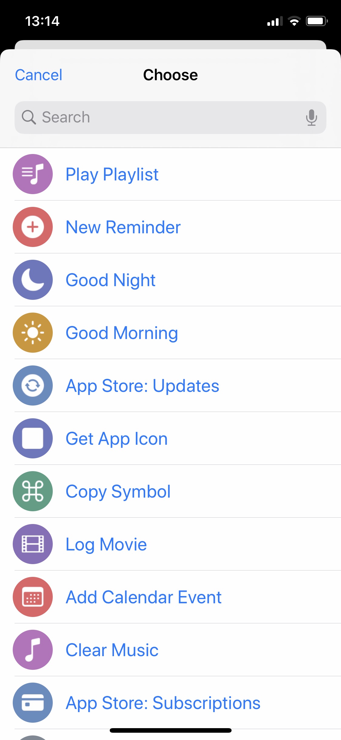
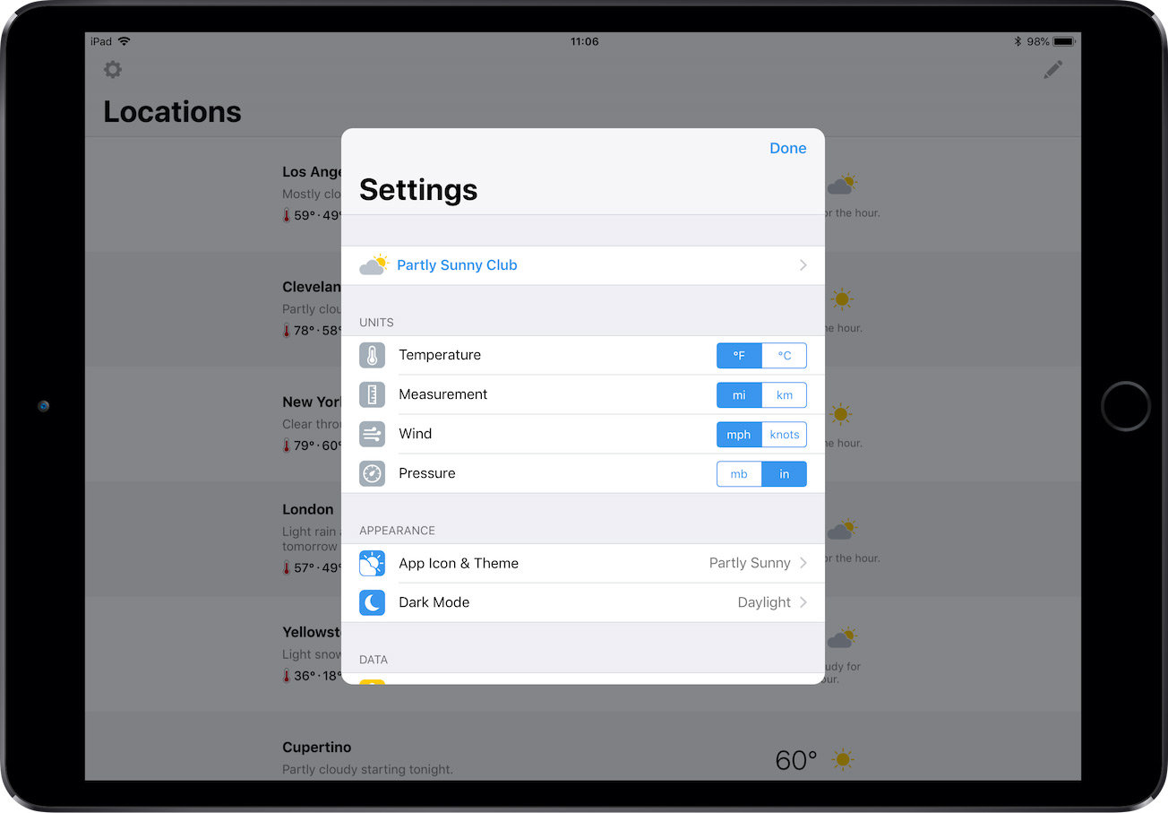
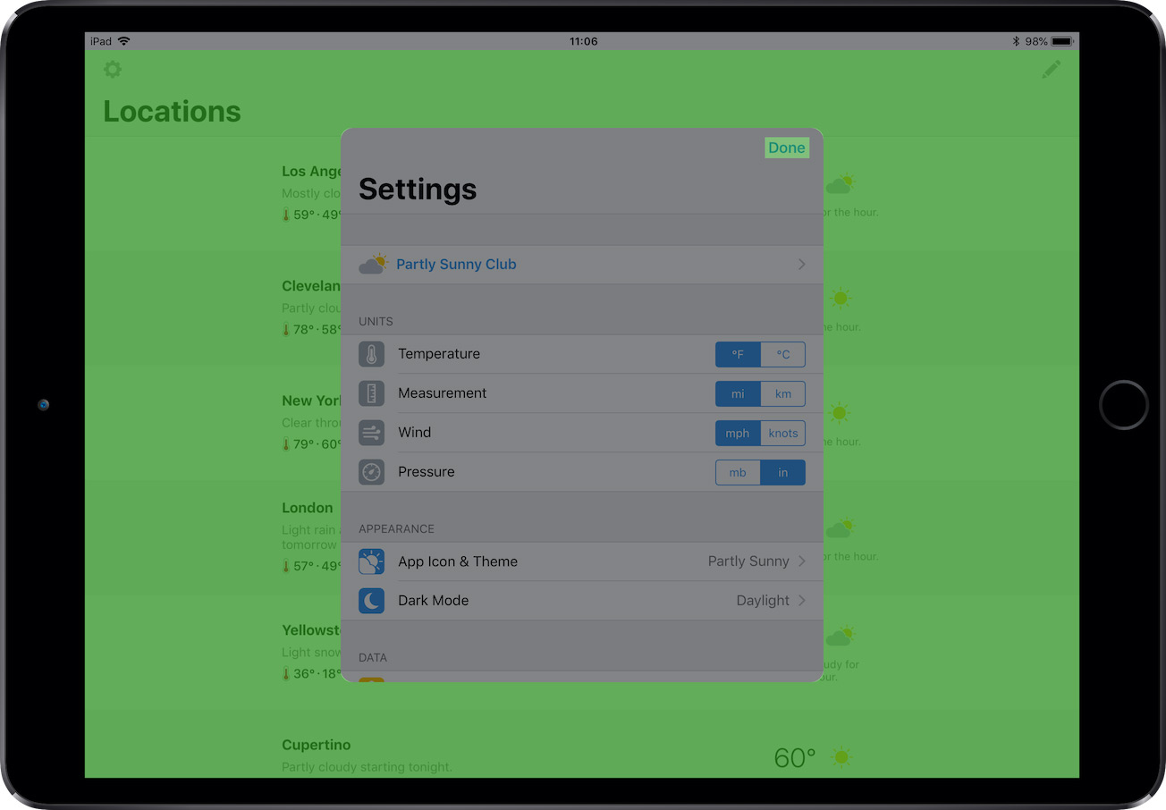
Let’s look at the Settings launcher as an example. Here’s the menu the shortcut presents:

settings launcher

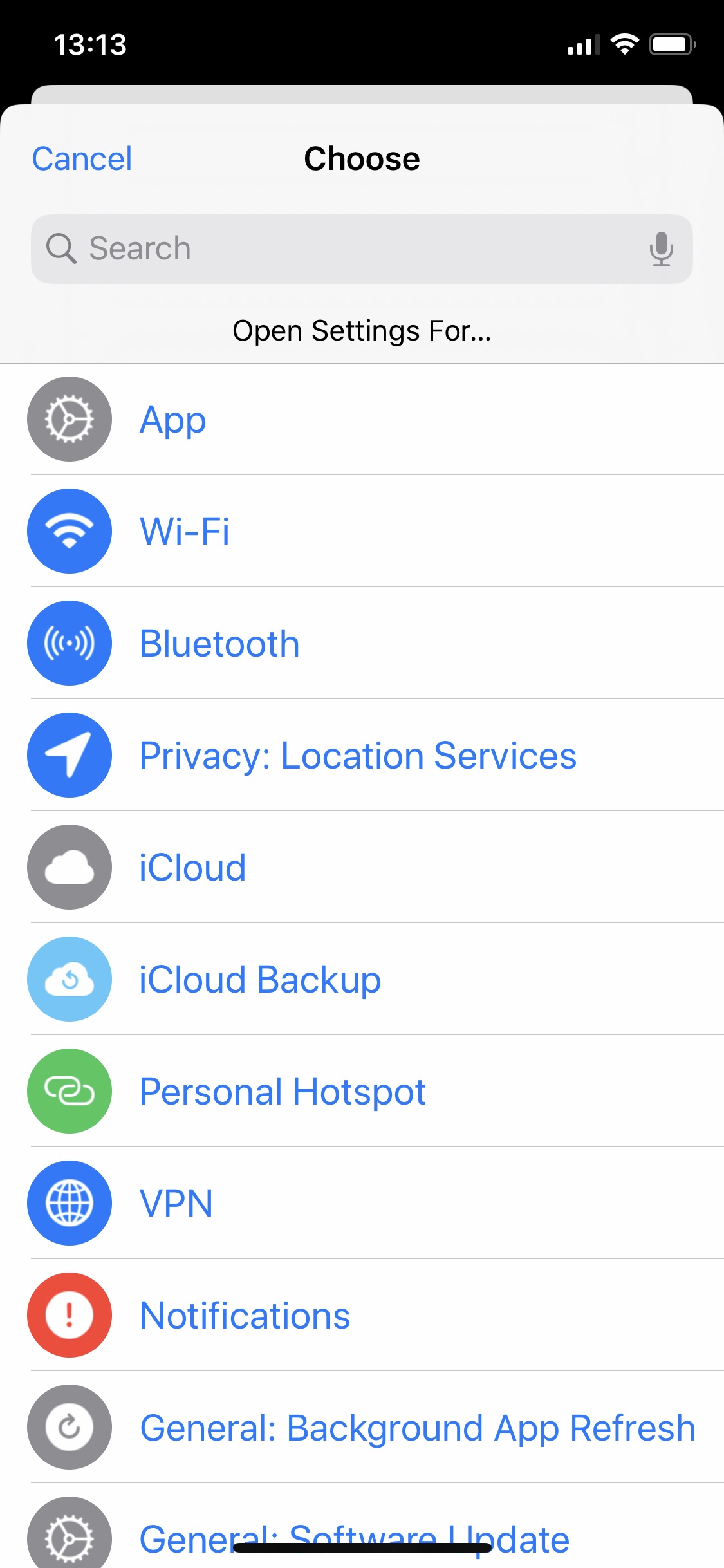
As mentioned above, this launcher is adapted from Federico Viticci’s Settings launcher that uses Settings URL schemes to deep dive into specific menus and submenus. It still works the same where when I run it, I get a menu of Settings options, I choose the thing I want to open settings for, and Shortcuts jumps over to Settings app into that thing saving me the steps of digging around to find the thing. My addition to Federico’s shortcut is having an SF Symbol and a color accompanying each option.

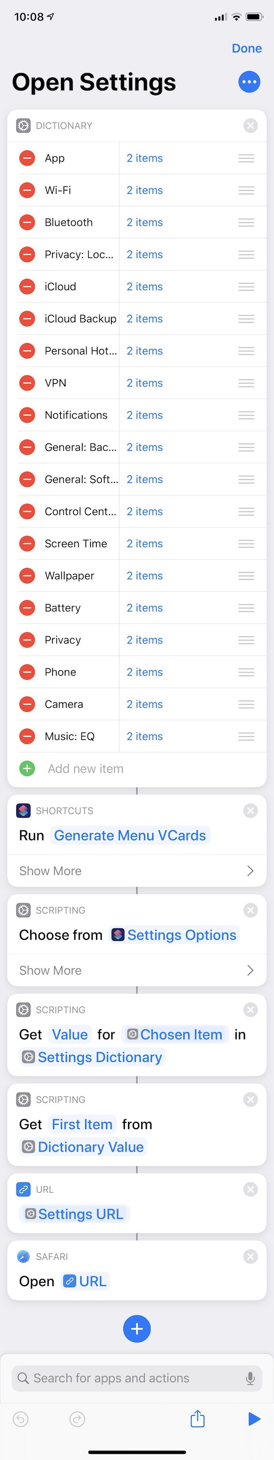
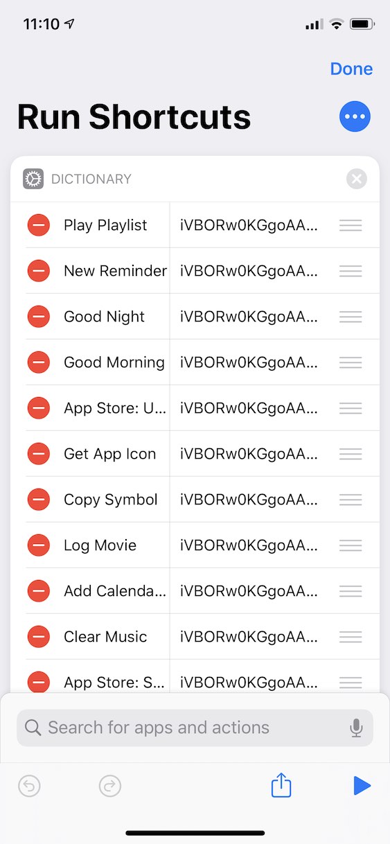
So how does it work? The shortcut starts with a dictionary of things to choose from. The keys are the text that appears in the list to choose from, and each value is an array of one or two strings.

settings launcher dictionary

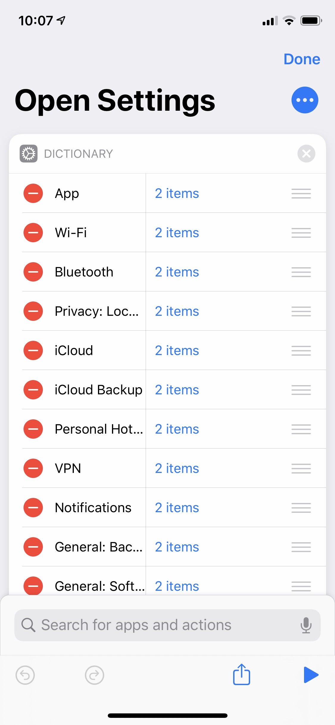
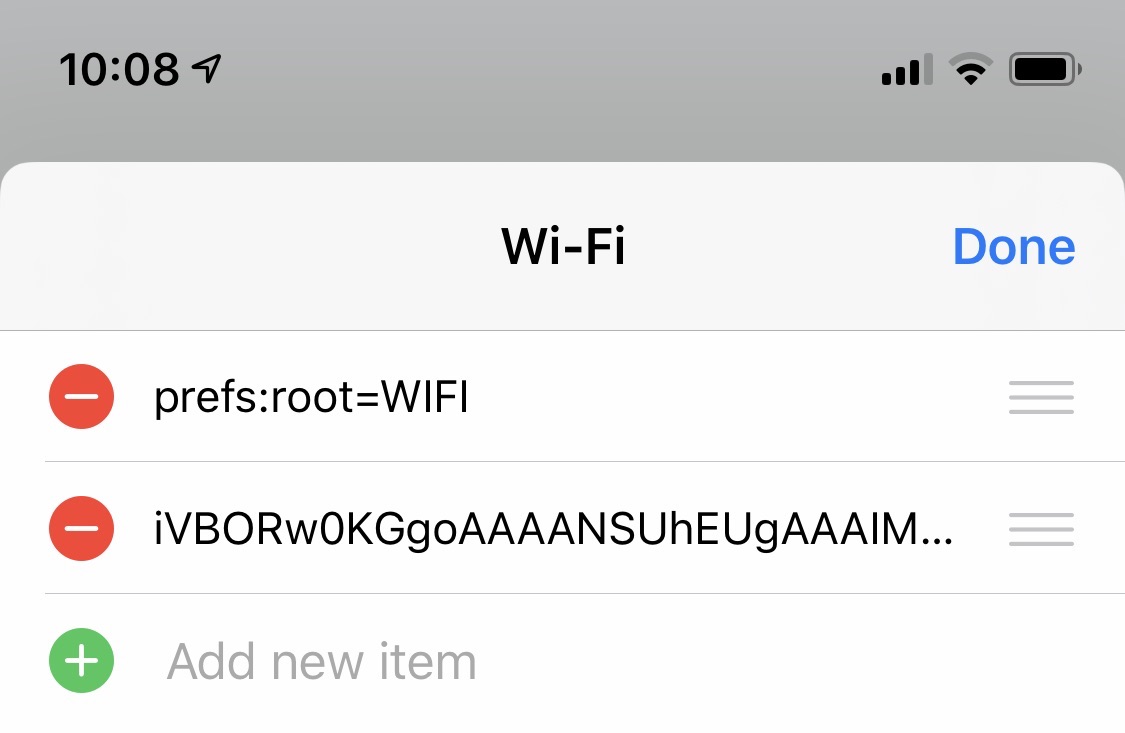
The first item in the array is the URL scheme for the setting. The second is a base64-encoded icon I generate with another shortcut (more on this below).

settings launcher dictionary value

This dictionary is sent to another shortcut which processes the dictionary, generates the actual menu, and returns it to the Settings launcher shortcut. The menu is presented, I choose the thing, and off I go to Settings.

settings launcher actions

Generating the Menu

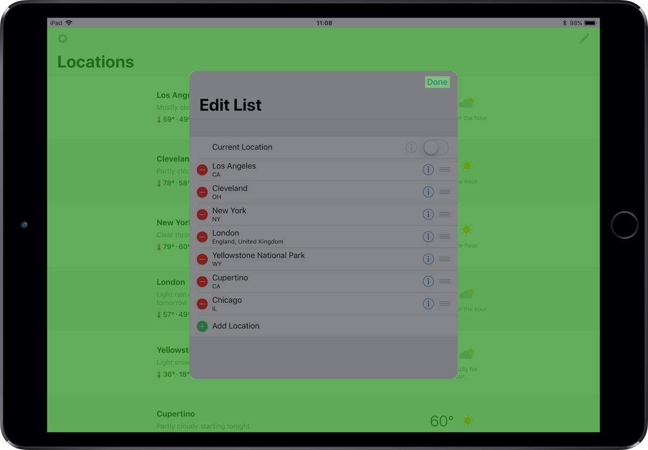
Shortcuts doesn’t have a native way of generating a rich menu, but if you give the Choose from List action a list of contacts, it uses the contact’s photo in the list item. So what the menu really is is a list of contacts.

To generate the menu (the list of contacts), I use another shortcut dedicated to processing the dictionary and generating the menu. Thanks to the Run Shortcut action, I can break out this set of actions as a reusable shortcut for all of my launchers since these steps are the same for all of them.

menu generator

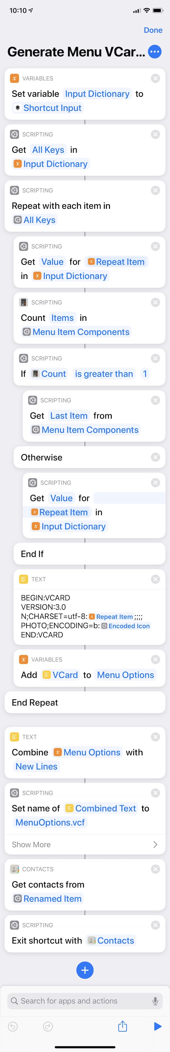
The shortcut takes each key/value pair from the dictionary above and creates a vCard with them. (A vCard is the file format for a contact card. It can contain a name, address, phone number, photo, etc.) The text is the “name” of the contact, and the icon is the photo. If the dictionary value has more than one item in it (in the case of the Settings launcher, it has two as described above), it uses the last item in the list; otherwise it uses the only item. The shortcut puts together the list of “contacts” and returns it to the Settings launcher shortcut to choose from.

One of the actions in Toolbox Pro is a Create Menu Item that puts a visual editor on top of vCard generation: you can specify the title and the SF Symbol & colors, and the action generates a menu item.

toolbox pro create menu item

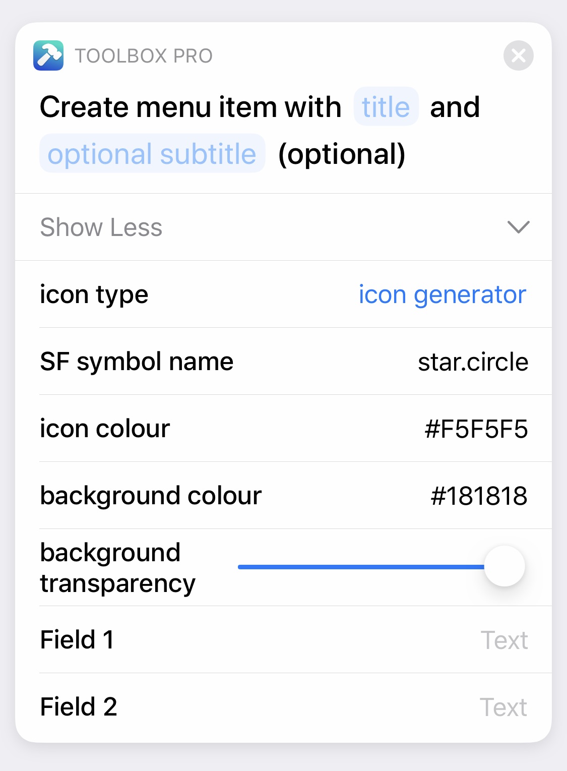
I originally was using this solution in my launcher setup instead of manually generating vCards, but there’s a slight delay while the menu is being generated each time I run the shortcut (I assume because Toolbox Pro has to create the image (symbol on a color) and then base64 encode it for the vCard for every item in the list). With many list items in my launchers, I wanted my launchers to be a little snappier, so I use a pre-generated and encoded image. (This isn’t me knocking the excellent work developer Alex Hay has done. Just explaining for anyone wondering why I don’t just use Toolbox Pro actions to make the menus!) So how do I generate the images? With a different action from Toolbox Pro!

Generating the Icons

To generate and encode each setting’s icon, I manually run a separate shortcut that takes advantage of the Create Icon action of Toolbox Pro.

settings icon generator

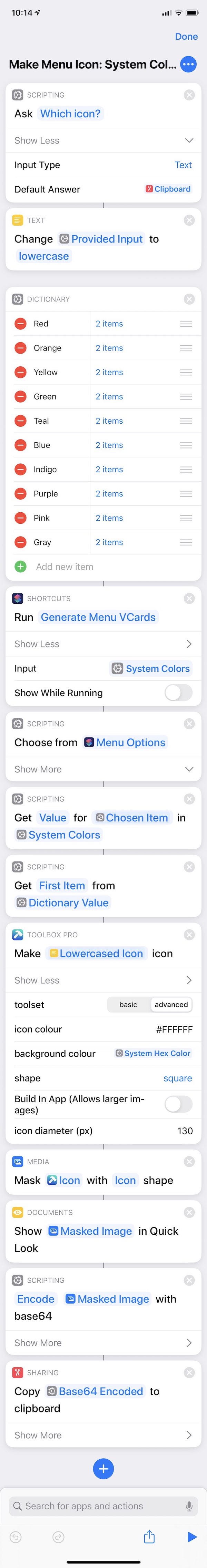
The shortcut asks for the name of an SF Symbol, presents a list of system color options, and then uses the advanced mode of the Create Icon action to generate the image. I mask it to an icon shape (I like how the icon shapes look when the launcher shortcut is run in the widget), encode it, and copy it to the clipboard. Then I go back to my launcher shortcut and paste the output into the corresponding dictionary item.

Because the launcher icons don’t dynamically change, I can generate them once when I’m initially building or editing the launcher; they don’t need to be regenerated every time I run the shortcut.

To get the name of an SF Symbol, I use Geoff Hackworth’s excellent Adaptivity. I find the symbol I want, copy the name, and run the icon-generating shortcut.

adaptivity

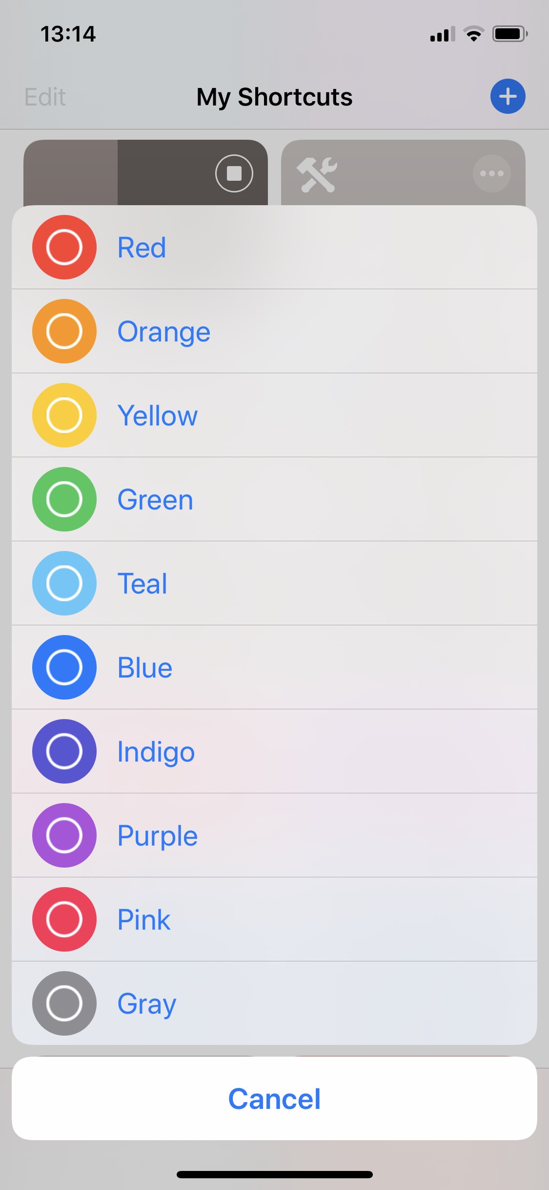
The list of color options to choose from that this shortcut presents was generated with a similar method. All the icons and menus!

settings launcher colors

For the icon size, I settled on 130×130. This size allows the icons to not be too small and thus too fuzzy on a retina screen while not being too large and possibly slower to decode with long lists.

Other Launchers

Similar to my Settings launcher, I have a shortcuts launcher that launches other frequently used shortcuts of mine.

shortcuts launcher

It’s built similarly where it presents a list with icons generated like the Settings launcher above though it uses Shortcuts colors instead of system colors. Instead of a dictionary of arrays, the shortcut has a dictionary of text since there aren’t any URL schemes involved.

shortcuts launcher actions

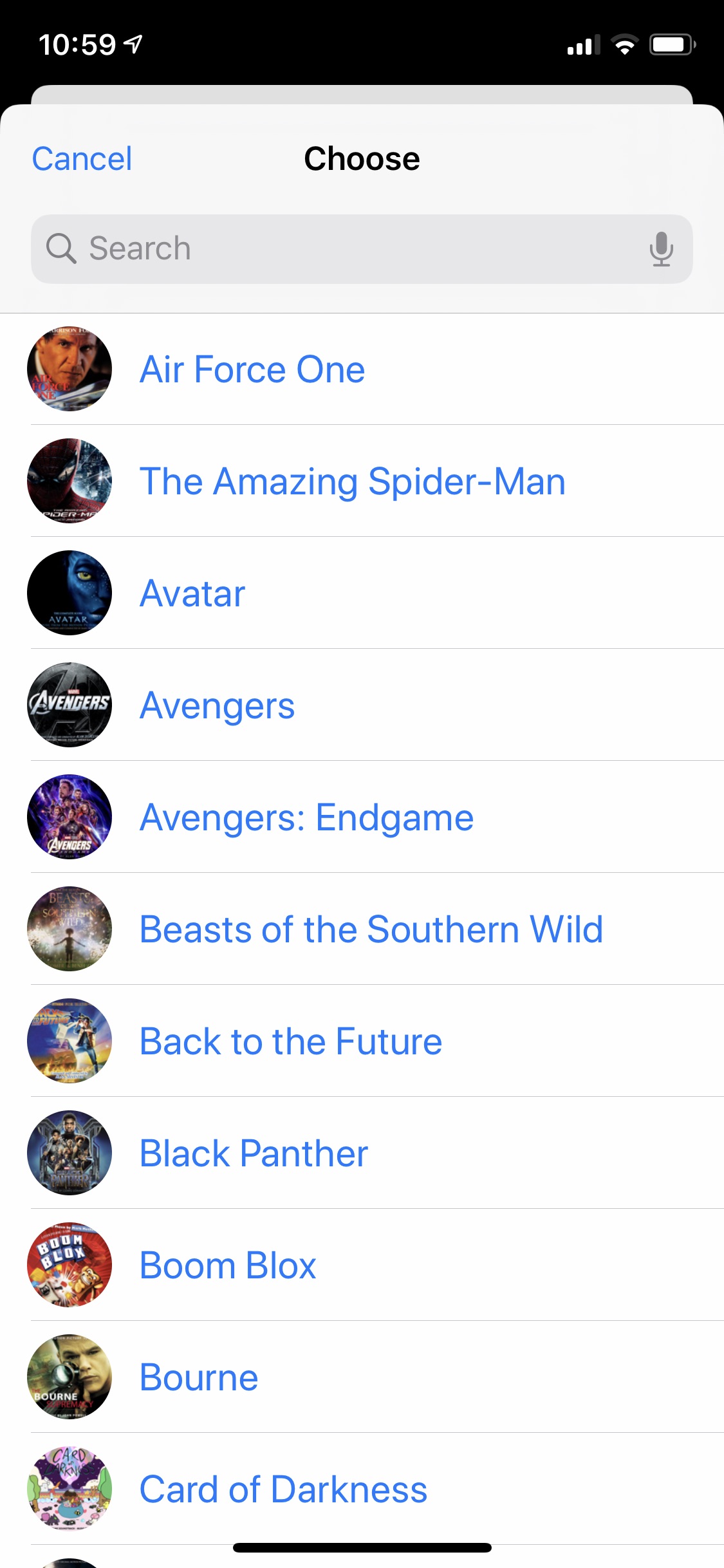
I also have a music launcher that presents a list of playlists to choose from. The icons in this case are generated from album art instead of SF Symbols, but the presenting and launching mechanics are the same.

music launcher

The Shortcuts

If you want to try these out at home, here are links to each of the shortcuts mentioned above. If you have ideas on how to improve them, please let me know!

My Home Screen

So that’s my Home screen and how I’m experimenting using shortcuts launchers on it. I’m curious to see where I go with this and what other shortcuts I may add to my Home screen.

Thanks for coming along on this experiment with me thus far. I hope this has inspired you to try one of these apps if you haven’t already or to tinker with these shortcuts to develop launchers and menus of your own.

Please come find me on Twitter and let me know what your Home screen looks like!

iOS 13 Wish List

WWDC19

Like last year, in the lead up to WWDC, I’ve been thinking about what new things or updates I’d like to see in the next version of iOS. Many of these items were on my iOS 12 wish list last year but didn’t come to iOS 12, so now I’m hoping they’re coming to iOS 13.

Here’s my list in no particular order:

  • Dark mode all the things! This has been on my iOS wish list for a few years now. But this year feels like the year it’ll happen. Dark mode came to macOS last year, and this year iPad apps are coming to the Mac—which means iOS apps will need to support dark mode. It would seem strange then for iOS not to get dark mode too. In addition to a toggle in Control Center, I would love to be able to toggle dark mode automatically either by screen brightness or by daylight time (which could be scheduled like Night Shift or could use the device location’s sunrise and sunset times).
  • Speaking of Control Center: Better Control Center placement. Perhaps it could live in the multitasking app switcher UI as an app card. On iPhone, it would be to the right of the active app. And like how you can swipe the home bar indicator right as a shortcut to switch from the active app to the previously active app, perhaps swiping left on it could be a shortcut to show Control Center.
  • One more Control Center thing: Allow third-party apps to add launcher buttons.
  • Replace the incoming call screen that takes over iPhone and iPad with a less-intrusive notification banner or something similar.
  • Replace the volume display that covers what’s being watched when the volume is changed with a display in the Status Bar like Apollo and Instagram.
  • An easier way to change the apps in Slide Over and Split View (like how prior to iOS 11 there was an app picker to select an app for multitasking). The Slide Over app and one app in Split View currently have a drag indicator at the top that allows the app to slide left or right or off the screen and allows dragging down to enter or leave Split View. Perhaps if the indicator were dragged down slightly, it would keep the current enter/leave Split View action, but if it were dragged down further, it would expose another panel with a grid of recently used apps that support multitasking. And perhaps apps could be favorited for quick access.
  • Picture-In-Picture on iPhone.
  • Better ways to dismiss modal form sheets.
  • Improvements and modernizations in Mail.
  • Ability to create smart playlists in Music.
  • Bring back the network activity indicator for notch phones.
  • A keyboard shortcut to dismiss Safari View Controller (unless this already exists and I don’t know about it?).
  • Bring back the URL schemes that launched Settings submenus (for example launching into Settings > Personal Hotspot or Settings > Privacy > Location Services).
  • If not those then allow customizing the 3D Touch shortcuts for Settings.
  • On iPhone X/XS, 3D Touch shortcuts on the lock screen when navigating or on a call (curiously they disappear from the lock screen now, so to take a photo, the phone has to be unlocked).
  • Ability to restore a single app or, say, a selection of Camera Roll photos from a backup rather than having to restore the entire device. (Seriously, why is this still a thing?) Imagine in iCloud settings being able to browse the contents of iCloud backups and selectively and directly restore things from them.
  • Make Apple Watch notifications opt-in instead of opt-out.
  • An expanded Shortcuts API. With it, developers could build shortcut actions that accept input and return output. And developers could build what are effectively native Shortcuts actions that can have full access to the app’s functionality and data and can perform actions in the background (like how the Notes actions work) without a URL scheme and bouncing to the app to complete.
  • Searchable emoji keyboard.
  • Low-light camera mode.
  • When deleting an app with an active subscription, display a prompt asking whether or not to cancel the subscription.
  • Ability to have three apps in iPad Split View.
  • Drag and drop from one app to another on iPhone.
  • Spam call filtering. If my phone can display “Scam Likely” when a suspected spammer is calling, I would like the option to have those calls not actually ring my phone and instead arrive silently like notifications can now.
  • Keyboard navigation system (and API for developers) to navigate an app with an external keyboard.
  • Some kind of indication what app has keyboard focus in iPad Split View. And the ability to Command-Tab between the two apps.
  • More robust developer analytics. Since third-party analytics frameworks have repeatedly shown they cannot be trusted, they should need to be approved by Apple. And Apple should provide developers with a robust, privacy-focused framework to use instead. Either should be opt-in for the user.
  • Related, more immediate stats and sales info in App Store Connect even if they are a couple hours delayed. Like the above item, Apple should provide more robust reporting and analytics frameworks so developers aren’t pushed to using possibly questionable third-party analytics librarys.

So, just a few things on my wish list again! Hah! I’m hoping many of these won’t be on next year’s list because they’ll be part of iOS 13. We’ll find out on Monday!

Watching for a Better Notification System

Notifications

One of the things on my iOS 12 wish list last year (that is also on my iOS 13 wish list) was opt-in Apple Watch notifications instead of opt-out. I’m an Apple Watch wearer who only wants taps on my wrist from things I need to act on immediately or soon (for example when I’m on the bus: a notification that my stop is coming up and I need to get off), so only a select few apps are allowed to send notifications. Too many things tapping my wrist gets annoying quickly.

The current system of allowing Apple Watch notifications, though, is not geared toward making this easy. I allow plenty of apps to send notifications on iPhone, and currently that means I also automatically get notifications on my Apple Watch. Nine times out of ten (maybe even 9.5), I don’t also want those notifications on my Apple Watch, so I have to go back to my home screen, find the Apple Watch app, scroll to and select Notifications, scroll scroll scroll to find that app, and toggle the switch off.

For users like me, Apple Watch notifications being opt-out is cumbersome and requires more management than it should.

But what if Apple Watch notifications were instead opt-in? Meaning: by default, apps would not also send notifications on Apple Watch, but if users wanted them to (in my case those one-out-of-ten times), we could allow them to.

How might opt-in Apple Watch notifications work?

One way to accomplish this is in Apple Watch app > Notifications having a switch to set whether or not Apple Watch automatically shows notifications for new apps. To maintain current functionality, it could even be toggled on by default.

Notifications Settings

I could toggle this off, and new apps I downloaded (or redownloaded) and allowed to send notifications would no longer automatically send them on Apple Watch in addition to iPhone—they would only be sending notifications on iPhone. For any apps I wanted to also send Apple Watch notifications, I could manually turn on notifications in the settings below the switch.

But I think a better way to handle this is in the modal when an app is requesting permission to send notifications. Currently, this modal has two options: Don’t Allow and Allow.

NotificationsModal_Current

What if it had a third option if there’s an Apple Watch paired to the iPhone?

NotificationsModal_Update

The phrasing could be improved of course since the label is rather long (or the button made taller to fit two lines of text), but the idea holds: this gives better, more immediate control over if and where I want to see notifications for this app. If I only want notifications on iPhone, there’s an option for that. If I want notifications on iPhone and Apple Watch, there’s an option for that too.

Compared to the current workflow, when I don’t want notifications on my Apple Watch too, this doesn’t require the extra several steps of navigating to and in the Apple Watch app to manually turn off notifications for the app (or manually turning them on if there were an auto switch like in the first example and I did want notifications). I can set where I want to see notifications right then and there.

As someone who only likes a few apps tapping my wrist with Apple Watch notifications and thus must more actively manage what apps can send them, the current opt-out notifications system feels more geared toward users who like all the apps sending all the notifications. An opt-in system, though, could work for both those users and users like me.

iOS 12 didn’t change the notifications workflow, so I’ll be watching to see if a change is on tap for iOS 13.

Favorite Film Scores of 2018

Off and on I write about my favorite film scores of the year. I didn’t the last two years for various reasons (I started writing a post last year but never finished it), but I did in 2015, 2013, 2012, and 2011. Rather than try to rank them as I’ve done in the past, I’m just listing them alphabetically this year. As in years past, these aren’t necessary the *best* scores of the year, but they’re the ones I listened to and enjoyed the most.

There are still some 2018 scores I haven’t listened to yet that I plan to, so this list could be updated with an late addition or two like it was back in 2012 with Dan Romer and Benh Zeitlin’s enchanting BEASTS OF THE SOUTHERN WILD.

BLACK PANTHER — Ludwig Göransson

If I were ranking these, this score would be at the top of the list. For me, this is the best score of the year. Full stop.

What makes this score so great is that it’s a superhero score that fits well in the Marvel musical world established by Alan Silvestri and further developed by Brian Tyler—it has rousing brass fanfares, driving percussive elements, stirring and striking vocals—but it’s a wholly unique entry in that world with its multitude of African flavors, and it even throws in some hip-hop beats. The themes are strong. The orchestrations are strong. There’s an obvious heart and level of care throughout the score. It is simply, uh, marvelous.

This is a fantastic achievement that further cements Ludwig Göransson as a composer to watch. I can’t wait to see what the future holds for him.

CREED II — Ludwig Göransson

Ludwig Göransson’s CREED score, uh, knocked me out back in 2015. His CREED II score does it again. It’s everything I like a sequel score to do: revisit and expand the existing themes and tone of the first score while further developing the musical world. I can’t say I’m a fan of hip-hop music, but I can’t get enough of the track “Runnin” that combines Göransson’s CREED themes with vocals by A$AP Rocky.

THE DEATH OF STALIN — Christopher Willis

This is technically a 2017 score, but with the movie being released in the United States in 2018, it’s eligible for 2018 Academy Awards, so I’m counting it as a 2018 score too. Christopher Willis seems to have taken a page from the Elmer Bernstein book of comedy scoring—write a serious score for a unserious movie (see: GHOSTBUSTERS). Further, he channels his music through the sound of great Russian composers giving it a classical sound that wouldn’t be out of place in, say, a Tchaikovsky ballet. It’s a brilliant effect and execution making for a very satisfying score.

INCREDIBLES II — Michael Giacchino

I was expecting more of the same (in a good way) from Michael Giacchino’s first INCREDIBLES score, but this one is a little different. It’s still jazzy, but not in a John-Barry-early-James-Bond-sound kind of way. Once I got past the sound being a little different, this score became one of my most listened to. It’s bursting with energy, full of familiar and new themes, and is a delight to listen to.

LOST IN SPACE — Christopher Lennertz

Christopher Lennertz’s score proudly and enjoyably evokes John Williams’s and James Horner’s big-themed, orchestral sci-fi scores of the 1980s. And I am here for it. I’m also here for the score’s generous use of John Williams’s LOST IN SPACE theme from the 1960s TV show. I always appreciate when a remake or reboot makes use of the original musical theme. As a lovely complement to the Williams theme is the main theme Lennertz wrote. The theme and the score as a whole exude a sense of adventure and make wondrous use of a sound that is sadly missing from a lot of modern scores.

OCEAN’S 8 — Daniel Pemberton

First coming on my radar back in 2015 thanks to his enjoyable, showcasing-several-styles STEVE JOBS score, Daniel Pemberton is again showing off his diverse talent. His OCEAN’S 8 score has a retro jazzy vibe—exactly what I would expect a heist movie like this to sound like. The music is energized and is just an overall very fun and easy listening experience that comfortably fits with David Holmes’s OCEAN’S ELEVEN musical world.

READY PLAYER ONE — Alan Silvestri

Not having a John Williams score in a Steven Spielberg film is still weird for me, but Alan Silvestri was the perfect choice to score this. He appropriately and successfully evokes his 1980s sound from his BACK TO THE FUTURE score (and even quotes the score here). Like Christopher Lennertz’s LOST IN SPACE, there’s a real sense of adventure in the music that makes for a delicious throwback sound. READY PLAYER ONE is easily Alan Silvestri’s best score in years.

SOLO — John Powell & John Williams

There aren’t too many things in the film-score world that get me more excited than a new John Powell score, but a new John Powell *adventure* score is one of them. And wow was this an exciting John Powell adventure score. John Williams wrote the main themes, and John Powell made them his own throughout the score (part of me wonders what a John Powell SOLO theme might have sounded like).

What I wrote about his PAN score is 100% accurate here too: Strong thematic material, rich orchestrations, and sheer fun. These are all hoped-for things in a John Powell score. And he again didn’t disappoint. Throw in some quotes of and allusions to Williams’s original STAR WARS themes (the music accompanying the Millennium Falcon reveal repeatedly gives me goosebumps), and this is not just a supremely enjoyable score, it’s easily one of John Powell’s best.

VICE — Nicholas Britell

Nicholas Britell’s score is at times dark, dramatic, buoyant, celebratory, soaring, classical, and at times it even throws in a little funk. It’s an enjoyable score that I wasn’t sure what to expect going into it but came out delighted by it. I imagine Britell’s IF BEALE STREET COULD TALK will get more awards recognition, but for me this is the more enjoyable, more accomplished score thanks to the many styles and instrumental voices it employs.

But wait. There’s more!

These, of course, weren’t the only scores I listened to in 2018, so I want to highlight some others. While the following scores weren’t amongst my favorites, they still had some standout tracks I enjoyed listening to repeatedly.

AVENGERS: INFINITY WAR — Alan Silvestri

BAD TIMES AT THE EL ROYALE — Michael Giacchino

THE BALLAD OF BUSTER SCRUGGS — Carter Burwell

BLACKKKLANSMAN — Terence Blanchard

CRAZY RICH ASIANS — Brian Tyler

FIRST MAN — Justin Hurwitz

HOLMES & WATSON — Mark Mothersbaugh

JURASSIC WORLD: FALLEN KINGDOM — Michael Giacchino

MARY POPPINS RETURNS — Marc Shaiman

MARY QUEEN OF SCOTS — Max Richter

SPIDER-MAN: INTO THE SPIDERVERSE — Daniel Pemberton

TAG — Germaine Franco

VENOM — Ludwig Göransson

Thank you to all of these composers and many more for entertaining me throughout the year. I hope you find entertainment in some of these scores too. Here’s to more orchestral delight in 2019!

Project 365 Retrospective

Project 365
2/365: A grandma’s love
27/365: Making some observations
187/365: “But it’s a dry heat”

If you follow me on Twitter, you know last year I embarked on a year-long photographic journey: take and a share a photo every day throughout the year. I successfully completed the project and wanted to wrap it up with some thoughts.

You can view all 365 photos in this Flickr album.

I also put together a 65-photo album of some of my favorites.

Part of my inspiration for this project was Stephen Hackett who did a 365-photo project in 2017 that I was following. Plus, since taking photos is a creative outlet for me, I wanted to get into taking photos more regularly, so this seemed like a great way to do that.

My goal each day was to post either something I encountered during the day I thought was interesting or something I thought somehow represented the day.

Some examples of things I encountered I thought were interesting:

113/365: Out of service

131/365: Doory McDoorface

157/365: Bee butts
157/365: Bee butts

338/365: Sign on the highlighted lines

352/365: Just a spladder of clouds today

Some examples of things I thought represented the day:

51/365: Urban jungle

160/365: Take me out to the ballgame

176/365: Rollin’ on the river

194/365: I couldn’t NOT have fries on National French Fry Day! #fatguyfriday

304/365: Trick or treat!

Some days were easier than others—days where I was traveling or exploring a part of L.A. that was for me new or less-frequented. And some days were harder than others—days where I didn’t go anywhere (or anywhere beyond my normal places) or didn’t have a photo I thought was interesting enough. There was a week or two where I was so uninspired and uninterested I wanted to give up. But I kept going, and I’m glad I did.

There were two things in particular that were helpful to keep me going. One was varying the routes I took getting places. I do a lot of walking, so I learned to go different ways and explore new streets and alleys. That helped to discover new things.

And a second thing was when I would find and take a photo of something interesting but wouldn’t use it for that day’s photo, I added it to a Trello board so I wouldn’t forget about it. Then on another day, I would go back to that thing and retake the photo for that day.

A Challenge Inside a Challenge

As if the overall project weren’t enough of a challenge, about halfway through the year, I decided the titles for my photos needed more what I called Michael Giacchino track titles—more puns, rhymes, and wordplay. (Michael Giacchino is one of my favorite film/tv/video-game composers, and his scores often have creative track titles. For example, here are the tracks for DAWN OF THE PLANET OF THE APES, JURASSIC WORLD, and SPIDER-MAN: HOMECOMING.)

This added a challenge on top of a challenge, but especially for photos I didn’t find as interesting, I wanted to spice them up a bit with bad puns. It was a way for me to have a little more fun with the project.

Some examples:

243/365: My heart was in the wrought place

247/365: Dog doos and don’ts

250/365: Ranger Rick’s restful recommendation

313/365: J’adoor
313/365: J’adoor

337/365: Crossing treeo

346/365: Make sure to have red and understood

362/365: A cloudy appierance

Software

All photos in the series were taken with an iPhone: most with iPhone X, many with iPhone XS, and a couple (the photos that had an iPhone X in them) with iPhone 7. The majority were taken with the default Camera app because when my phone is locked and I need a quick photo, there’s no beating lock screen access to Camera.

But I did also often use the manual camera app Halide. I find many manual camera apps overwhelming; they have so much going on they become intimidating or convoluted. But Halide keeps things simple while still being powerful: it doesn’t let the UI and features get in the way of the fundamental purpose of the app—taking photos. One of my favorite features of Halide is the ability to highlight what’s in focus, so when I’m composing a shot and want a particular thing in focus, this feature is helpful for exactly that.

Once I had the photo, I then applied some edits to it. When I started the project, I was using the photo editor built in to Photos to adjust lighting and color and to crop and straighten. This is fine for quick edits. About halfway through the year, though, I started using Darkroom to edit my photos. Darkroom is a powerful, easy-to-use photo editor that gave me more precise tuning for straightening and adjusting light and color. I often find iPhone X and XS photos to be touch too green, and Darkroom has a tint adjustment to add a hint of purple to the photo.

And then once I had the photo and made a few tweaks to it, I posted it to Flickr, Twitter, and Instagram through a multi-step Shortcuts shortcut that gave me more control than posting it in one place and have it auto-post to the others. Some of the steps in my shortcut included generating the day number text (e.g. “216/365”), opening Metapho so I could remove location data from the photo before sharing, expanding the Flickr short url because at one point during the year Twitter decided tweets with the short url were spam, and composing a tweet in Twitterrific and threading it with the previous tweets in the series. Since I was repeating the same steps each day to post my photos, I figured I could automate many of the steps with Shortcuts.

Project 365
105/365: Hangin’ out
262/365: Colors²
342/365: Taking shapes

Some Advice

I have a few pieces of advice for anyone who might be considering embarking on a similar project.

Don’t get overly stressed (like I often would) if toward the end of the day you don’t have something you think is on the same level of your best photos. Not every day has to be a prize-winning photo. Grab a cherished nicknack, memento, or toy and frame it in an interesting way.

Similarly: Don’t do it for the likes. You aren’t doing this project for someone else (or at least I don’t think you are). You’re doing it for you. Post things that make you happy—not what you think will get the most likes.

It doesn’t have to be a Trello board, but I recommend having some sort of repository to keep photo drafts. There are going to be days you have more than one photo you want to post. Use the one that most speaks to you that day, and save the others somewhere so you can be reminded to retake them another day.

Have fun with the project. If (and let’s be honest: perhaps when) you find yourself dragging to find and post a photo each day and want to quit, try to remember what made you inspired to start in the first place, and try to recapture some of that spark. And also remember at the end of the year, you’re going to have fun looking back at a year’s worth of photos and the journey you took getting them. I know I have.

Project 365
63/365: And the Oscar for best food and socks combo goes to…
155/365: Camo tree
221/365: This photo was stairing down at me

The End?

Would I embark on another 365 photo project? I’m really not sure. I do miss it in some regards, but I am happy to not have the pressure of finding a photo each day and trying to come up with a creative title (or, depending on your tolerance for puns, a really cringeworthy title!).

But I think instead of doing it again—at least this year—I want to keep up with taking photos in general and do it more often than I was before the project. As I said, taking photos is a creative outlet for me. I don’t have to post a photo every day or even every week, but I want to keep looking for interesting things and interesting ways to photograph those interesting things.

Whether or not I do another 365 project, I have these photos to look back on. If a picture really is worth a thousand words, I have 365,000 words to smile about. Plus all those bad puns.

Thanks for following along on this journey. Here’s to more photographic fun for everyone this year!

Project 365
324/365: Joe’s Hrepresentations
341/365: Spheres, spears, and tears (if you touch it)
353/365: “El Pueblo de Nuestra Señora la Reina de los Ángeles” or “L.A.” for short

My Home Screen Setup: December 2018 Edition

It’s been a while since my last home-screen-update post, and quite a bit has changed. Here’s what my home screen looked like in May and in January.

I was inspired by various posts in the iOS Setups subreddit with home screens organized by color. Here’s my current home screen (select to view a larger version):

home screen

These are the apps I use the most or I want easy access to. I’m currently using a wallpaper from AR72014. This is a slightly desaturated version of Colorful Sky V3. The subtle color and textures are pleasing and allow the icons to pop. Below are a few notes on some of the apps I have on my home screen.

timery

Timery
I use Toggl to track my time on various tasks and projects. I wrote previously how I used Workflow to start and stop time entries because the official Toggl app isn’t for me. Wanting more functionality like editing or deleting time entries, I decided to make my own Toggl app since their API is rather robust. I’ve been hard at work on Timery for the last several months, and it should be ready soon!

fantastical

Fantastical
I don’t usually have many calendar entries, but when I need to add one, I enjoy Fantastical’s, well, fantastic natural-language parsing. (If you’re on iPad, here’s the iPad version.)

momento

Momento
This is a journaling app that collects manual thoughts and media and also automatically imports tweets, Instagram and Facebook posts, and other social-media feeds. I’ve been using Momento for several years now, and looking back at memories and what I was doing, thinking, and even tweeting years ago is something special.

transit

Transit
I enjoy trying different apps to see how they solve the same problems, and transportation apps are no exception. In Los Angeles where many public-transportation lines run infrequently or have earlier-than-ideal-end-of-service times, Transit has some key features for me: its active-trip mode lets me know when to get off, whether or not I’ll make a connection, and what my ETA is.

castro

Castro
I switched to Castro after their big 3.0 update, and I’m really enjoying the app. Many design aspects and interactions are clever and just fun. The drag & drop support inside the app is particularly clever and fun.

twitterrific

Twitterrific
I’ve been an avid Tweetbot user since the first version came out. But I’m using Twitterrific now because certain things about Tweetbot 5 drove me away. There are certain things Tweetbot does better than Twitterrific, and there are certain things Twitterrific does better than Tweetbot. Perhaps more on this another time. But for now, I’m using Twitterrific and enjoying it. As I said, I enjoying trying different apps.

start

Start
This is a shortcut from Shortcuts saved to my home screen. It presents a menu of apps and tasks, and for the selected item, it starts an associated Toggl timer with Siri Shortcuts from my Timery app and then opens the app.

partly sunny

Partly Sunny
I’m the developer and designer behind this app that shows your weather in quick glances and detailed looks. If you just want a quick glance at what’s happening, Partly Sunny can show that. If you want a more detailed look at what’s happening in the next hour, day, or week, Partly Sunny can show that too. Whichever you prefer, everything is meant to feel at home on iOS. Some of the key features include: customizable hourly graphs; customizable conditions in current, hourly, and daily forecasts; interactive radar; a widget; and a dark mode.

trello

Trello
Trello helps me organize Partly Sunny and Timery to-do lists, feature requests, and bug reports as well as plan out future updates. I’ve been using it beyond project tracking too. For the 365-day photo project I’m doing this year, I have a Trello board to save sort-of photo drafts; if I see something interesting I want to revisit for a future photo, I add a photo of it to a Trello board so I don’t forget about it.

apollo

Apollo
With its many customization options, gestures, and the jump bar, Apollo is such a delight to use (it’s easy to tell much thought and love has been poured into the app). And it feels at home on iOS (always a bonus for me when apps do).

things

Things
Earlier this year, I started using Things to keep track of my to-dos. Its design is striking for two reasons: it’s beautiful and it’s calming—meaning it doesn’t stress me out to use it. Plus, it doesn’t shame me for not completing a task the previous day. The cost of the apps may be a dealbreaker for many (there’s a separate app for iPad), but Things is more than enjoyable and useful enough to justify the price.

launch center pro

Launch Center Pro
I used this app frequently before 3D Touch Shortcuts, widgets, and another launching app largely replaced it. But earlier this year I came back to it after I realized there’s still a place for it, and I’m excited what version 3.0 will bring. Launch Center Pro is still great for launching into deeper parts of apps and sending text input to process. Plus, many times throughout the day I’m launching other apps from Launch Center’s 3D Touch app-icon widget.

shortcuts

Shortcuts
This is an indispensable app for connecting and combining apps and actions to automate tasks—thus saving me time and effort. I have shortcuts for sharing photos, adding calendar entries and reminders, adding Trello cards and attachments, adding Apple device frames to screenshots, parsing email receipts, and more. Sure, I could do all those things without Shortcuts, but Shortcuts makes those things easier. Plus, I love making shortcuts. I wish I could find a job as a “Senior Shortcut Builder”.

1password

1Password
If you aren’t already using a password manager to create and store passwords, you really should. 1Password has been my password manager of choice for a long time now, and I’m excited to have it more integrated and easier to use in iOS 12. Having 1Password directly integrated into iOS password suggestions is so convenient.

halide

Halide
A polished, powerful manual camera app. One of my favorite features is when in manual-focus mode, I can turn on highlighting of what’s in focus in the frame—immensely helpful when I’m trying to compose a shot with a particular thing in focus. Something I like about Halide in particular over other manual camera apps is that it doesn’t overwhelm me. Some manual camera apps have so much going on they become intimidating or convoluted. But Halide keeps things simple while still being powerful.

darkroom

Darkroom
A polished, powerful photo editing app to complement Halide (the two apps have buttons in each that launch the other). I’ve been using this to make my daily photos pop just a bit more. Plus, the depth-editing features are helpful to make Portrait Mode photos really shine.

And in my Dock:

cesium

Cesium
Since iOS 9, the default iOS Music app hasn’t been for me. Thankfully, Cesium exists with its customizable tabbed navigation, powerful list sorting and grouping, track details, dark theme, and more. (I’m using an alternate icon to match the iOS 7 Music app color.)

drafts 5

Drafts
This app is great for when I need to jot down a quick note. From there, I can decide what to do with it later or immediately perform an action or set of actions on the text and send it somewhere else like a message, a tweet, or elsewhere with a URL scheme. Drafts 5 brought a powerful new scripting environment giving me further options for processing text—and giving me opportunities to brush up on my Javascript.

As a complement to my wallpaper, my lock screen uses Colorful Sky by AR72014.

home screen

So that’s my home screen setup. December 2018 edition. As I said last time, I like to tinker, so no doubt this will get tweaked soon. What does your home screen look like? Come find me on Twitter and let me know!

iOS 12 Wish List

wwdc18

For weeks I’ve been thinking about what I would like to see in iOS 12. I’m a details person, so many of the things on my wish list are tweaks or improvements to more minor aspects of iOS. If Apple really is delaying big iOS features and focusing on smaller improvements for iOS 12, these things on my wish list would fit right in.

Here’s my list in no particular order:

  • Dark mode all the things! (I feel like this has been on my iOS wish list for years now.) Developers can then tie in to the system determining if dark mode should be on or not. Also, dark mode should be toggled manually (perhaps by something in Control Center (though I would be sad to ditch the two-finger swipe up/down gesture in Partly Sunny, Tweetbot, and others)) or toggled automatically either by screen brightness or by daylight time (which could be scheduled like Night Shift or could use the device location’s sunrise and sunset times).
  • Unify the swipe-up gesture on iPhone and iPad. This means iPhone X Control Center isn’t in the top-right corner (hooray!). Perhaps the current implementations of Control Center and App Switcher on iPad and iPhone X could be combined: the new system would look like iPad with Control Center to the right of App Switcher, and it would work like iPhone X. Swiping up would go to the home screen, and swiping up and holding would bring up Control Center and App Switcher. And like how iPhone X works currently, swiping up and to the right at the same time would bring up App Switcher in one action, and swiping up and to the left at the same time would bring up Control Center in one action.
  • Replace the incoming call screen that takes over my iPhone and iPad with a less-intrusive notification banner or something similar
  • Replace the volume display that covers what I’m watching when I change the volume with a display in the Status Bar like Apollo and Instagram
  • An easier way to change the apps in Slide Over and Split View (like how prior to iOS 11 there was an app picker to select an app for multitasking). The Slide Over app and one app in Split View currently have a drag indicator at the top that allows the app to slide left or right or off the screen and allows dragging down to enter or leave Split View. Perhaps if the indicator were dragged down slightly, it would keep the current enter/leave Split View action, but if it were dragged down further, it would expose another panel with a grid of recently used apps that support multitasking. And perhaps apps could be favorited for quick access in a separate section. (I‘ll mock this up, but I’ll see what WWDC brings first.)
  • PIP on iPhone
  • Group FaceTime calls
  • Use iPhone 8 size for iPhone apps running on iPad instead of iPhone 4 size
  • Better ways to dismiss modal form sheets
  • Improvements and modernizations in Mail
  • Ability to create smart playlists in Music
  • Bring back the network activity indicator for iPhone X
  • A keyboard shortcut to dismiss Safari View Controller (unless this already exists and I don’t know about it?)
  • Bring back the URL schemes that launched Settings submenus (for example launching into Settings > Personal Hotspot or Settings > Privacy > Location Services)
  • If not those then allow customizing the 3D Touch shortcuts for Settings
  • 3D Touch on app icons working as soon as iPhone is unlocked (currently there’s a couple second delay while the apps animate into position where a 3D Touch press on an icon activates jiggly mode to rearrange instead of activating 3D Touch shortcuts and widgets; the same press a second later works as expected.)
  • On iPhone X, 3D Touch shortcuts on the lock screen when navigating or on a call (curiously they disappear from the lock screen now, so to take a photo, the phone has to be unlocked)
  • Messages recognizing a contact sent a message from another address (from email instead of phone number for example) and keeping the message in a single thread from the contact instead of a separate one. macOS does this. iOS should too.
  • Ability to restore a single app or a selection of Camera Roll photos from a backup rather than having to restore the entire device. (Seriously, why is this still a thing?) Imagine in iCloud settings being able to browse the contents of iCloud backups and selectively and directly restore things from them.
  • Make Apple Watch notifications opt-in instead of opt-out. Currently, if on iPhone I allow an app to send notifications, I automatically get notifications on my Watch too. Nine times out of ten, I don’t want notifications on my Watch too, so I have to manually turn them off every time. I would like either a setting in Watch app to make notifications opt-in (meaning if I wanted Watch notifications too I would have to manually turn them on) OR on the iPhone app’s modal asking for permission to send notifications another choice that deals with Watch notifications. For example: “This app would like to send you notifications” with the choices of “Don’t Allow”, “Allow on iPhone”, and “Allow on iPhone and Apple Watch”.

So, just a few things on my wish list! Hah! What did I miss? No doubt as soon as I hit the publish button on this, I’ll think of something else. I hope at least a few of these are addressed in iOS 12—especially if it’s focused on polishing what’s already in iOS. We’ll find out on Monday!

Not Mailing It In

Mail

A few months ago, I switched back to the default iOS Mail app (as seen on my home screen) after using third-party email apps for a while. I’m not an email power user (I don’t snooze my emails for example), so Mail is good enough for me.

There are a few things, though, that would make Mail more useful for email users of all levels and would help Mail better fit in the modern iOS ecosystem. Here are four easy things and one more advanced thing.

1.) Safari View Controller

When I tap a web link in an email, instead of Mail kicking over to Safari, the link should open right inside Mail using Safari View Controller. Perhaps this could be an option in Settings that is turned off by default so less tech-savvy users don’t have to know about it, don’t have to use it, and don’t have to be confused how to get back to their mail when they open a link in Safari View Controller.

Safari View Controller

2.) Returning to the inbox after acting on a message

Currently, when I’m viewing an email and I delete it or file it away to an archival folder, I’m shown the next or previous email from my inbox. I don’t necessarily want to act on it or mark it read (and then have to immediately mark it unread), so I would like an option to go back to my inbox after acting on a message. Perhaps this could be an option in Settings too.

Actions

3.) Account avatars

To help in quickly browsing an inbox, Mail should show avatars for each email in the list like each contact has in Messages. The avatar would be useful to visually process who the email is from.

Avatars

Currently when viewing an email, an avatar appears in the header information along with the from and to details. This avatar should be in the list view as well.

Message avatar

Additionally, while senders who are saved in Contacts use the image I have set for them, senders not in Contacts should use the domain’s favicon (if the email is from a company) or even the sender’s Gravatar instead of the sender’s initials as it works now (unless neither are available).

4.) Share sheet

For whatever reason, email messages can’t be acted on with the share sheet. I can share websites from Safari, notes from Notes, and locations from Maps, but why not emails from Mail?

Share

Not that I want to send my email to someone through the share sheet, but I might want to share it to another app. For example, if someone sends me a link to an article or video, I may want to send it to Pocket to view later. Currently, I have to tap the link, get kicked over to Safari, save the thing to Pocket with the share sheet, close the Safari page or tab, and go back to Mail. A Safari View Controller would save a few steps here, but being able to use the share sheet right in the email would save even more.

5.) Rules / smart inbox?

This one I realize could be considered more of a power-user feature, but I feel even casual email users could benefit from this too. While avatars for each email in the inbox list would be a small change to aid in triaging email, a smart inbox would be a big change. This could be something as simple as having the ability to set up rules which would work like they do in desktop email clients: if an incoming email matches a rule or set of rules (for example if it’s from a particular sender), it gets filtered to a particular folder.

But perhaps this could also be something more advanced like what Spark does: emails are grouped into predefined categories so more important emails are together at the top, and less important ones are together at the bottom.

SmartInbox

Mail already allows setting up VIPs, so perhaps one of the categories is VIP emails, another is other non-newsletter emails, and another is newsletter emails. There’s already some newsletter detection happening since Mail offers a link to unsubscribe, so at the very least why not group all the newsletter emails together so they don’t have the same weight as emails from friends and family. And if friends and family have their own MailChimp newsletters they’re sending me (or the automatic grouping missed something), there should be a way to mark the email as a particular type so it gets grouped correctly in the future.

A full modernization of Mail should also include the ability to snooze emails, create and save smart searches, and set email to send at a later date, but these five things would be a good start to making Mail more useful for both casual and more advanced users.

Mail feels like it’s good enough for many iOS users—me included—but that doesn’t mean it can’t be better. I hope a new version of iOS brings some updates to Mail so parts of the app don’t feel so, well, mailed in.

My Home Screen Setup, May 2018 Edition

I thought perhaps I would make sharing my home screen setup a regular thing. Back in January, I posted my then-current setup. Four months later, my home screen is a bit different, so here’s an update.

My current home screen (select to view a larger version):

home screen

These are the apps I use the most or I want easy access to. As for my wallpaper, this is a wallpaper I’ve been using for years (I have no idea where I originally found it) (and actually it’s too small for iPhone X, but I’m using it anyway). The subtle grays and textures are pleasing and allow the icons to pop. Below are a few notes on some of the apps I have on my home screen.

tweetbot

Tweetbot
For me, this is the gold standard of what a Twitter app should be. With thoughtful design and interactions, timeline sync, and more, Tweetbot is an all-around terrific Twitter app. I hope Twitter’s recent API news doesn’t make Tweetbot—and all third-party Twitter clients—unusable.

timr

Timr
I use Toggl to track my time on various tasks and projects. I wrote previously how I used Workflow to start and stop time entries because the official Toggl app isn’t for me. Wanting more functionality like editing or deleting time entries, I decided to make my own Toggl app since their API is rather robust. I don’t know ultimately what the roadmap for Timr is, but for now it offers me a better way to interface with Toggl—and, unlike the official app, works natively on iPad and with iPad multitasking too!

partly sunny

Partly Sunny
I’m the developer and designer behind this app that shows your weather in quick glances and detailed looks. If you just want a quick glance at what’s happening, Partly Sunny can show that. If you want a more detailed look at what’s happening in the next hour, day, or week, Partly Sunny can show that too. Whichever you prefer, everything is meant to feel at home on iOS. Some of the key features include: customizable hourly graphs; customizable conditions in current, hourly, and daily forecasts; interactive radar; a widget; and a dark mode.

workflow

Workflow
This is an indispensable app for connecting and combining apps and actions to automate tasks—thus saving me time and effort. I have workflows for sharing photos, adding calendar entries and reminders, adding Trello cards and attachments, adding Apple device frames to screenshots, parsing email receipts, and more. Sure, I could do all those things without Workflow, but Workflow makes those things easier. Plus, I love making workflows. I wish I could find a job as a “Senior Workflow Builder”.

things

Things
I recently started using Things to keep track of my to-dos. Its design is striking for two reasons: it’s beautiful and it’s calming—meaning it doesn’t stress me out to use it. Plus, there’s no concept of overdue in Things, so it’s never shaming me for not completing a task. The cost of the apps may be a dealbreaker for many (there’s a separate app for iPad), but Things is more than enjoyable and useful enough to justify the price.

momento

Momento
This is a journaling app that collects manual thoughts and media and also automatically imports tweets, Instagram and Facebook posts, and other social-media feeds. I’ve been using Momento for several years now, and looking back at memories and what I was doing, thinking, and even tweeting years ago is something special.

transit

Transit
I enjoy trying different apps to see how they solve the same problems (see: Things), and transportation apps are no exception. In Los Angeles where many public-transportation lines run infrequently or have earlier-than-ideal-end-of-service times, Transit has some key features for me: its active-trip mode lets me know when to get off, whether or not I’ll make a connection, and what my ETA is.

lire

lire
In the previous post, I had just started using this RSS reader, and here I am four months later still using it. Still one of the most notable things for me is it feels at home in iOS 11 with its design choices. Another notable thing is it can fetch the full text of articles that get truncated in feeds.

apollo

Apollo
Here’s a bar graph comparing my Reddit usage before Apollo was released vs after: ▁ ▇. With its many customization options, gestures, and the jump bar, it’s such a delight to use (it’s easy to tell much thought and love has been poured into the app). And like lire, it feels at home on iOS.

trello

Trello
Trello helps me organize Partly Sunny to-do lists, feature requests, and bug reports as well as plan out future updates. I started using it beyond project tracking too. This year, I embarked on a 365-day photo project where I take and share a photo each day. I have a Trello board to save sort-of photo drafts; if I want to revisit something for a future photo, I take a photo and add it to this board so I don’t forget about it.

halide

Halide
A polished, powerful manual camera app. One of my favorite features is when in manual-focus mode, I can turn on highlighting of what’s in focus in the frame—immensely helpful when I’m trying to compose a shot with a particular thing in focus.

And in my Dock:

cesium

Cesium
Since iOS 9, the default iOS Music app hasn’t been for me. Thankfully, Cesium exists with its customizable tabbed navigation, powerful list sorting and grouping, track details, queue editing, dark theme, and more. (I’m using an alternate icon to match the iOS 7 Music app color.)

drafts 5

Drafts
This app is great for when I need to jot down a quick note. From there, I can decide what to do with it later or immediately perform an action or set of actions on the text and send it somewhere else like a message, a tweet, or elsewhere with a URL scheme. The recent Drafts 5 (I’m using an alternate icon) brought a powerful new scripting environment giving me further options for processing text—and giving me opportunities to brush up on my Javascript.

So that’s my home screen setup. May 2018 edition. As I said last time, I like to tinker, so no doubt this will get tweaked soon. What does your home screen look like? Come find me on Twitter and let me know!

Gesturing for User-Friendliness

With my iPhone X in my hand, I’m checking the weather for my current location in Partly Sunny, and I want to see my full locations list. What do I do? I swipe from the left edge of the screen to go back. I’m done checking the weather, and I want to go to my home screen. What do I do? I swipe up from the bottom.

I open Photos, swipe through my Camera Roll, favorite some photos, and now I want to go to the Favorites album. What do I do? I swipe down on the current photo to get back to the Camera Roll, I swipe from the left edge to go back, and now I can tap on the Favorites album. With all that navigating, I didn’t press any buttons. I only used gestures.

Gestures are an increasingly important part of iOS. Whether they’re a simple tap to dismiss, a swipe to go back, or a pinch to close, gestures not only offer shortcuts, they offer increased usability.

There is one particular place in iOS that hasn’t been given some gesture love but dearly needs some: modal form sheets. No doubt you’ve seen and interacted with form sheets in iOS before. On iPhone, they slide up from the bottom of the screen and fully cover the other view you were interacting with. On iPad, they slide up from the bottom and occupy a portion of the width and height of the screen. The area of the other view not covered by the form sheet is dimmed underneath.

App Store Apple ID

By default, when modal form sheets are displayed, there is one way to dismiss them: the Done button in the top-left or top-right corner. This can make dismissing form sheets user-unfriendly. On iPads, this button occupies a tiny portion of the screen—meaning there’s just a tiny portion of the screen that can dismiss the modal. And on taller iPhones, reaching for the Done button can be challenging. How can dismissing form sheets be made easier? Gestures!

Before we get to that, let’s define a few things. First, what’s a modal? In its basic definition, a modal is a view that covers up another view and prevents interaction with that other view (the parent view) until an action occurs on the modal view. What are some examples of modal views?

In iOS, there are a variety of modal views. There are alerts (centered on the screen with usually a message and one more more buttons), action sheets (anchored to the bottom of the screen and usually show two or more choices to act on something), and activity sheets (commonly know as “share sheets” to copy, send, or share content).

Modals

These types of modal views are defined by iOS. One more type of modal view is defined by developers. When showing (called “presenting” in iOS parlance) a custom view—say a settings view with options and submenus—developers can choose to present the view modally. By default, the view will slide up from the bottom of the screen and cover the view the user was interacting with.

When presenting a view modally, developers can choose a few styles for the modal view. From the iOS Human Interface Guidelines, the styles are “full screen”, “page sheet”, and “form sheet”. On smaller screens, page sheets and form sheets cover the whole screen, but on larger screens, they cover a portion of the screen. The portion of the parent view not covered is dimmed underneath.

ModalPresentations

I’m going to focus specifically on form sheets though the improvements I discuss would also apply to page sheets and mostly to full screen modal views too.

What are some examples of form sheets? In App Store, viewing your Apple ID account presents a form sheet.

App Store Apple ID

In Settings > Apple ID, tapping “Set Up Family Sharing” presents a form sheet.

Family Sharing

And in Partly Sunny, viewing settings, editing the locations list, and viewing radar all present a form sheet.

Partly Sunny settings

Partly Sunny edit list

Partly Sunny radar

So how can dismissing form sheets be made easier with gestures? Here are two ways.

First, on iPad, tapping anywhere outside the form sheet where the parent view is dimmed underneath should dismiss it. Here’s the current active area of the screen where tapping will dismiss the form sheet: just the Done button.

Current tap area

And here’s what the active area to dismiss the form sheet should be: both the Done button AND the space outside the view (the status bar is still reserved for its interactions like scrolling a view to the top).

Proposed tap area

The space outside the form sheet currently is a touch dead zone; the dimmed area merely prevents taps to the view underneath. Why not use this space to dismiss the form sheet?

Tapping outside a view to dismiss it already exists elsewhere in iOS—even for dismissing modal views. When an action sheet or activity sheet is presented, tapping above or outside the buttons or view will dismiss the sheet.

Tap outside action sheet

In the iOS 11 App Store, tapping a Today story tile or list tile opens a sort-of page sheet where, on iPad, tapping to the left or right of the view in the blurred area will dismiss the view.

Tap outside App Store tile

This example isn’t a modal view per se, but it applies. On iPad when pulling down on a Messages notification banner to reply to the message, tapping to the left or right of the messages view in the blurred area will dismiss the view.

With the latter two examples, perhaps these relatively new interaction methods will inform an updated modal system in a future iOS version.

In the meantime, there’s a workaround to capture taps outside the form sheet and have them dismiss the modal. This Stack Overflow thread discusses the solution. Since I first discovered this workaround, there’s been an update for Swift 4. I’ve reproduced and tweaked it here:

import UIKit

class FormSheetViewController: UIViewController, UIGestureRecognizerDelegate {
    // gesture recognizer to test taps outside the form sheet
    var backgroundTapGestureRecognizer: UITapGestureRecognizer!
    
    // dismiss the modal and perform any other related actions (e.g. inform delegate)
    func done() {
        dismiss(animated: true, completion: nil)
    }
    
    // check if the tap was outside the form sheet
    @objc func handleTap(_ sender: UITapGestureRecognizer) {
        if sender.state == .ended {
            let location: CGPoint = sender.location(in: view)
            
            // if outside, dismiss the view
            if !view.point(inside: location, with: nil) {
                view.window?.removeGestureRecognizer(sender)
                done()
            }
        }
    }
    
    override func viewDidAppear(_ animated: Bool) {
        super.viewDidAppear(animated)
        
        // set up gesture recognizer
        if backgroundTapGestureRecognizer == nil {
            backgroundTapGestureRecognizer = UITapGestureRecognizer(target: self, action: #selector(handleTap(_:)))
            backgroundTapGestureRecognizer.delegate = self
            backgroundTapGestureRecognizer.numberOfTapsRequired = 1
            backgroundTapGestureRecognizer.cancelsTouchesInView = false
            view.window?.addGestureRecognizer(backgroundTapGestureRecognizer)
        }
    }
    
    override func viewWillDisappear(_ animated: Bool) {
        super.viewWillDisappear(animated)
        
        // remove gesture recognizer
        if backgroundTapGestureRecognizer != nil {
            view.window?.removeGestureRecognizer(backgroundTapGestureRecognizer)
            backgroundTapGestureRecognizer = nil
        }
    }
    
    // don't forget the delegate method!
    func gestureRecognizer(_ gestureRecognizer: UIGestureRecognizer, shouldRecognizeSimultaneouslyWith otherGestureRecognizer: UIGestureRecognizer) -> Bool {
        return true
    }
}

Partly Sunny uses this workaround, so in any of the previously mentioned form sheets, tapping outside the view will dismiss it.

Tap outside Partly Sunny settings

Tap outside Partly Sunny edit list

Tap outside Partly Sunny radar

This works for iPad, but what about iPhone where the form sheets cover the full screen and there isn’t any dimmed area? The second way to make dismissing form sheets easier is dragging. Once the view is dragged down a certain amount, the view should dismiss. This would work on iPads too.

Drag to dismiss

This idea of dragging down to dismiss something exists elsewhere in iOS. In Photos, when tapping on a photo in the Camera Roll or an album, the photo goes full screen. Tapping the back button goes back to the album, but also dragging down on the photo will shrink it and fade it to reveal the album—in other words, dragging down dismisses it.

Drag photo to dismiss

While Maps doesn’t use traditional modal views, the system it uses allows for dragging the cards down to get back to the content underneath.

Drag map card to dismiss

Third-party apps have started to employ dragging down modals to dismiss as well. I’m not sure where I first saw it, but I know of several apps that have this functionality. Partly Sunny is one of them. In any form sheet, dragging down on the view will dismiss it. Here it is in action:

Drag to dismiss

I added a sort-of guard to help prevent accidental dismissals. If you scroll the view and then scroll back to the top, if when you reach the top you’re still dragging down (so that the view is doing the iOS rubber-banding effect), the view won’t dismiss. But once you release, if you drag down again, the view will dismiss. I didn’t want anyone to be casually scrolling up and suddenly the view disappeared on them. Here’s what that code looks like added to the code above:

import UIKit

class FormSheetViewController: UIViewController, UIGestureRecognizerDelegate {
    // scroll view must be dragged down this distance to be dismissed
    var scrollDistanceToDismiss: CGFloat = 50
    
    // tracks whether or not the scroll view should be dismissed if dragged down from top boundary
    var dragScrollViewToDismiss = true
    
    // tracks whether or not dragScrollViewToDismiss is ready to be set
    var dragScrollViewToDismissIsReady = false
    
    // stores the initial offset of the scroll view
    var scrollViewInitialOffset: CGFloat = 0
    
    // stores if the scroll view was loaded; guards overwriting scrollViewInitialOffset
    var scrollViewLoaded = false


    // gesture recognizer to test taps outside the form sheet
    var backgroundTapGestureRecognizer: UITapGestureRecognizer!
    
    // dismiss the modal and perform any other related actions (e.g. inform delegate)
    func done() {
        dismiss(animated: true, completion: nil)
    }
    
    […]
}

extension FormSheetViewController: UIScrollViewDelegate {
    func scrollViewDidScroll(_ scrollView: UIScrollView) {
        // store initial content offset of scroll view
        if !scrollViewLoaded {
            scrollViewLoaded = true
            scrollViewInitialOffset = scrollView.contentOffset.y
        }
        
        if dragScrollViewToDismiss {
            // if scrolling up, cancel dismiss
            if scrollView.contentOffset.y - scrollViewInitialOffset > -scrollView.contentInset.top {
                dragScrollViewToDismiss = false
                dragScrollViewToDismissIsReady = false
            }
            // if scrolling down, dismiss view controller
            else if scrollView.contentOffset.y - scrollViewInitialOffset <= -scrollView.contentInset.top - scrollDistanceToDismiss {
                done()
            }
        }
        
    }
    
    // if scroll view released beyond top boundary, set dismiss ready
    func scrollViewDidEndDragging(_ scrollView: UIScrollView, willDecelerate decelerate: Bool) {
        if scrollView.contentOffset.y <= -scrollView.contentInset.top {
            dragScrollViewToDismissIsReady = true
        }
    }
    
    // if scroll view drifts beyond top boundary, set dismiss ready
    func scrollViewDidEndDecelerating(_ scrollView: UIScrollView) {
        if scrollView.contentOffset.y <= -scrollView.contentInset.top {
            dragScrollViewToDismissIsReady = true
        }
    }
    
    // if scroll-to-top activated, set dismiss ready
    func scrollViewDidScrollToTop(_ scrollView: UIScrollView) {
        dragScrollViewToDismissIsReady = true
    }
    
    // when tapping again on scroll view, set dismiss active
    func scrollViewWillBeginDragging(_ scrollView: UIScrollView) {
        if dragScrollViewToDismissIsReady {
            dragScrollViewToDismiss = true
        }
    }
}

Form sheets and modal views as a whole are important and useful tools for iOS app developers. Dismissing them could be a bit more user-friendly, and gestures—tapping outside the view and dragging down on the view—can accomplish that. I hope a future version of iOS gives developers out-of-the-box tools to do both and thus standardizes these interaction methods.

Until then, developers can use their own solutions like those above. If you have suggestions how I can improve tapping outside the view or dragging down on the view, please let me know. Now it’s time for me to swipe down on this and get back to work.

Tracking My Time with Workflow and Toggl

Thanks to Federico Viticci at MacStories, last year I started using Toggl to track the time spent on many of my tasks. I started initially for two reasons. First, the work I was doing at the time was hourly, and I punched in and out for the day and for lunch. Keeping an account of how long I had been working and how long I had been away at lunch ensured I didn’t end my day or my lunch too early or too late.

Second, there are sometimes long stretches of time when I’m doing something—from working on Partly Sunny to playing a game to just reading Twitter—where I have no idea how long I’ve been doing that something. Tracking my time has allowed me to, well, keep track of my time—it has allowed me to better understand what I’m spending my time on. And in the case of working on a project, it allows me to better understand how long something actually takes to complete.

When I started using Toggl, I made sure to not be militant with my time tracking. I’m not tracking everything I do to the point where I get so annoyed with it and want to print out the Toggl website and set fire to it. But things that are work related and tech related—the things I need to track or the things I’m most curious about tracking—I’ve been tracking.

To aid in this tracking, I’m using the indispensable (and hopefully long-lasting) Workflow. While the new Toggl app has improved over the previous version, it still is clunky to use and doesn’t offer ways to quickly start and stop time entries—like, for example, a widget or Apple Watch app or even 3D Touch shortcuts—and doesn’t have a native iPad app. This is where Workflow comes to the rescue. Federico discussed how he used workflows to start and stop Toggl timers when Workflow gained the ability to more powerfully work with web APIs. Later, in an edition of Club MacStories, he wrote about a new approach that used dedicated workflows for quickly starting and stopping timers.

Using his modified workflow idea, I created several workflows fashioned to how I use Toggl. For example, I have a Partly Sunny timer that when run asks what I’m working on (development, testing, replying to emails, etc.) and starts a time entry with that chosen thing as its description. I also have a Games timer that asks what game I’m playing. For this timer, I have several defaults (including Alto’s Odyssey, Really Bad Chess, Mini Metro, and Rodeo Stampede), but I also have an “Other” option. I built my workflows so that if I select “Other”, Workflow will prompt me to type in the other thing I’m doing that isn’t a preset in the list.

As I was creating my timer workflows, I kept pulling out portions of them that were the same in each and creating reusable workflows to embed with the Run Workflow action (I’m still happy this was added to Workflow. The Run Workflow action has allowed me to create many reusable workflows to run inside other workflows.). For example, the actions that create the encoded Toggl authentication became a separate workflow. The actions that processed the selected description choice and asked for input when “Other” was selected became a workflow. My goal was to pull out all the duplicate actions so that if I ever wanted to update these core actions I wouldn’t have to update them in ten or more places.

Eventually I reached the point where I thought creating a sort-of “super workflow” for starting time entries was the way to go. Rather than having several reusable workflows, could I have just one? Challenge accepted! For me, part of the joy of using Workflow is actually building the workflows and experimenting to see what I can do. It’s like visual programming—visual problem solving.

What I ended up creating is a workflow that takes as input a dictionary of project IDs and a list of descriptions. It does some parsing and starts a time entry accordingly. Here’s what the workflow looks like (select the image for a larger version):

super workflow

If I send the workflow more than one project ID or description, it asks which one I want to use for the time entry; if there is only one of either, it just uses that one project ID or description. And for the descriptions, if I select “Other”, the workflow prompts me to type in an other item. The workflow is also built to handle “None” for a description; choosing “None” starts a time entry with a blank description. Once this parsing and processing takes place, the workflow starts the time entry.

Because the super workflow does all the processing of IDs and descriptions and handles the Toggl API call that starts the time entry, I can more easily create other workflows that set up the timers or groups of timers. These timer-setup workflows then, with the Run Workflow action, run the super workflow. None of the timer-setup workflows contain any of the processing and handling actions, so if I need to adjust them in the future, I’m adjusting them in one place: the super workflow. Reusable code (sort of) for the win!

So what do the timer-setup workflows look like? They’re much simpler than the super workflow. Each timer-setup workflow contains a dictionary of project IDs and a list of possible time-entry descriptions associated with the project IDs. For example, my Partly Sunny timer workflow has one project ID—that for my Partly Sunny Toggl project—and a list of several possible descriptions: “Development”, “Testing”, “Replying to emails”, etc. The aforementioned games timer looks similar.

partly sunny timer

One of my other timers is a reading timer that has four project IDs in the projects dictionary (those for Twitter, Reddit, RSS, and Pocket) and one description in the list: “Reading”.

reading timer

You’ll notice there are a few more actions under the Nothing action. Each of these timer workflows do include a few more actions that package the projects dictionary and the descriptions list into a dictionary that gets sent to the super workflow, and then the super workflow is run. None of these actions are modified when duplicating a timer workflow or creating a new one.

So with this setup, how easy is it to create a new timer workflow for something new I want to track? Let’s do it. I’m working on a new app project (more on this later), so I’m going to create a timer workflow for it. First, since I don’t have a workflow for this, I create the project on the Toggl website (I suppose I could—should?—make a workflow to do this). Next, I get the Toggl project ID for it with another workflow (that I believe came from Federico at some point) that returns a list of all my projects and prompts me to choose the one I want the ID of. The workflow copies the project ID to the clipboard for easy pasting in the next step.

project ID workflow

Next, I duplicate an existing timer workflow and delete any project IDs and descriptions I don’t need for this new timer. In the projects dictionary, I type in the name of my project and paste in the ID. Then, in the descriptions list, I add any descriptions I want shortcuts for.

toggl timer

And that’s it. My new timer workflow is done. And it works in both the Workflow widget and the Apple Watch app.

Thanks to the indispensable Workflow, tracking my time with Toggl is easy and convenient. And thanks to the Run Workflow action, I can create reusable workflows to embed in other workflows instead of having duplicate actions in multiple places.

And a big thank you goes to Federico for inspiring me to not only better track my time but better track my time efficiently and conveniently with Workflow and Toggl.

Here are links to the various workflows:

If you have ideas or suggestions to improve these workflows, please let me know!

Happy time tracking!

My Home Screen Setup

I enjoy seeing what apps people use and how they’re arranged. In the past, I’ve shared my home screen on sites like homescreen.me, but recently I learned about the iOSsetups subreddit which is more active than the websites I previously used.

Here’s my current home screen (select to view a larger version):

home screen

These are the apps I use the most or I want easy access to. As for my wallpaper, I’ve been enjoying the built-in multi-colored dynamic wallpaper. Below are a few notes on some of the apps I have on my home screen.

tweetbot

Tweetbot
For me, this is the gold standard of what a Twitter app should be. With thoughtful design and interactions, timeline sync, and more, Tweetbot is an all-around terrific Twitter app.

workflow

Workflow
This is an indispensable app for connecting and combining apps and actions to automate tasks to save time and effort. This helps make things a little more efficient.

partly sunny

Partly Sunny
I’m the developer and designer behind this app that shows your weather in quick glances and detailed looks. If you just want a quick glance at what’s happening, Partly Sunny can show that. If you want a more detailed look at what’s happening in the next hour, day, or week, Partly Sunny can show that too. Whichever you prefer, everything is meant to feel at home on iOS. Some of the key features include: customizable hourly graphs; customizable conditions in current, hourly, and daily forecasts; interactive radar; a widget; and a dark mode.

momento

Momento
A journaling app that collects manual thoughts and media and also automatically imports tweets, Instagram and Facebook posts, and other social-media feeds. I’ve been using Momento for several years now, and looking back at memories and what I was doing, thinking, and even tweeting years ago is something special.

transit

Transit
I’ve tried several apps for navigating cities’ public-transportation systems, and Transit has stuck. Thanks to its ability to show nearby stops with realtime train and bus times and its active-trip mode that lets me know when to get off, whether or not I’ll make a connection, and what my ETA is, Transit helps me get to where I need to go on public transportation. Also, they often have fun release notes—a welcomed thing in the age of “bug fixes and performance improvements”.

apollo

Apollo
I enjoyed using Alien Blue back in the day, but after it became the official Reddit app, it lost its charm and what made it a great app. Not being able to find a great replacement, I only occasionally browsed Reddit. But then Apollo came along. With its many customization options, the gestures, and the jump bar, it’s such a joy to use that I found myself browsing Reddit much more.

lire

lire
I recently started using this RSS reader, and one of the most notable things for me is it feels at home in iOS 11 with its design choices. Add to that it can fetch the full text of articles that get truncated in feeds, and this feels like an app with staying power.

clash royale

Clash Royale
I’m rather addicted to this game right now (send help?). Does anyone play? I’m looking for a more active clan.

halide

Halide
A polished, powerful manual camera app. One of my favorite features is when in manual-focus mode, you can turn on highlighting of what’s in focus in the frame—immensely helpful when trying to compose a shot where I need a particular thing in focus.

launch center pro

Launch Center Pro
A sort-of speed dial for apps and actions that uses apps’ URL schemes to launch or deep-dive into the apps more quickly and efficiently.

And in my Dock:

cesium

Cesium
Since iOS 9, the stock Music app has not been for me. Thankfully, Cesium exists with its customizable tabbed navigation, powerful list sorting and grouping, track details, queue editing, dark theme, and more. (I’m using an alternate icon to match the iOS 7 Music app color.)

drafts

Drafts
This app is great for when I need to jot down a quick note. From there, I can decide what to do with it later or immediately perform an action or set of actions on the text and send it somewhere else like a message, a tweet, or elsewhere with a URL scheme.

One other note about my Dock: since iOS 7 introduced Control Center with its shortcut to Camera, I had the app buried in a folder on another screen. When my phone was unlocked, I used this shortcut to launch Camera. But with Control Center’s less-than-convenient placement on iPhone X, I brought back Camera to my home screen—changing my Dock arrangement for the first time in years—to have easy, quick access to Camera. Here’s hoping iOS 11.x finds a better way to access Control Center on iPhone X.

So that’s my home screen setup. January 2018 edition. As I like to tinker, no doubt this will get tweaked soon.

Project 365

Project 365

Photography is a creative outlet for me, and I’ve been wanting to take more photos for a while (especially now that I have an iPhone X). So, I decided to try a Project 365 photo challenge for the year: a photo every day in 2018. Let’s see how this goes!

Above are three of my photos so far. You can follow along on Flickr.

Partly Sunny 1.3

I’ve been working on a big update to my weather app Partly Sunny for many months now, and it’s finally done and available on the App Store. This is the biggest Partly Sunny update yet bringing you more tools and more options to help you check your weather.

1.3

This update introduces the Partly Sunny Club. With a monthly or yearly subscription, you can unlock additional features: interactive radar, yesterday’s weather, time machine, more saved locations, and custom app icons & colors.

club

If you’re worried this will fundamentally change the app, worry not. All the functionality that was in the app will remain—and even expand! The subscription will include new functionality on top of what was already there.

Why the subscription? I have to purchase the weather data that is shown in the app, so every time the app is opened and the forecasts are refreshed or radar is shown, that costs me money. With the subscription, I hope to offer more features that use more data while ensuring the app doesn’t become too expensive for me to maintain and continue to improve.

Whether (weather?) or not you’re in the Partly Sunny Club, there are many more new things in this update. In addition to iPhone X support, on iPad, you can now use Partly Sunny with Slide Over and Split View.

multitasking

The condition that displays with high and low temperatures in daily forecasts and the condition that displays below hourly graphs can now be customized.

customization

If you’d prefer Dark Mode automation, it can now be toggled automatically based on your device’s screen brightness or your selected location’s sunrise and sunset times.

darkMode

But wait; there’s more! Moonrise and moonset times can now be displayed in Day View. More reliable and more accurate automatic location naming. iMessage stickers. Keyboard shortcuts.

more

After having been working on this update for a while—and learning new things in the process—having it done and available on the App Store is a huge relief. Just in time for any shiny new iOS devices you may be receiving for the holidays.

You can grab the update or download the app on the App Store.

iPhone X

iPhone X

You all weren’t kidding how crazy good iPhone X is. The device—especially the screen—is simply marvelous. Here are a few initial thoughts:

I don’t miss the home button. The swipe gesture is far superior. I just wish Control Center were integrated into that gesture. (Perhaps Control Center could be activated by continuing the swipe up gesture past activating the app switcher.)

Face ID is magic. I keep expecting there to be something else I need to do, but it just does its thing without me even thinking about it.

I do miss the 3D-Touch app-switcher gesture on X. The left/right swipe of the home indicator is fine but not as convenient.

I’m very curious for the future. What will iPhone X2 look like? What will Apple take from X to the rest of their product line?

Well done to everyone at Apple who brought us iPhone X. It’s the future, and it’s crazy good.

Workouts

From this Apple Support tweet, I’m mesmerized by these animations. Does this little guy have a name? Does he ever get tired? What does he do when he’s not exercising?

Promote the General Welfare

(I tweeted all this earlier, but I’m including it here too.)

In the preamble of the Constitution are the words “promote the general welfare”. Why doesn’t health care count toward that?

Why should Americans have to worry about getting sick and not being able to afford health care? Why should Americans have to chose between treating illness or buying food and paying rent? Why should Americans not be free to quit their jobs and start their dream business without fear of losing their insurance? Why is single-payer Medicare acceptable for Americans 65 and older but not for Americans 64 and younger?

Health care should be alongside public schools, libraries, roads and highways, and police and fire protection. All things that promote the general welfare. All things that we don’t have to think about—worry about—being around or being able to afford.

We don’t worry whether or not the fire department will come if our house catches fire. Why do we have to worry whether or not treatment will come if we get sick?