The Soft Red Fox Wraps Around the Glossy Earth

firefox_before_after

In conjunction with the soon-to-be-released Firefox 3.5, the Firefox logo received an update.   From Alex Faaborg, Principle Designer on Firefox:

The updated Firefox icon is based on sketches and conceptual artwork by Jon Hicks and Stephen Horlander.   It is also of course an evolution of the previous rendering of the Firefox icon which was created by Jon Hicks, based on a sketch by Stephen DesRoches and the creative direction of Daniel Burka and Steven Garrity.

This new logo was created by  Anthony Piraino from the  Iconfactory and is a marked improvement to the iconic logo.   The old rendering was good, suitable, and memorable.   The new logo retains the old logo’s feel and makes definite design improvements, rendering the fox smoother and with enhanced shading.   Although not drastically different than the old logo, the new logo doesn’t have to be.   The old logo worked; the new one works better.

New Firefox logo:

new firefox logo

Old Firefox logo:

old firefox logo

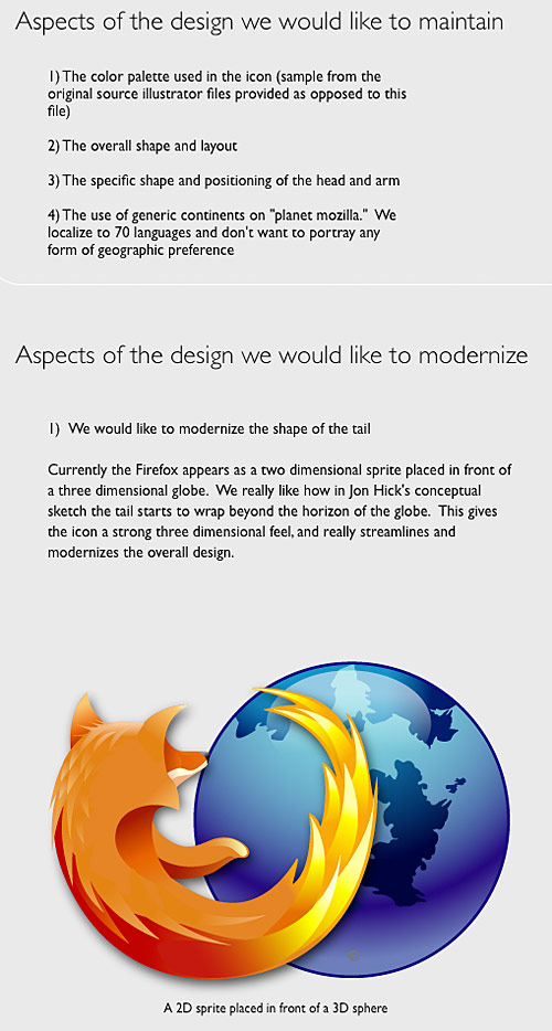
What I find more interesting about the updated Firefox logo is the transparent design process: Faaborg documented the process on his Mozilla blog giving readers updates and a peak into the behind-the-scenes back-and-forth of the process.   On his blog, Faaborg shared the Firefox team’s Creative Brief in preparation of the logo update:

firefox logo creative brief

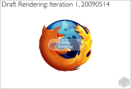
In addition, Faaborg shared several iterations of the design while Piraino worked with the Firefox team to update the logo:

firefox logo draft

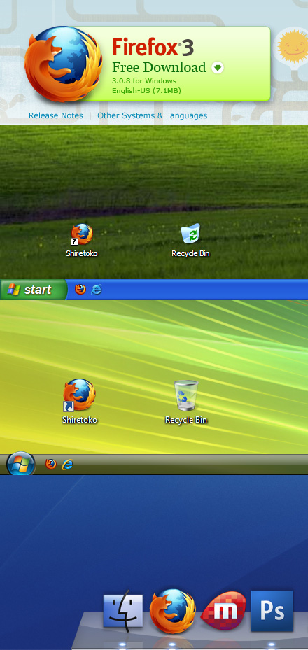
As well as the final iteration in context:

firefox logo in context

Many thanks to Faaborg and the design team for posting these images for all the world to see. Allowing us to see this usually internal process is both enlightening and fascinating.

“He’s Barack Obama”

JibJab does their first Obama video. Cue the hilarity:

http://aka.zero.jibjab.com/client/zero/ClientZero_EmbedViewer.swf

Today’s the Day!

iPhone OS 3.0 is finally here today. Sometime today, that is. I feel like a little kid on Christmas morning whose parents told him he has to wait until after church to open his presents–the presents are there, I know they’re there, but I can’t have them yet. We know the upgrade happens today, but we have to wait until Apple deems us worthy. Ahh! The suspense!

In-N-Out

Zagat has published their 2009 Fast Food survey, and the best fast food burger belongs to In-N-Out Burger.   This comes as no surprise  to me.   I rarely eat fast food in fact, I eat it so infrequently, I might as well say I never eat it.

But there’s just something magical about In-N-Out.   When I was visiting my sister in Arizona this past February, we made sure to grab a burger one night.   Perhaps a good thing for me, In-N-Out Burger only has locations in four states: California, Nevada, Utah, and Arizona.

What makes In-N-Out special is they’re a no-nonsense fast food joint they do three things: burgers, fries, and shakes.   That’s it.   No pretend-healthy food, no chicken or fish.   Just the basics.

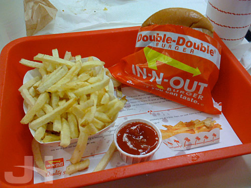
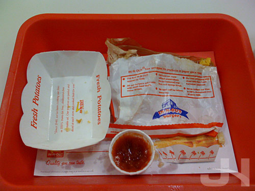
My In-N-Out meal:

in-n-out burger

in-n-out burger

Mmm.   I think I may have to open a franchise on the east coast!

(Nod: Lifehacker)

Giacchino on Giacchino

I’ve been listening to Michael Giacchino’s score for Land of the Lost, and something I noticed on my very first listen was a curious quotation of a motif from another Giacchino score. Subtly included 19 seconds into the second track “The Lighter Side of Archaeology” is one statement of the island motif from the TV show Lost, also scored by Giacchino. Curious. And subtle. But the motif is definitely there. I wonder why.

How’s the rest of the score? More later, but the short answer is if I were making a movie, Giacchino would be scoring it.

There Isn’t an App for That… Yet

MG Siegler at TechCrunch  argued  this weekend for a Genius feature for the iTunes App Store, similar to how the Genius feature for music and movies already works.

The problem is that while early on, it was pretty easy for small-time developers to make an app and get it noticed in the store, now with 50,000 apps, we’re getting to the point where you need to do something else to promote your apps. That’s good news for big time development studios like EA, which can throw marketing money at the problem. But for some smaller developers some of which are just one person that’s simply not an option. But there is one potential solution, and it’s one Apple already has built-in to iTunes: Genius recommendations.

So, like the music and movies Genius feature, the App Store Genius would give recommendations for other apps you might be interested in based on what you have as compared to other similar users.

What a terrific idea, and I find it hard to believe a) Apple hasn’t already thought of this or b) this isn’t in the works already if the Genius feature, originally only for the music store, was recently extended to the movie store.   iPhone and iPod touch  users knowing what other apps they might also like could open an additional stream of revenue, no?   Hard to argue against instating a feature to bring more cash in.

I know I would find this helpful.   I used to subscribe to a couple RSS feeds that listed new apps, but I quickly found I couldn’t keep up with the volume of new apps that came in.   That volume is great for Apple, but bad for users who can’t keep track of the apps and bad for small-time developers who can’t get their apps noticed.

With a Genius feature, more apps will be exposed to more users, resulting in a win for users, a win for developers, and a win for Apple.   Perhaps there’ll soon be an app for that, too.

(Nod: Just Another iPhone Blog)

Prestidigitation

Every morning, I receive dictionary.com’s word of the day in my inbox.   Usually the word is something that I know I’ll never use, and I’m likely to forget the word ten minutes later.   Sometimes, though, the word sticks, either because the definition is either useful or humorous, or because the word is just fun.   Today’s word falls into the latter category because it’s just fun to say: prestidigitation.   The word means the “skill in or performance of tricks; sleight of hand.”   I’ve been repeating this word all day.

An example of part B of the former category (a word with a humorous definition) would be the word of the day from 19 June 2008: defenestrate, which means “to throw out of a window.”   There’s actually a word in the English language for throwing something out of a window.   How terrific.   I now use this word at work when I want to throw my work computer out the window err, defenestrate my computer because it isn’t working properly.   Look out below.

Double Click through the City

Google Maps recently made a huge usability improvement to their Street View technology.   To “drive” along the street, you had to continuously click an arrow that moved them incrementally along the street.   Now, you can double click an area on the street and fly to that location (or even double click on something along the street to zoom in).   A huge usability improvement.

(Nod: Fumin)

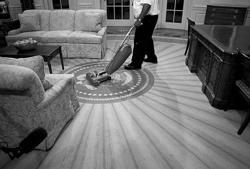
NBC Goes Inside the Obama White House

oval office

If you didn’t get a chance last week to watch NBC’s Brian Williams’s two-part special going inside the Obama White House, you can catch the video online via MSNBC here.   Also while you’re there, be sure to check out the awesome interactive tour of the White House.

(Photo: Antoine Sanfuentes / NBC News)

Up With Easter Eggs

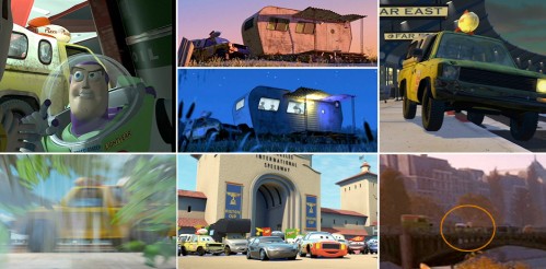
In their latest film Up, the Pixar team continues their tradition of including a healthy dose of easter eggs throughout the film.   Slashfilm has compiled a list of easter eggs in Up, including the ever-present Pizza Planet truck originally from Toy Story.   The truck in past films, clockwise starting top-left: Toy Story, A Bug’s Life, Monsters Inc., Toy Story 2, Ratatouille, Cars, and Finding Nemo (click for larger version):

pizza planet truck in past films

And here’s the truck in Up:

pizza planet truck in up

AT&T Fail

iphone 3gs

As expected, today Apple announced a new iPhone, one that boasts faster operation and data speeds, a built-in compass, voice activation, a 3-megapixel camera with auto focus, and video recording and editing capabilities.

Since the rumor mill was churning out its speculations, I speculated on whether or not I would pony up the cash for a new model even though I purchased myPhone 3G in February.   Based on what I saw on the features list, I’m definitely interested in an upgrade.   For as much as I use the iPhone camera, a better camera with focusing and white balance abilities is a huge plus.   And who doesn’t like a faster device?

But then I heard about the fine print: there is a set of prices for new AT&T customers and a set of prices for existing AT&T iPhone 3G customers.   Those of us already in contracts with the carrier would have to pay $200 more for the particular model of iPhone we would purchase.   The same 16 GB iPhone 3GS that would cost a new customer $199 would cost me $399.

iphone pricing

Any chance of Apple or AT&T getting me to fork over more cash for a new iPhone are nil now.   What percentage of existing iPhone 3G customers does Apple and AT&T expect to pay twice the retail price of the phone to upgrade?   I assume this decision is that of AT&T.   I’m not a business major, but this decision seems like it is slamming the door on a potentially huge stream of additional revenue for both Apple and AT&T if many existing iPhone 3G customers like me are unwilling to pay the doubled price for the new phone.   Instead of forcing us to pay the additional price, which will likely be unlikely for many or most iPhone 3G owners, why not extend our contracts two years from whatever point we are in our contract and allow us to pay the normal price for the phone?   We’re still locked into a contract, but now the contract is even longer, so that’s additional monthly revenue for AT&T, no?

I imagine there will be a significant amount of pushback from iPhone 3G owners.   As a result, perhaps this policy will fall.

Furthermore, what’s with AT&T not offering MMS (multimedia messaging) until late summer and no date for tethering ability?

Those small digs at AT&T from Apple today during the keynote were well deserved.   What a spectacular fail for AT&T today.

Soundtrack Review: Up

up logo

Michael Giacchino is back with his second feature film score of the year, this time composing the score for Disney/Pixar’s latest film Up. Giacchino again soars with his musical accompaniment to the endearing and delightful story of love, loss, companionship, and adventure.

Giacchino’s score for Up marks his third score for a Pixar film, following The Incredibles and Ratatouille. For The Incredibles, Giacchino wrote a super-hero-esque-slash-John-Barry-scoring-James-Bond-sounding score, and for Ratatouille, Giacchino wrote a charming-and-heartfelt-yet-energetic score. Up falls more closely with the mood set in Ratatouille, so if you enjoyed the latter, you’ll likely enjoy the former.

Throughout the score are two prominent themes: Carl’s theme for the Ed-Asner-voiced crotchety old man and Muntz’s theme for the Christopher-Plummer-voiced, old-time explorer/hero character. Carl’s theme is a delightful waltz usually orchestrated very lightly save for a few heroic outbursts. The theme gets generous use in the track “Married Life”:
/swf/audioPlayer2.swf

The theme also gets an energetic rendition in “Memories Can Weigh You Down”:
/swf/audioPlayer2.swf

And an all-out orchestral rendition in “Up with End Credits”:
/swf/audioPlayer2.swf

Muntz’s theme, performed with lyrics in “The Spirit of Adventure,” is, appropriately, more adventurous than Carl’s theme.   The theme:
/swf/audioPlayer2.swf

And the song, which, appropriately, sounds like it was recorded in the 1930s:
/swf/audioPlayer2.swf

In “Walkin’ the House,” we’re given a motif for the adventurers’ walk through the jungle.
/swf/audioPlayer2.swf

The track “Canine Conundrum” is the first to feature the music for Muntz’s dogs. This music is part savage- and Conan-the-Barbarian-sounding, and for some reason is strangely familiar to me. I can’t, though, pinpoint why the music is familiar-sounding; perhaps this is an homage to something else I know?
/swf/audioPlayer2.swf

More comes later in “Seizing the Spirit of Adventure”:
/swf/audioPlayer2.swf

Giacchino supplies listeners with a healthy dose of action material for Up, including “Escape from Muntz Mountain” (with a short muted-trumpet burst of Carl’s theme:
/swf/audioPlayer2.swf

And “The Small Mailman Returns”:
/swf/audioPlayer2.swf

And as is his usual custom, Giacchino treats us to a wonderful end credits suite of the film’s themes and motifs followed by the aforementioned “The Spirit of Adventure.”   Curiously, the track title of the end credits suite follows the naming convention of his two previous Pixar-film scores: melding the title of the film with “credits.”   The end credits track title in The Incredibles was “The Incredits”; in Ratatouille, “End Creditouilles”; and in Up, “Up with End Credits.”   Another naming convention tradition he maintains here is naming a track “<#> <object> Dash.”   In The Incredibles was “100 Mile Dash”; in Ratatouille, “100 Rat Dash”; and in Up, “Three Dog Dash.”   Very nice, Michael, very nice!

Michael Giacchino’s score for Up soars with energy, charm, and fun like his previous Pixar scores. The fun-factor in the music is definitely a reflection of the fun Giacchino must have had composing this decidedly feel-good music. Another terrific score from Michael Giacchino.


4/5

Can’t Resist the Tangy Zip of a Redesign

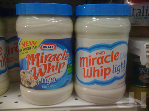
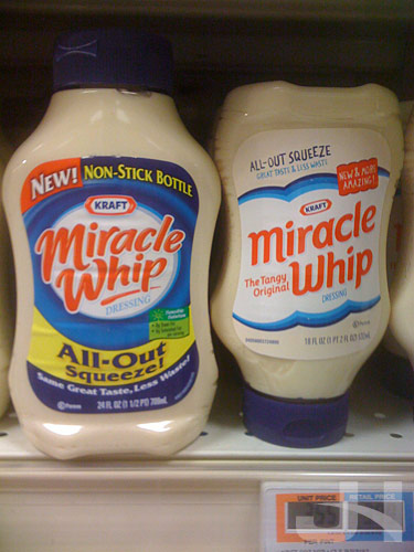
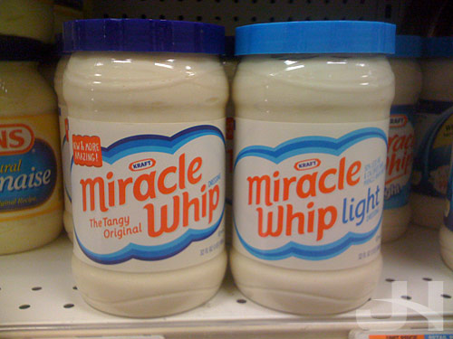
On Brand New last week, I read Kraft is continuing their apparently on-going product redesign campaign (following, so far, Wheat Thins, Toasted Chips, and their shredded cheese line), this time with Miracle Whip.   So while I was at the grocery store, I stopped for a few snaps.   Below, the old logo and packaging on the left, the new on the right:

miracle whip old and new packaging

And the squeeze bottles:

miracle whip old and new packaging

Wow, what a transformation.   All the excessive text and over-designed elements have been jettisoned in favor of simpler, clearer designs and messaging.   Compared to the old design, the new Miracle Whip design has an almost retro feel to it, from the lack of crazy swirls and over-scripted word mark to the sparse background and simplified design elements.   But compared to other recent redesigns, this new packaging follows the trend of less-is-more.

Curious, too, is the treatment of the “NEW!” messaging on the new design versus the old design.   The old packaging has a bold and distracting “new” message, whereas the new design has a “new” message that better coheres with the design as a whole.

Several of these redesigns I’ve wrote about here make a great study in American packaging design.   We’ve become accustomed to the over-designed, compete-for-your-attention mess that is much of American packaging design.   Look at the old Baked! packaging as an example, the old Miracle Whip packaging as another, or many other brands at the grocery store.   This type of design is what we’ve come to expect from package design more is more.   Product packaging attempts to fit every possible bit of information and marketing ploy on them.   Marketers, executives, and designers somewhere, though, realized what a mess the American shopping experience has become and decided to change it.   In a packaging world where each package design tried to out-design the competitor, these new, simpler, and clearer designs come along and say, “Yeah, you have seventeen more typefaces and eighty-three more colors and text bursts than I do, but you all look the same.   Here I am ready to quietly stand out.”   And stand out they do compared to the over-designed chaos at the grocery store.

This new Miracle Whip packaging is another successful redesign from the Kraft Foods family.   What Kraft brand is next?

miracle whip new packaging

Balls to the Wall

A manager in my department at work mentioned I was “balls to the wall” this week.   I knew the phrase meant going all-out, full-throttle, etc., but I was curious about the origin of the phrase.   Did the phrase really have something to do with male anatomy as I thought?   Or was my mind thinking on a high-school level?

Turns out the answer is no to the first question.   According to Slate Explainer,

The expression comes from the world of military aviation. In many planes, control sticks are topped with a ball-shaped grip. One such control is the throttle to get maximum power you push it all the way forward, to the front of the cockpit, or firewall (so-called because it prevents an engine fire from reaching the rest of the plane). Another control is the joystick pushing it forward sends a plane into a dive. So, literally pushing the balls to the (fire)wall would put a plane into a maximum-speed dive, and figuratively going balls to the wall is doing something all-out, with maximum effort. The phrase is essentially the aeronautical equivalent of the automotive “pedal to the metal.”

Interesting bit of trivia.   But about the second question, pilots go balls to the wall in the cockpit.   Turns out the answer is yes.