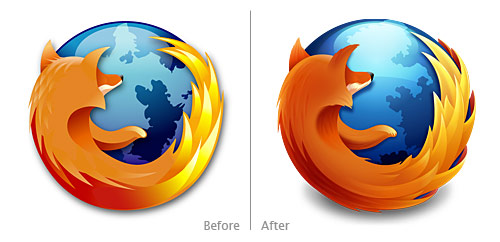
In conjunction with the soon-to-be-released Firefox 3.5, the Firefox logo received an update. From Alex Faaborg, Principle Designer on Firefox:
The updated Firefox icon is based on sketches and conceptual artwork by Jon Hicks and Stephen Horlander. It is also of course an evolution of the previous rendering of the Firefox icon which was created by Jon Hicks, based on a sketch by Stephen DesRoches and the creative direction of Daniel Burka and Steven Garrity.
This new logo was created by Anthony Piraino from the Iconfactory and is a marked improvement to the iconic logo. The old rendering was good, suitable, and memorable. The new logo retains the old logo’s feel and makes definite design improvements, rendering the fox smoother and with enhanced shading. Although not drastically different than the old logo, the new logo doesn’t have to be. The old logo worked; the new one works better.
New Firefox logo:

Old Firefox logo:

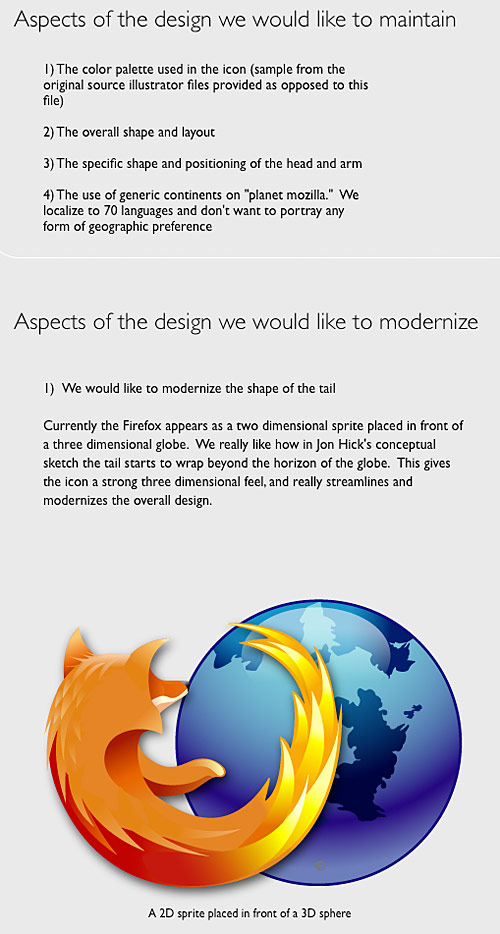
What I find more interesting about the updated Firefox logo is the transparent design process: Faaborg documented the process on his Mozilla blog giving readers updates and a peak into the behind-the-scenes back-and-forth of the process. On his blog, Faaborg shared the Firefox team’s Creative Brief in preparation of the logo update:

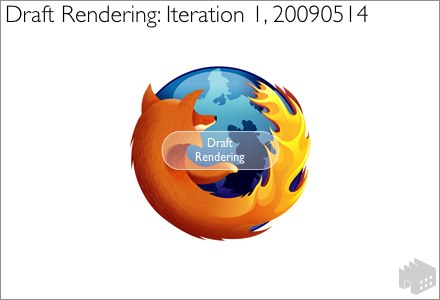
In addition, Faaborg shared several iterations of the design while Piraino worked with the Firefox team to update the logo:

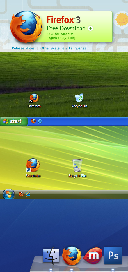
As well as the final iteration in context:

Many thanks to Faaborg and the design team for posting these images for all the world to see. Allowing us to see this usually internal process is both enlightening and fascinating.