I wrote back in April about the then-recently-redesigned Wheat Thins logo and packaging. While I was doing my shopping today, I noticed this new packaging:
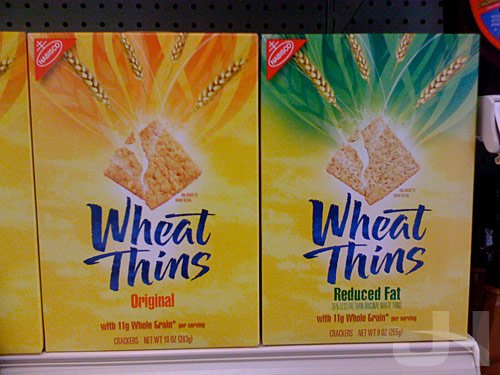
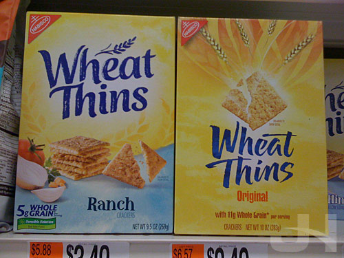
Curious, as they just redesigned their logo and packaging not too long ago. Here’s the now-old packaging on the left with the new-new packaging on the right:
And here’s the then-old and then-new (but now-old) packaging I saw in April:
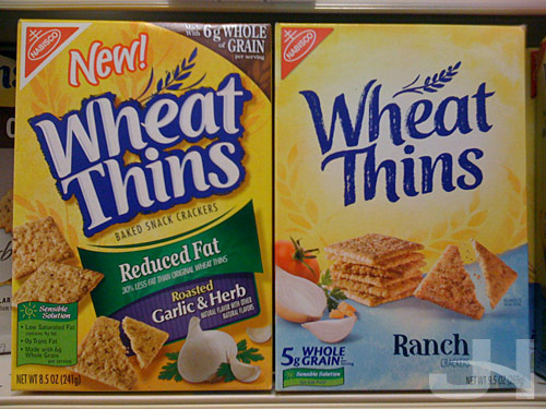
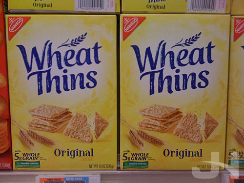
At least at my store, only the original and original reduced fat Wheat Thins have the new-new packaging, but according to the Wheat Thins website, all varieties are being re-branded. As with the last redesign, I couldn’t find any press release or any other information on the redesign.
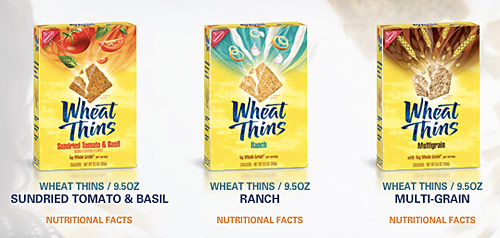
The new logo tosses the wheat icon that survived this year’s earlier redesign, and the text is decidedly more flamboyant than before. Coupled with the logo, the exploding cracker with the various food items bursting from it definitely thrusts the energy level of the packaging to a new level.
So this year’s earlier redesign cleaned-up the logo and packaging, giving the brand a much-needed face-lift. Now this redesign injects a sassy, energetic attitude into the packaging.
I liked the earlier redesign. I like this one even better. Excellent work, but curious why it happened.