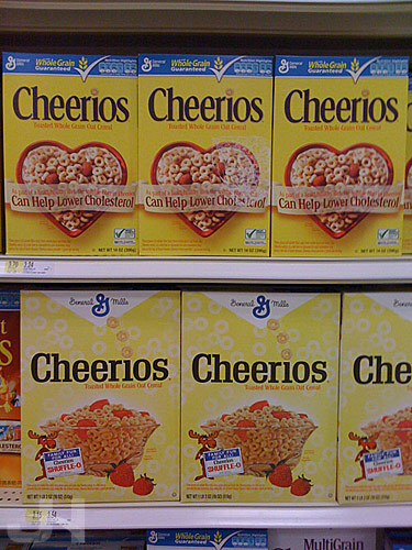
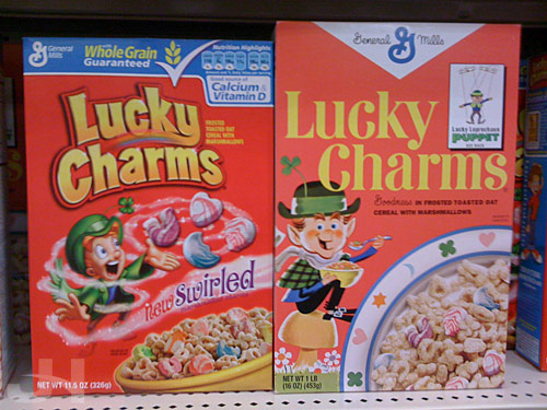
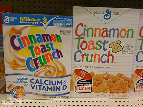
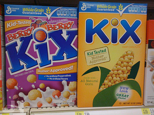
I haven’t posted any branding/packaging images in a while, so here you go. Recently at the grocery store, I discovered a mother lode of new packaging: General Mills cereals. Except for the Kix packaging, the design seems retro, so I wonder if this is a limited-time redesign similar to the Oreo and Ritz redesigns from last summer or if this indeed a temporarily permanent redesign. Either way, these look great. Gone are the Americanized, ADHD-inspired design elements like arced balloon text and swirls within swirls. Instead, we have simple text, simple layer styles, and simple design elements.


More please!