Lost in recent Apple Music discussions is how the usability of navigating on-device music has been unnecessarily over-complicated. Apple’s focus on Apple Music the service has seemingly come at the expense of Apple Music the app.
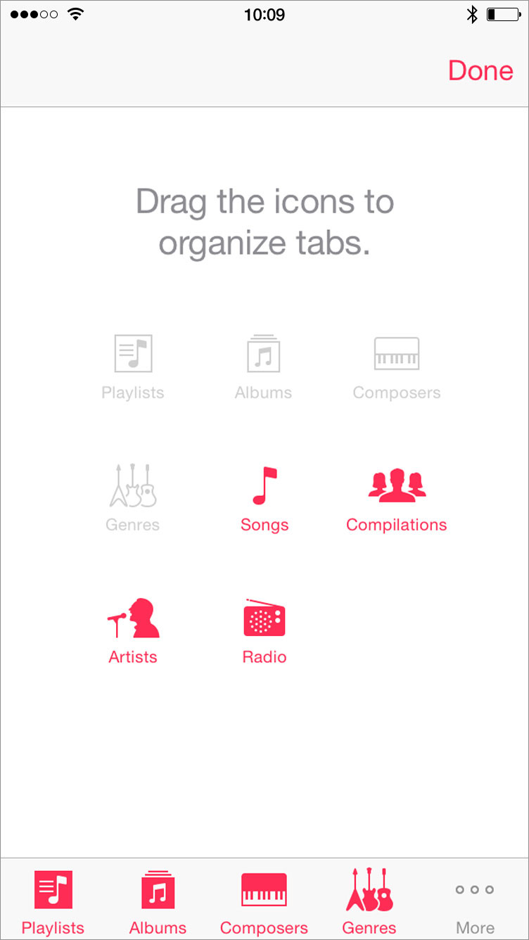
Along with Apple Music the service, iOS 8.4 brought a new organization scheme to Apple Music the app. Previously, the bottom navigational tabs in the app were customizable. I could choose four of Playlists, Albums, Composers, Genres, Songs, Compilations, Artists, and Radio.
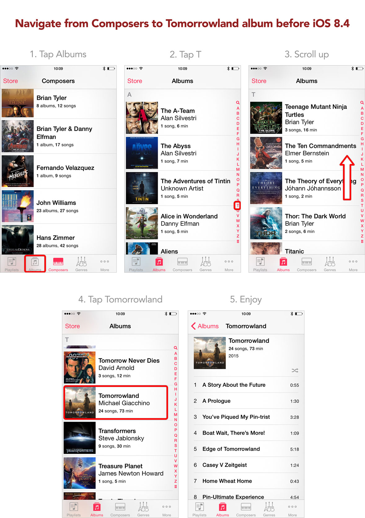
To jump from one list of items to another involved a single tap (provided both were present in the customizable tabs). For example, say I wanted to navigate from my list of composers to a specific album. Let’s say I want to listen to a track on the Tomorrowland score. Before 8.4, I would tap the Albums tab, tap the T in the letter slider along the righthand side, scroll to reveal Tomorrowland, and select the Tomorrowland album. Four steps.
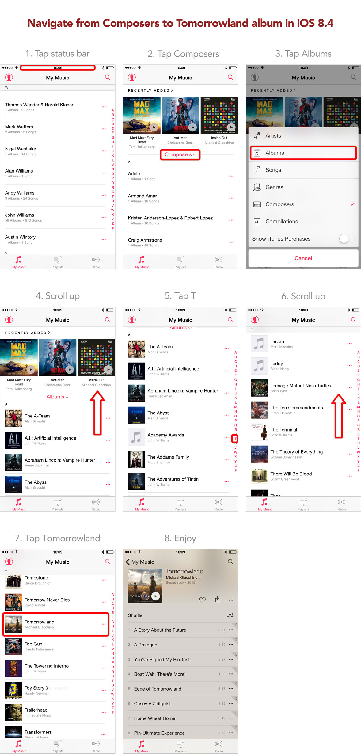
In 8.4, that process has become more complicated. To navigate from composers to Tomorrowland, I tap the status bar to scroll the list of composers to the top, tap the sort button, select Albums, scroll the Recently Added section out of the way, tap the T in the letter slider along the righthand side, scroll to reveal Tomorrowland, and select the Tomorrowland album. Seven steps.
The steps to navigate are nearly doubled. I could search for the album or track I want to listen to, but I shouldn’t have to rely on search to navigate. While Apple Music the service has made streaming favorite artists and albums easier, Apple Music the app has made navigating on-device artists and albums harder.
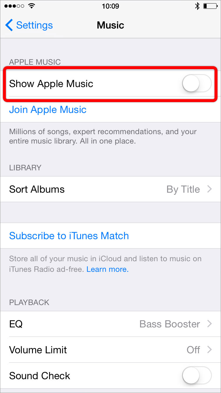
In Settings > Music, if I toggle off “Show Apple Music”, the “New” and “For You” tabs in Music are replaced with a Playlists tab.
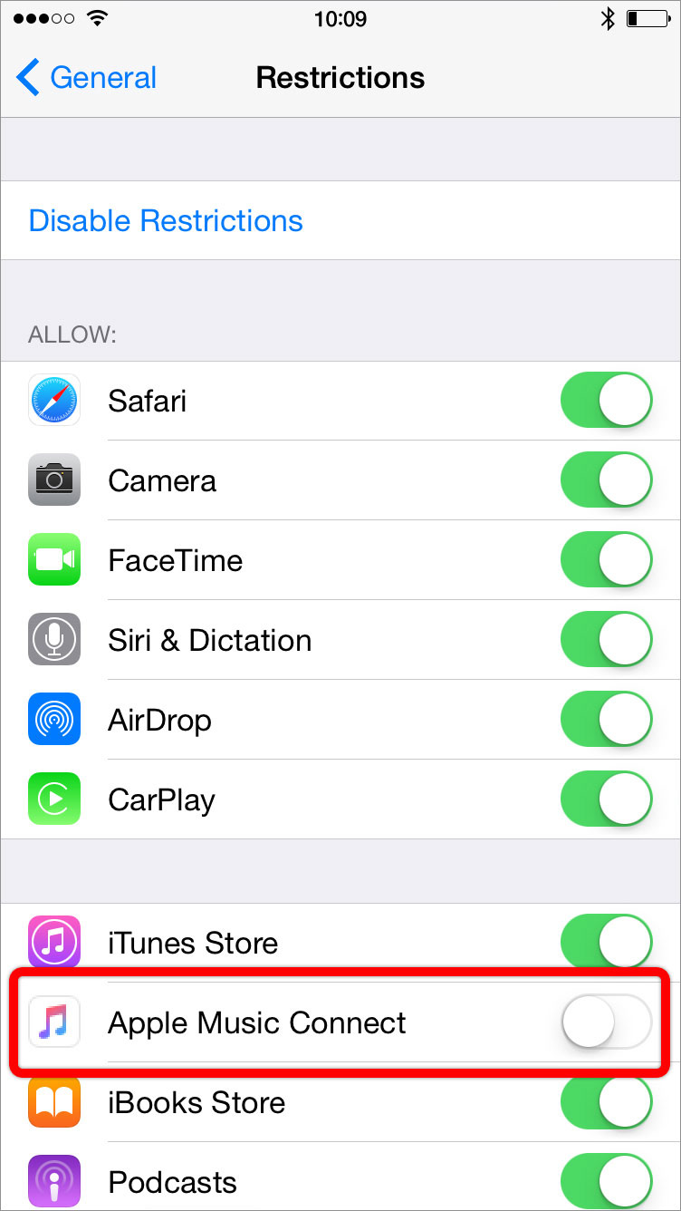
And in Settings > General > Restrictions, if I toggle off “Apple Music Connect”, the Connect tab in Music disappears.
Why make customizing this row of tabs buried and convoluted especially since in the previous version of the app this customization was forefront and simple?
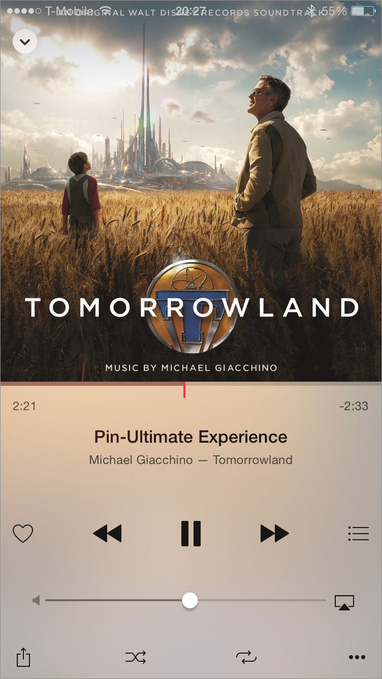
Navigating my music isn’t the only frustrating new thing about Apple Music the app. The Now Playing view features album art positioned flush against the top of the screen. This top-heavy design makes the whole view unbalanced. And the album art’s new position means the status bar covers the art—making for situations were the status bar is illegible.
While the new Apple Music the app has become fraught with usability frustrations, the app does have two new features in particular that are welcomed additions.
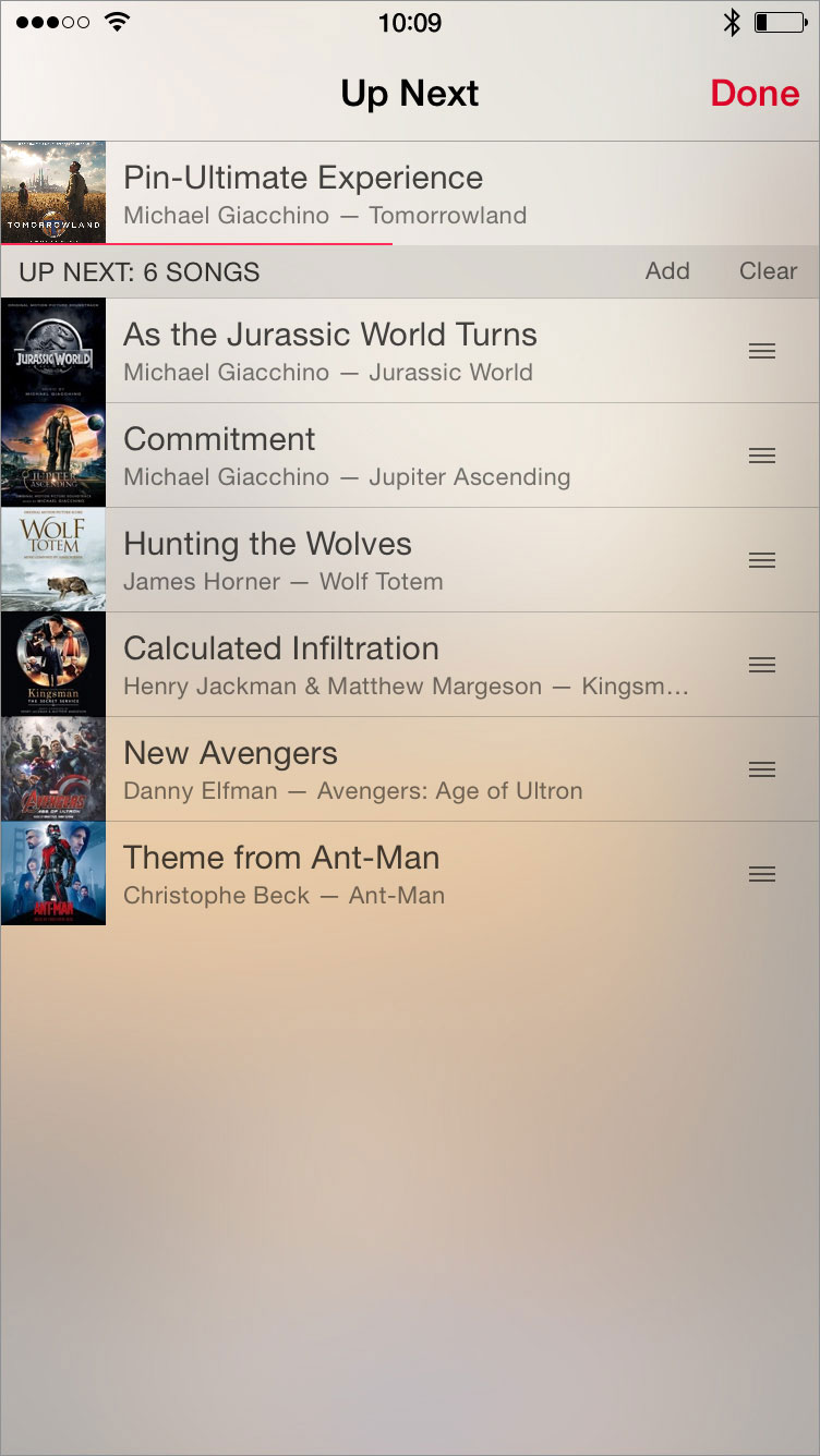
First is the Up Next feature similar to iTunes on the Mac to show all the upcoming tracks to play. This is especially helpful to create an on-the-go playlist that iPods of yesteryear could create. Here, I can reorder, remove, or add tracks to the currently playing list of tracks.
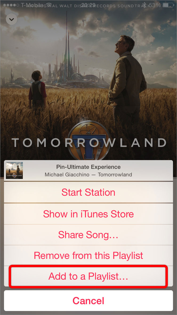
Also of note is the ability to add the currently playing track to a playlist. If I am listening to a particular track and think, “Gee, this would fit really well in X playlist”, I can immediately add the track to said playlist by tapping the ellipsis button and “Add to a Playlist…”. Previously, I would have to browse to the playlist, tap on Edit, tap +, and find the track in the library.
While these two new features are great usability additions to Apple Music the app, they don’t overcome the larger usability frustrations of the redesigned app. These frustrations are enough to have me experimenting with alternative music players. I’m hoping a future version of Apple Music the app restores easy customization of the tabs—and thus also restores the superior usability of the old app.