Multitasking on iPad received an enormous update in iOS 9 in the form of Slide Over and Split View. But however advanced and, well, pretty cool both are, the execution of Slide Over has puzzled me since I first played with it. The list of apps available for multitasking is presented in an excessively roomy fashion—meaning finding the app you’re looking for can be unnecessarily difficult.
Jason Snell wrote this week about a few ways to improve iPad multitasking. After reading the article and finding myself in agreement, I mocked up some ideas last night based on his suggestions. Let’s start.
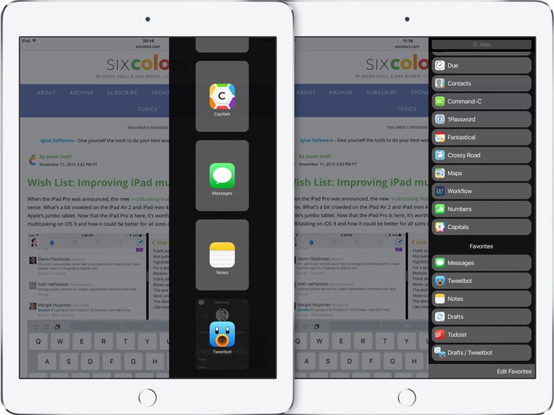
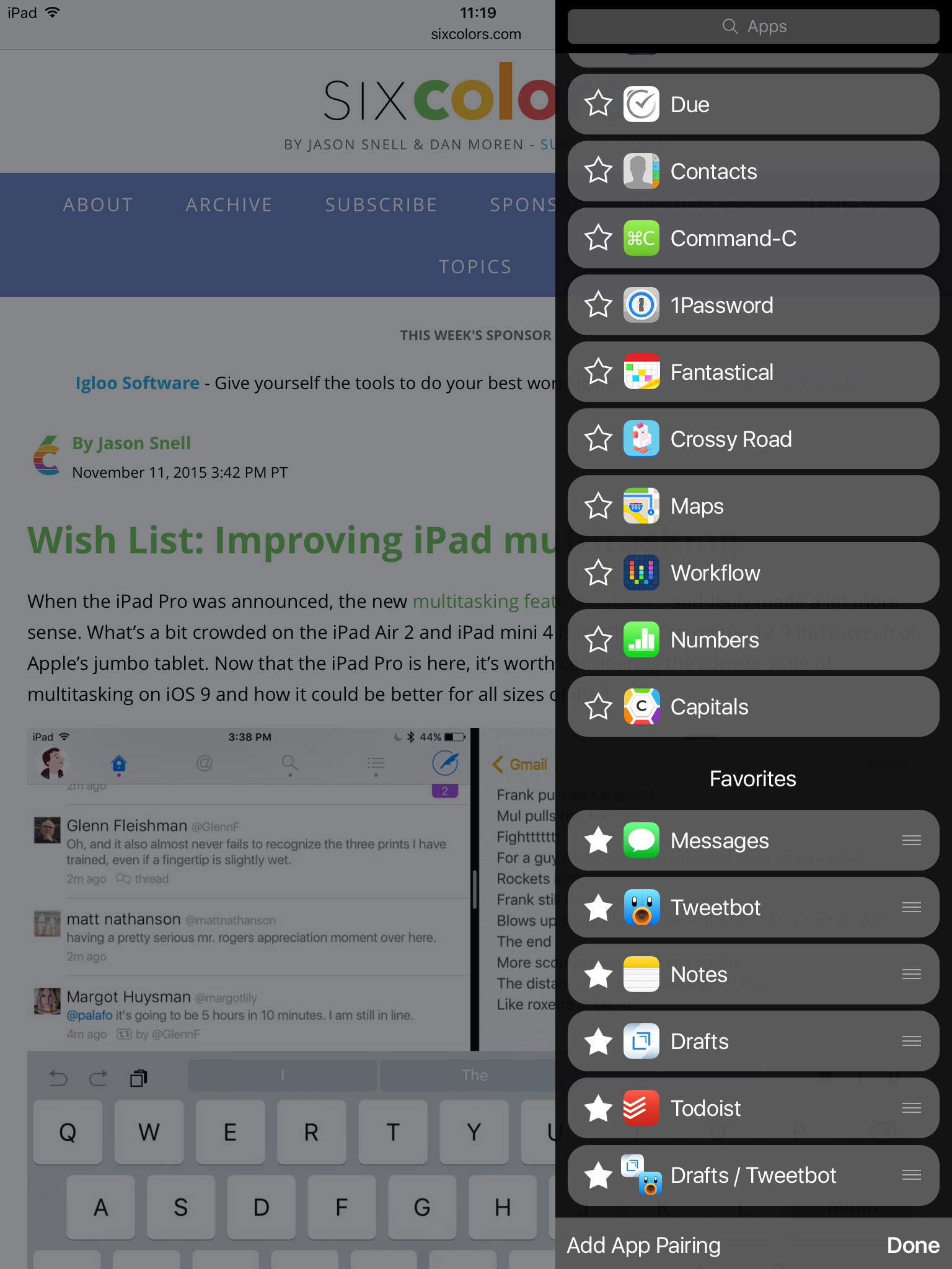
Here’s what Slide Over looks like currently on an iPad mini.
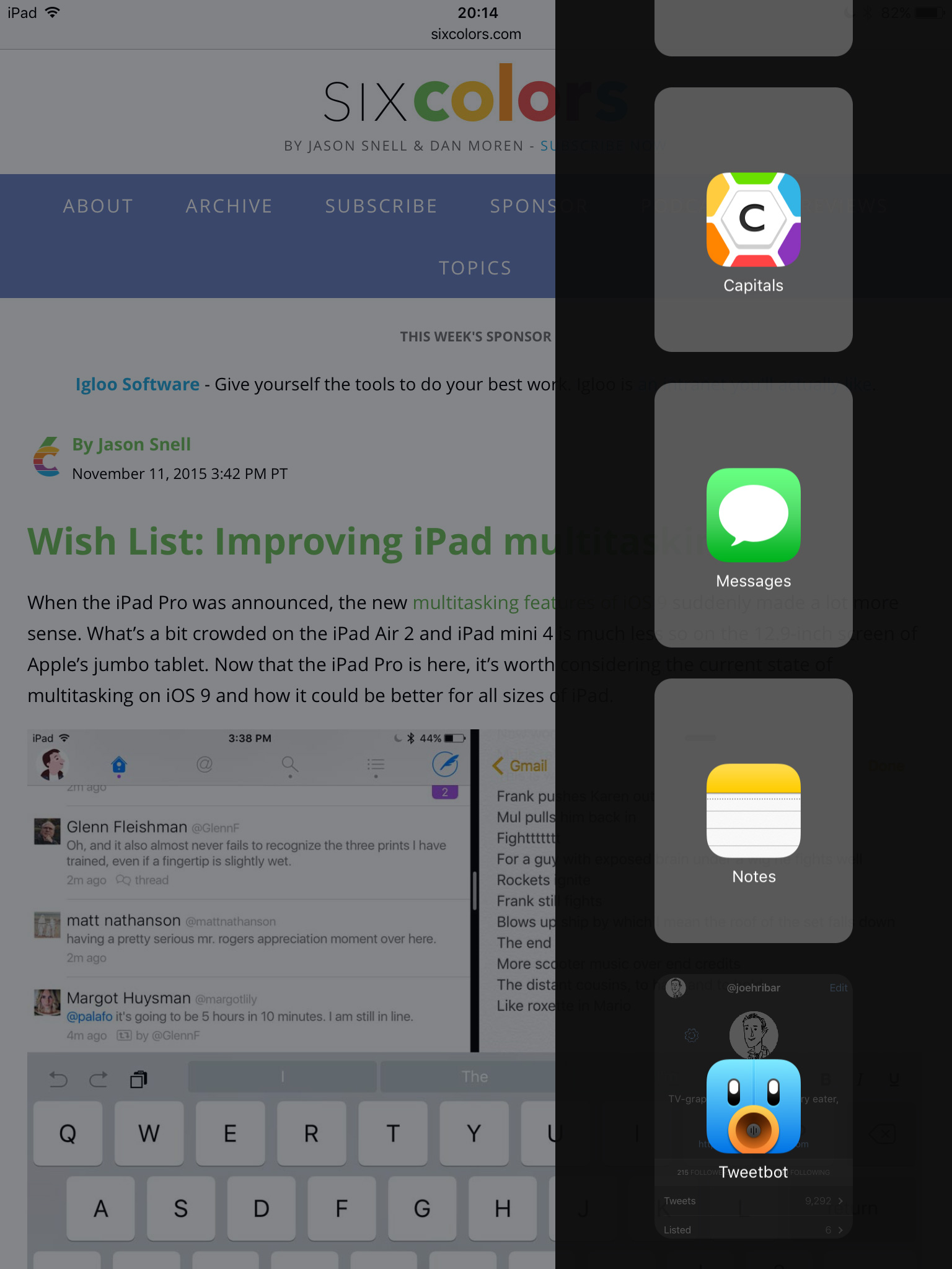
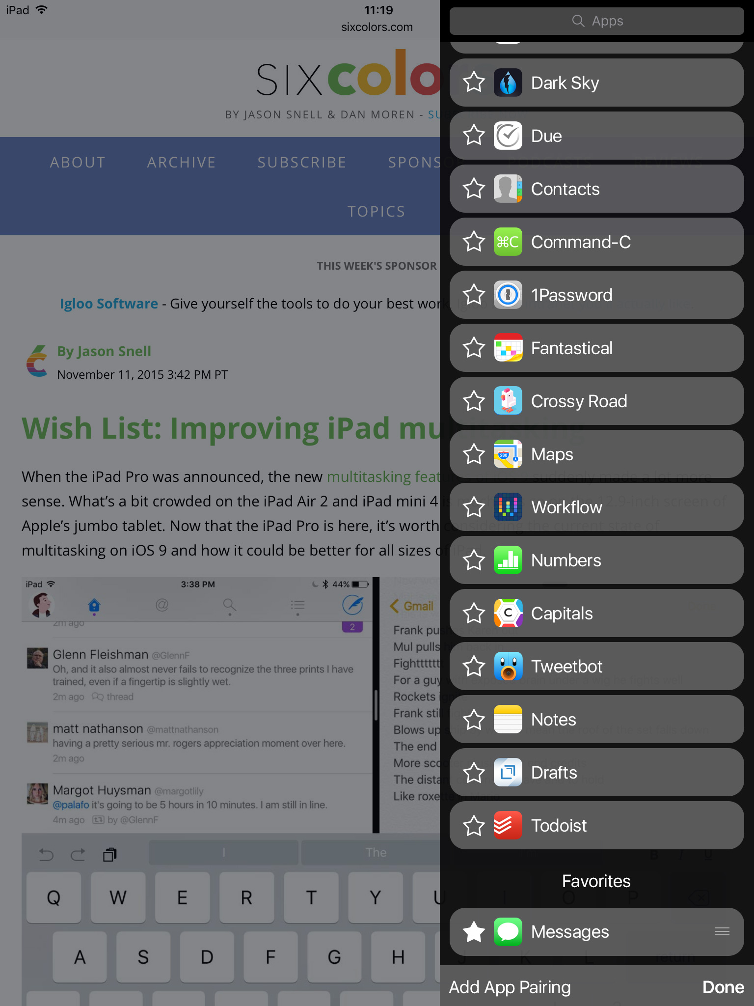
There are four (FOUR!) apps visible in the menu. Finding the app you’re looking for can result in scroll after scroll after scroll.
Jason wrote, “A denser design that presented the app list in a more straightforward manner would be welcome, especially when the list is long.” So what might that look like?
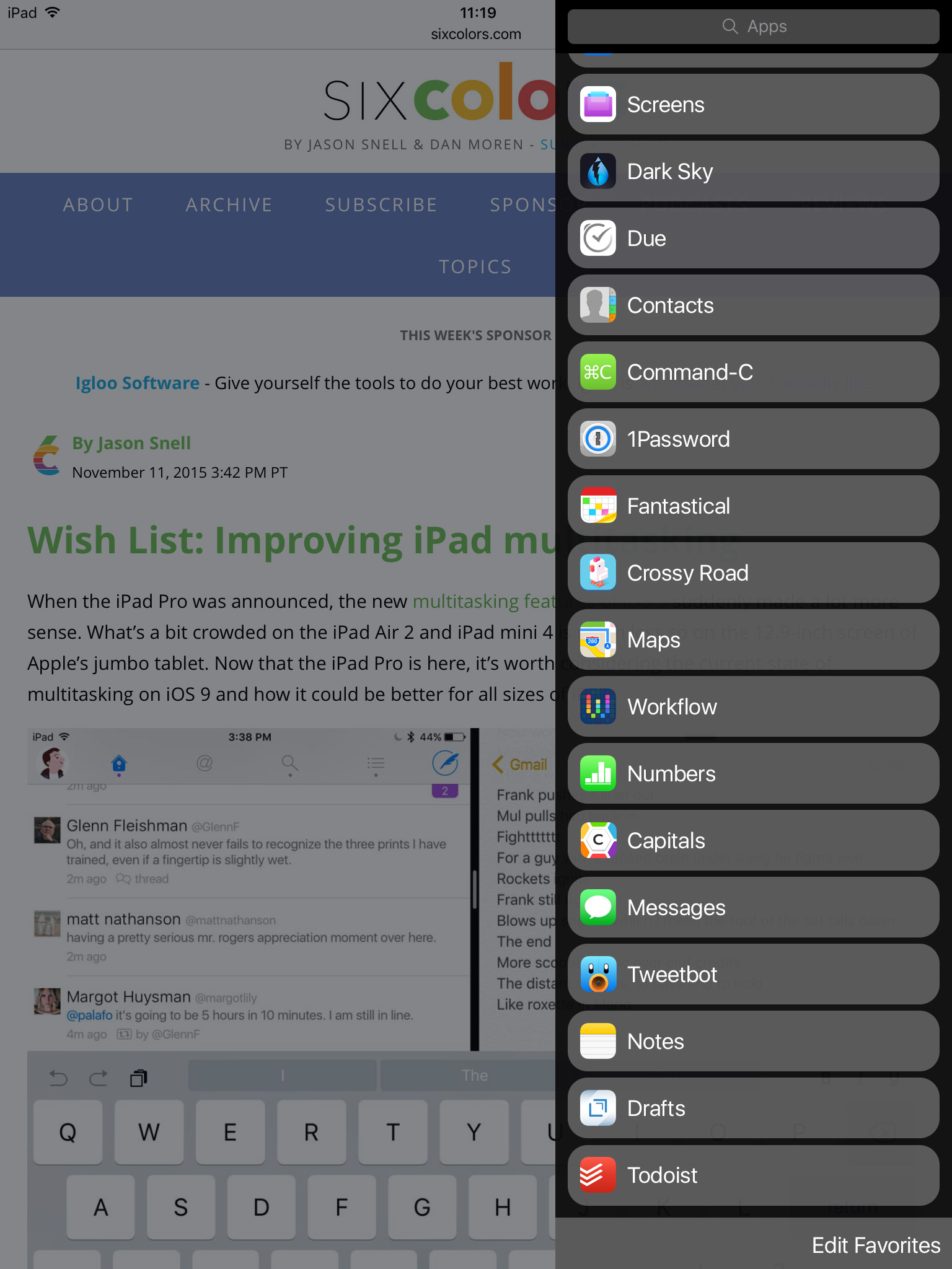
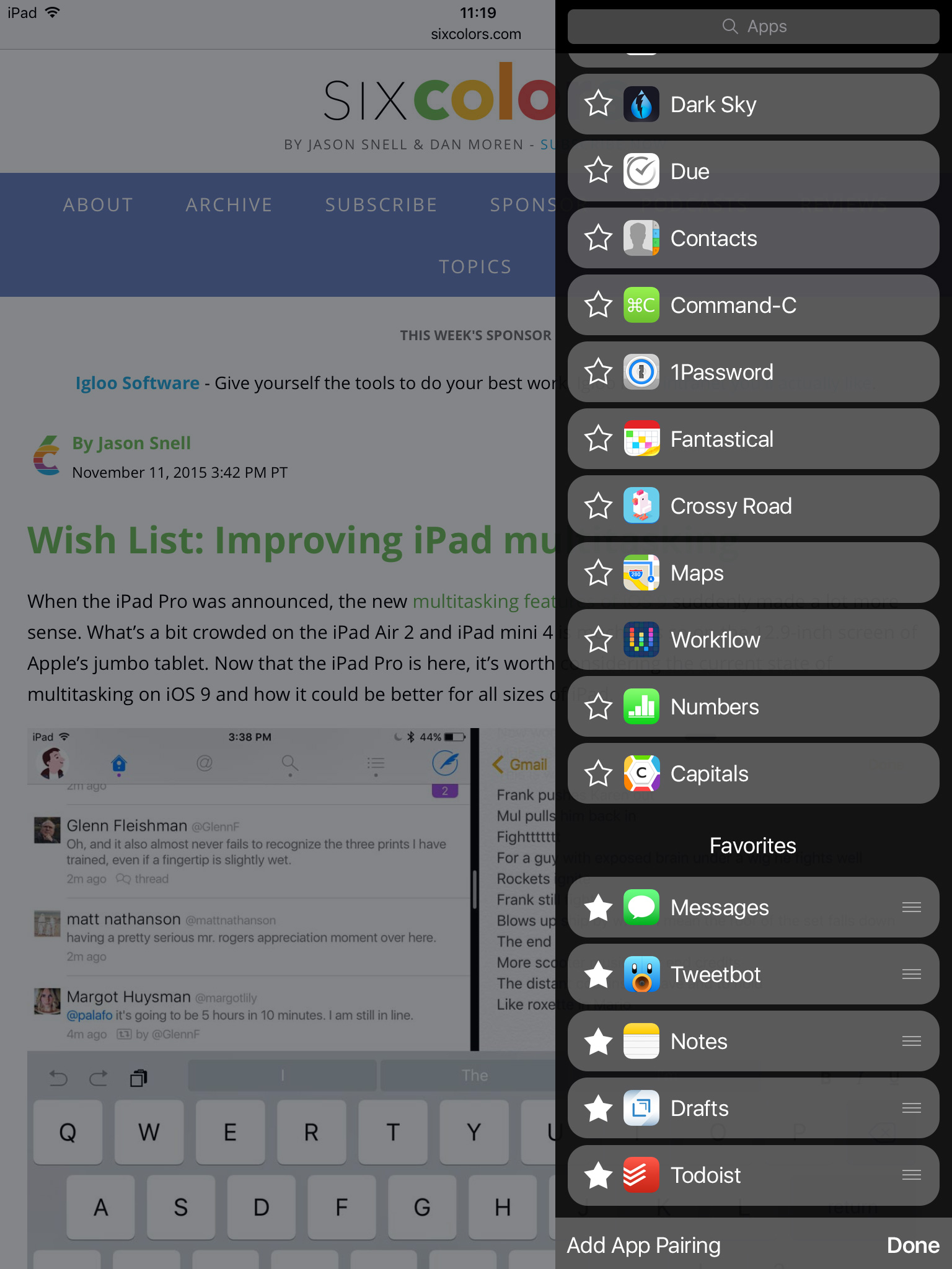
I made the buttons a comparable size to a list view for familiarity, but perhaps they could be a smidge bigger. Also, I’m designing for an iPad mini, and I realize what looks good on the mini might not look good on the pro, so perhaps some dynamic resizing could be in order depending on the device.
I think this is already an improvement. Sure the list is still long (a product of having so many great apps!), but the compact nature reduces the amount of scrolling necessary.
In addition to the “denser design”, there is a search bar at the top. Don’t want to scroll to find the app you’re looking for? Search for it instead.
Also of note is the button shape. I retained the rounded rectangles with the idea of keeping a similar shrink-down animation when closing an app in Slide Over.
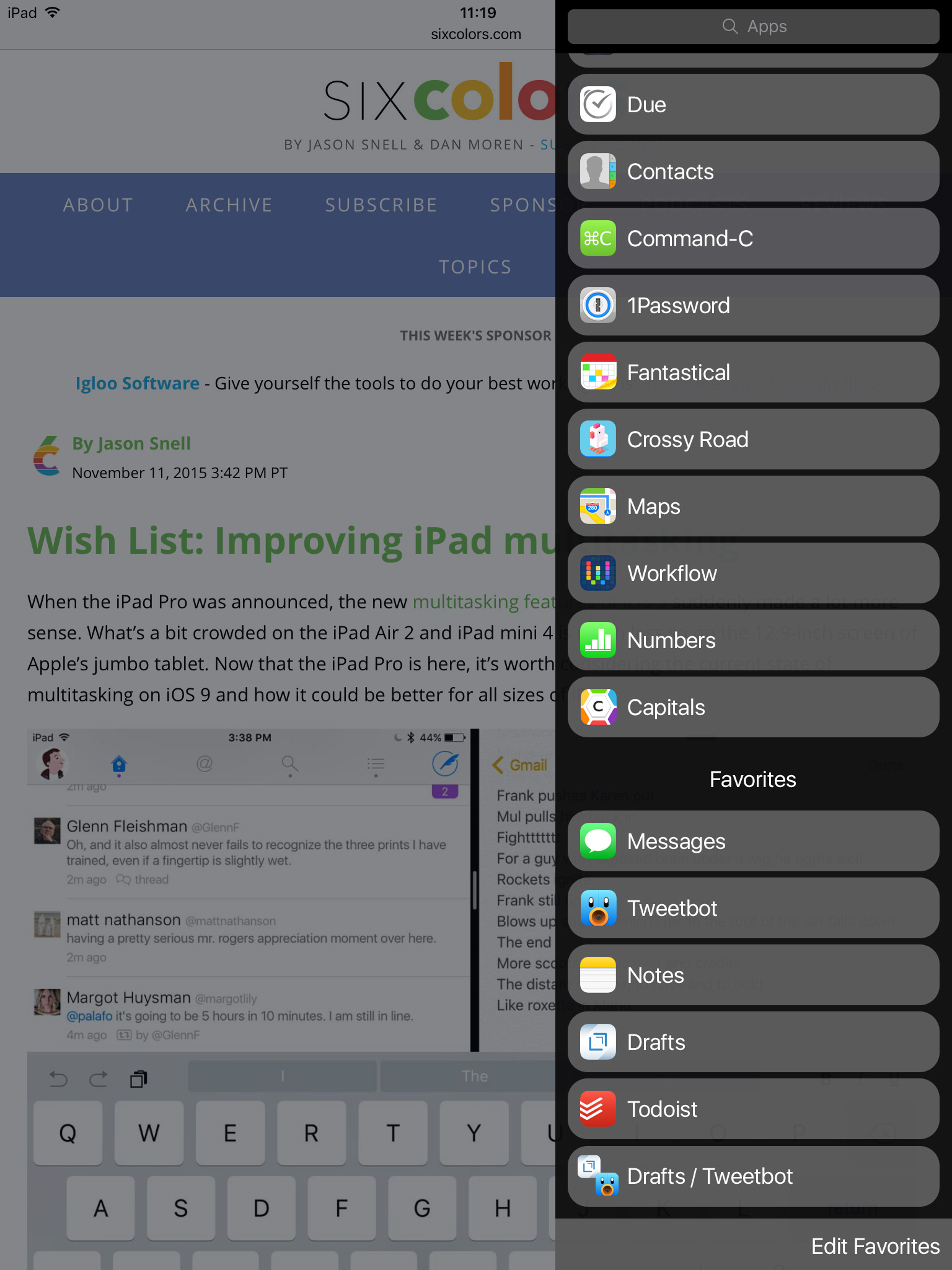
Now that more apps are visible, finding the app you want is easier. But what if there are a few apps you want quick access to in Slide Over. Why not pin them as Jason suggests? Tap “Edit Favorites” to enter edit mode. App icons and names slide over to reveal a star outline.
Tap the star, and the app animates into your favorites list.
(Since Twitter’s favorites and stars have recently found themselves unemployed, I put them to work here.)
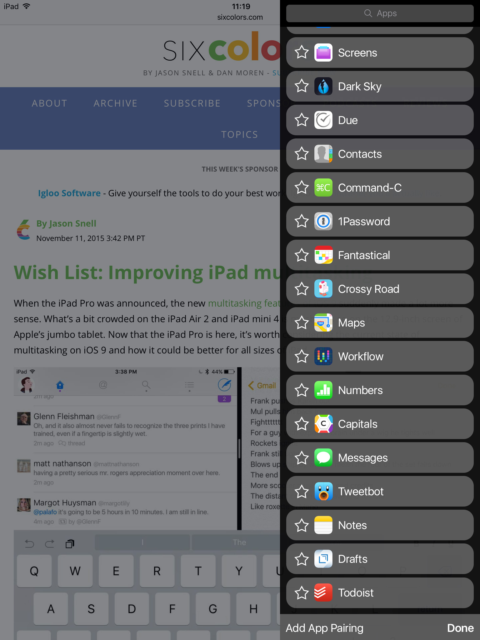
Grips on the right of the buttons give you the ability to reorder your favorites as you see fit. Tapping a star on a favorited app would animate it back to the list of unfavorited apps. Tap “Done” to exit edit mode.
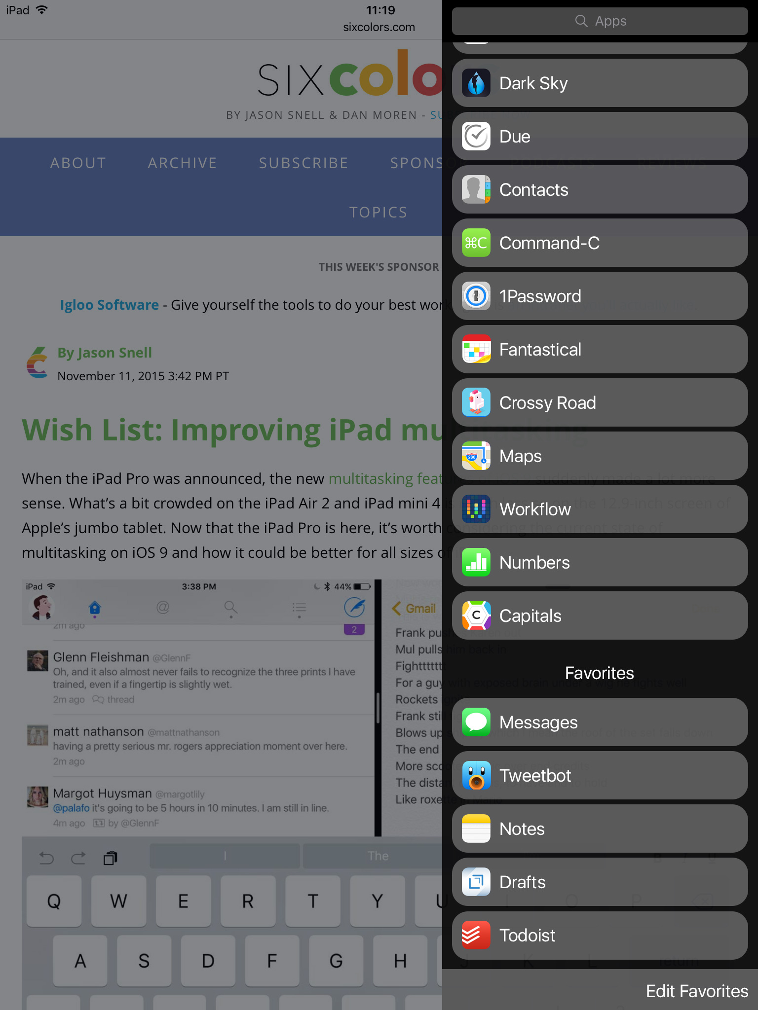
Now we have a more compact design, the ability to search for an app, and the ability to pin apps for quick access.
The final bit of functionality to add is the ability to save app pairings—app buddies as Jason called them. The idea here is to have quick access to two apps you like to use together in Split View. The current system, as he describes, can make getting those two apps together a pain. So how about favoriting an app pairing? In edit mode, tap “Add App Pairing” to open a popup with the list of available multitasking apps.
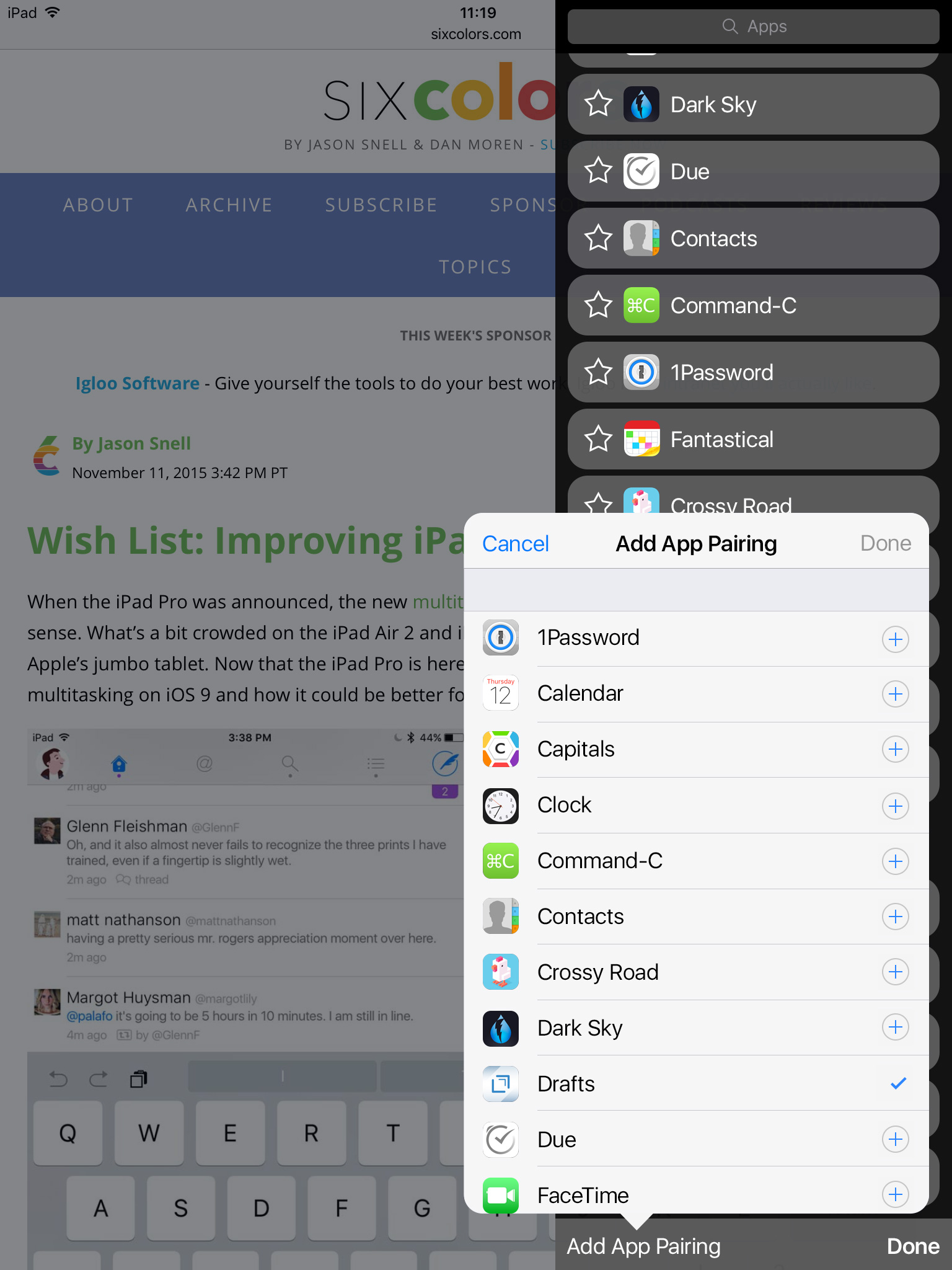
Select two apps, tap “Done”, and Split View will now remember you want those two apps together.
I imagine when selecting a paired favorite from the list, an elegant animation would animate the current app off the screen and the two selected apps into position. And tapping on the star of an app pair would simply delete the pairing.
So there you have it. While iOS 9 introduced great new multitasking tools, selecting apps to multitask with can be a chore. But a few tweaks and some new bits of functionality could go a long way to improving iPad multitasking.