Wheat Thins Thins-Out

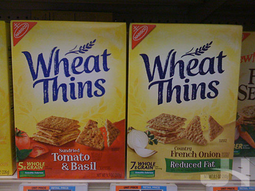
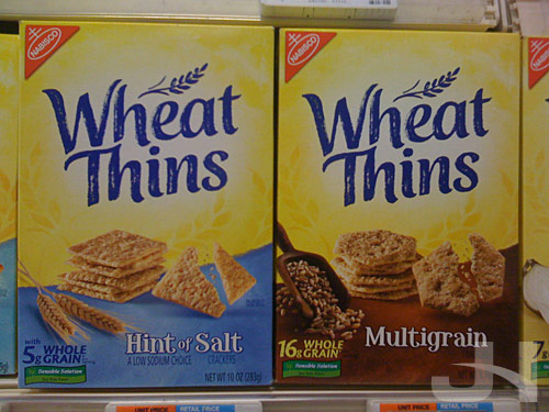
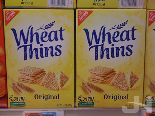
Apparently I missed this packaging and logo redesign when it happened (and I can’t find a press release or other information about it), but the Nabisco brand Wheat Thins is sporting a new logo and packaging design.   I snapped these at the grocery store this morning:

Old packaging on the left, new packaging on the right:

wheat thins packaging old and new

new wheat thins packaging

new wheat thins packaging

new wheat thins packaging

Another brand turning to a simpler, cleaner design, offering American consumers a welcomed break from the over-designed mess that is much of our visual stimuli on our products and our media.

Counting the 2008 Vote

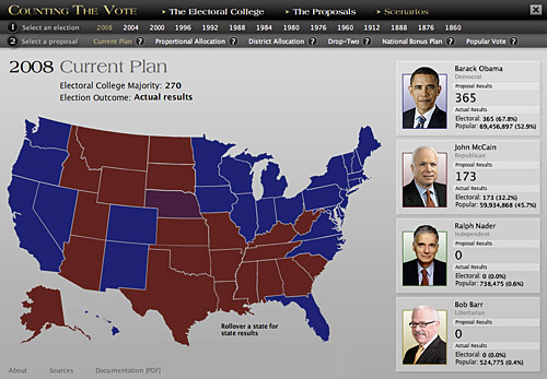
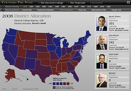
I finished updating my thesis project “Counting the Vote: An Interactive Study of Electoral College Reform” to include the 2008 election.   You can see results by proportional allocation, district allocation, and popular vote.

counting the vote

counting the vote

Generic?

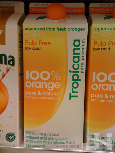
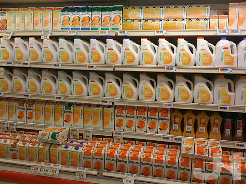
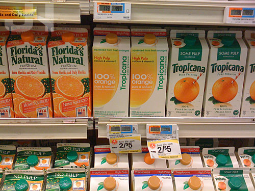
If you’ve been around here long enough, you already know my disappointment with the decision by Tropicana to, what I call, un-design their juice cartons.   I’m very upset at the abandonment in favor of blah design.   Critics charged that the new design was “generic.”   Again, the new design:

tropicana carton

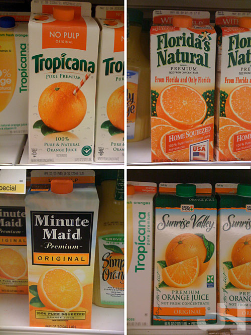
But a quick look at four other carton designs, including the old (new?) Tropicana design, really shows how generic orange juice carton design is:

cartons

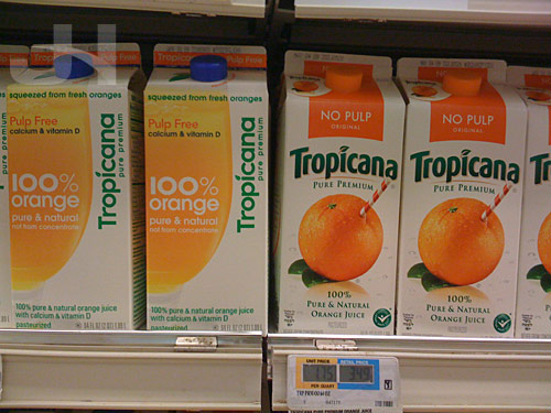
The Tropicana redesign actually made the cartons stand-out more because they didn’t look like every other orange juice carton.   But because the designers went for a simpler and more elegant design and execution, people cried “generic.”   Were the new designs perfect?   No, they weren’t, but instead of simply trashing the designs, why not modify them to placate the masses?   How about a hybrid of the two designs?   Ugh, how frustrating.

tropicana before and after

tropicana cartons

tropicana on the shelf

Microsoft Uber-Coolness

Yes, that’s right, I wrote that.

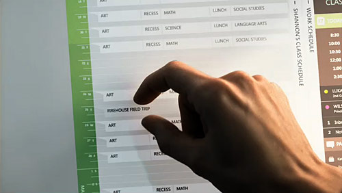
So maybe their operating system sucks.   And their browser, well, yeah, there are no words.   But they are still capable of developing good and interesting ideas.   Working with animation studio Oh, Hello, Microsoft gives us their vision of the future.   And I like it.   A lot.   The interface designs are strikingly simple, the animations sleek and smooth, and the touch-based interactions fantastically envious.

Watch the video here at Oh, Hello.

microsoft_sustainability

(Found on Motionographer.   Nod: Jeremy)

Flavia Adds Some Flavor

At work, we have Flavia coffee machines that make a single cup of coffee. You select the coffee blend you want, stick the packet in the machine, press a couple of buttons, and you get a freshly brewed cup of coffee (I don’t drink coffee, so I can’t vouch for the taste or quality).

The brewing machine (image from Flavia):
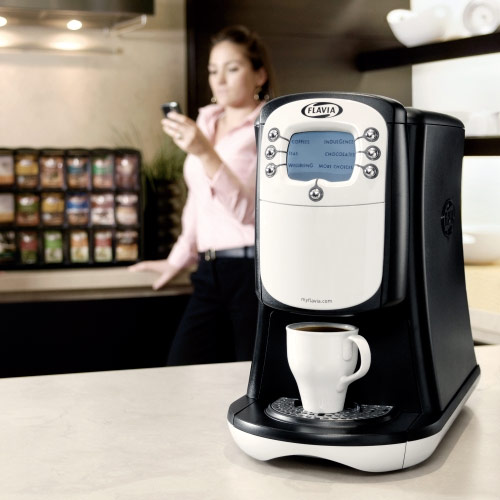
flavia brewer

I noticed this week, Flavia, a division of Mars (the M&Ms and Snickers people), redesigned their logo and their coffee packets. From an October 2008 press release:

After launching almost 25 years ago, Mars ® Drinks is proud to unveil a brand refresh for FLAVIA ®, its groundbreaking linke of single-serve beverage systems. With a new tagline – “Think Fresh” – as well as exciting new packaging, FLAVIA ® will make freshness, choice and convenience center stage to further solidify its role as a leader in workplace beverages.

Mars ® Drinks knows how important fresh, quality beverages are to keep employees’ workdays running smoothly and its FLAVIA’s unique 3-step process, Source. Seal. Serveâ„¢, does just that: ensures each delicious cup is fresh and full of authentic flavor. FLAVIA’s new brand elements showcase this dedication, highlighting the freshness of the beverages each and every time they are served.

“Our new packaging features crisp and modern designs, showcasing the authentic ingredients inside every FLAVIA pack,” said Nick Branden, General Manager, Mars Drinks North America. “We are passionalte about freshness and want our customers to know that only FLAVIA fresh packs are specifically designed to make sure that each beverage tastes as fresh as if it was brewed at the source of origin.”

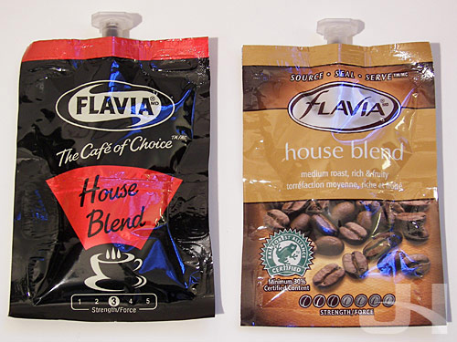
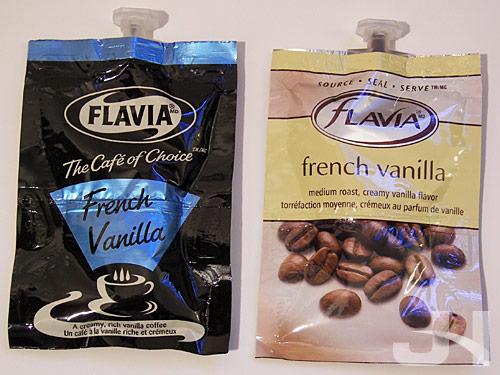
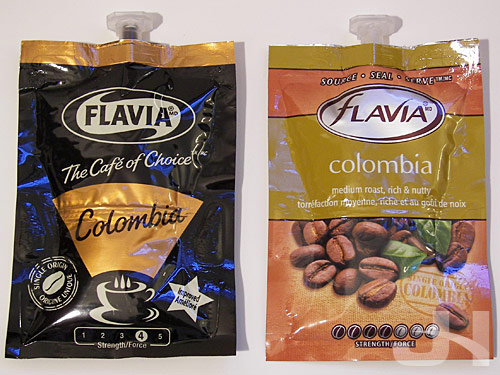
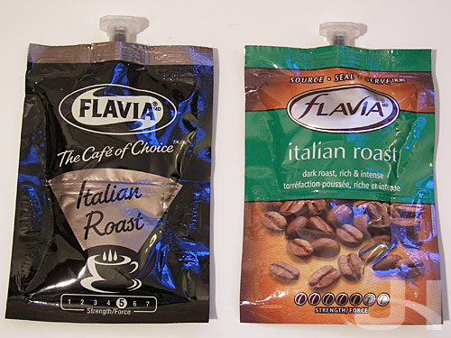
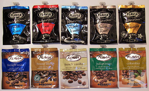
Here are some snaps I took of the old and new coffee packets at work:
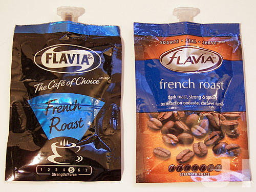
flavia coffee packets

flavia coffee packets

flavia coffee packets

flavia coffee packets

flavia coffee packets

flavia coffee packets

The logo is curious, mostly upper-case with a giant, lower-case ‘f’ at the beginning of the wordmark. The “lavia” characters go well together, even the check-mark-esque ‘v,’ but the ‘f’ seems tacked-on to the more cohesive remainder of the wordmark. Furthermore, the descender of the ‘f’ looks prematurely cut-off by the encasing oval. But with the slightly italicized and less-bold typeface, the new logo is less imposing than the old logo and is simplified by the removal of the wisp-like extensions on the white shape behind the text.

The new packaging is also less imposing and is far more attractive and elegant than the old packaging. Solid black has been replaced with an expanded color range to differentiate the several coffee blends and coffee bean photography that is as attractive as coffee bean photography comes.

For the coffee bean photography, having individual coffee bean photography for each coffee blend would have given the blends and their packaging a little more uniqueness. French roast, house blend, and Italian roast use the same bean photo.

Overall, the new packaging is a success. The product is more attractive and inviting, and the design is still clean and simple, which is always a winner in my book.

Clarify with Clarifi

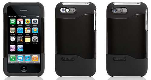
griffin clarifi

(Image from Griffin)

I recently purchased an iPhone case after I decided I didn’t want my iPhone encased. But the selling point on the case I bought wasn’t the case itself; rather, a unique feature of the case sold me. The case I purchased was the Griffin Clarifi, and what is unique about the case is it includes a tiny lens on the back of the case that slides over the camera to improve close-up shots.

Because the iPhone camera doesn’t offer any focus controls (or the camera hardware itself is incapable of changing its focus), close-up shots taken with the camera often are blurry and any text is illegible. Enter Clarifi. From the Griffin website:

Slide the Clarifi lens into place over the built-in lens of your iPhone. Your macro and close-up shots are instantly finer in detail, more accurate in color. With Clarifi’s lens, your iPhone can image an entire business card with astounding clarity. Slide the lens aside for normal photography. WIthout Clarifi, iPhone requires about 18 inches to focus properly. Slide Clarifi’s lens into place and you can move in to 4 inches for crisp detail and great pictures.

The important thing to remember is for non-close-up shots, slide the lens off the camera or your photos will be blurry.

As I said, I bought the case for the lens, but the case itself is solid and sturdy, and it keeps my iPhone from sliding around when I lay it down on a surface and try to type on it.

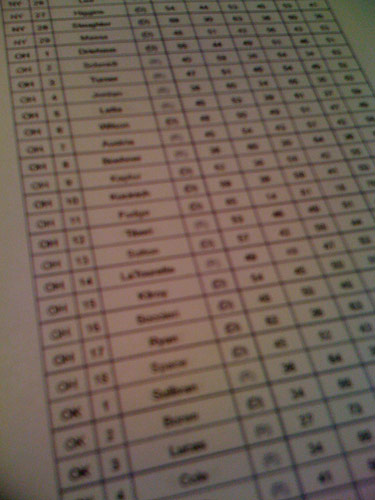
Photo of text without using Clarifi:

without clarifi

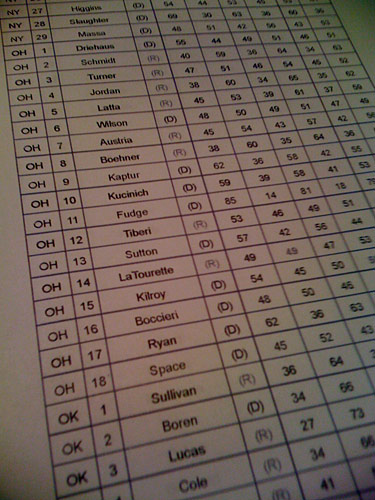
With Clarifi:

with clarifi

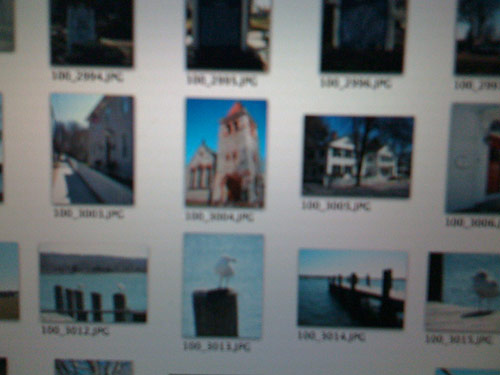
Photo of my computer screen without Clarifi:

without clarifi

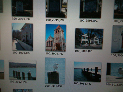
With Clarifi:

with clarifi

The case retails for $35, but I found it on Amazon for $15 plus shipping. If you’re like me and don’t care if your device is in a case or not but are interested in crisper close-up photos, I highly recommend purchasing the Griffin Clarifi case. The clarity of your close-up shots will amaze you.

Lost Podcasts

lost podcasts

Sometime a couple months ago, I started listening to these two Lost podcasts.   For any Lost fans interested in show recaps and talk about Lost theories (like Richard Alpert’s Egyptian connections), I highly suggest checking these two podcasts out, particularly Jay and Jack’s podcast (they have thought-provoking, mind-twisting “crackpot” theories).   Links will open the iTunes podcast feed:

The Lost Podcast with Jay and Jack

The Transmission