Arrr, Facebook Walks the Plank

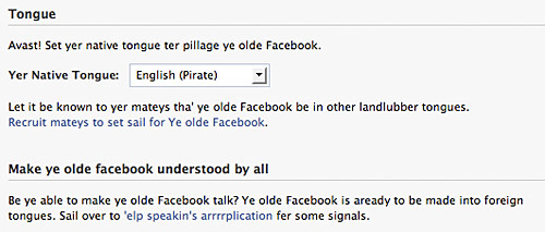
Last night while poking around Facebook, I discovered the Pirate language setting.   Yo ho ho.

The language page in U.S. English:

facebook_3

And in Pirate English:

facebook_4

The normal menu:

facebook_5

The pirate menu:

facebook_6

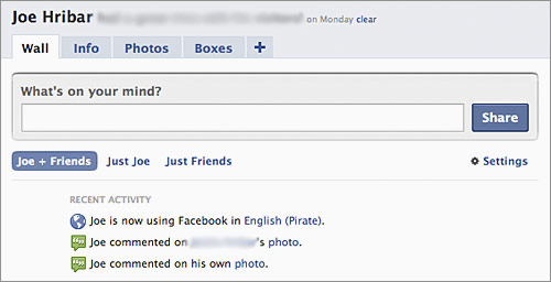
My normal profile:

facebook_1

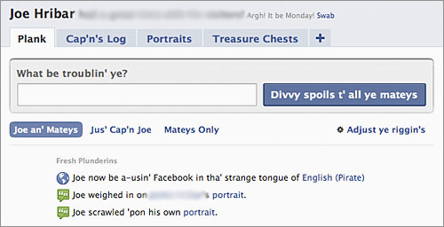
My pirate profile:

facebook_2

Kudos to whomever translated Facebook to pirate.   Amazing!   Drink up me hearties!

MLB Steps Up to the Plate

I saw this Business Insider article linked by The Unofficial Apple Weblog: “MLB Nearing $1 Million In iPhone Revenue.”

[Major League Baseball] tells us it’s sold 130,000 copies of the $10 app so far this year. That translates to about $1.3 million in gross revenue. After Apple’s 30% cut, MLB’s take is about $910,000 so far with five months left in the season.

The app is a bit pricey, but if you’re a baseball fan, the app is definitely worth it. I’m not much of a sports fan (even though I work at the worldwide leader in sports), but I grew up watching, listening to, and attending Cleveland Indians baseball games. After not following the team for the last few years, I decided this year, I would. In order to stay in touch with their games, I decided to invest in the MLB At Bat app (iTunes link) for my iPhone.

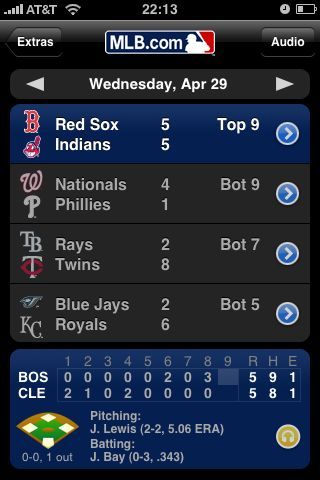
For a baseball fan, this app has a large amount of stats and other information. For instance, you see a lineup of the games being played for any given day.

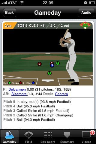
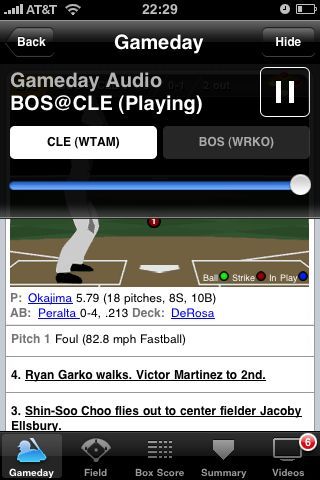
For any in-play game, you can see detailed information about the game, like pitch-by-pitch recaps:

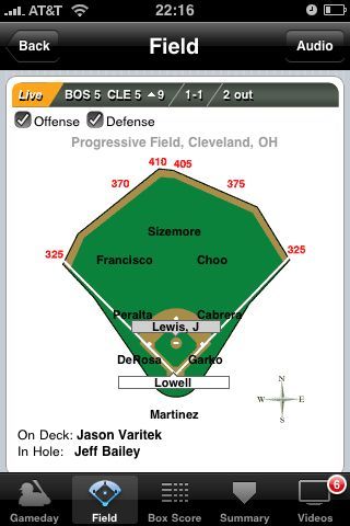
Or on-field lineups:

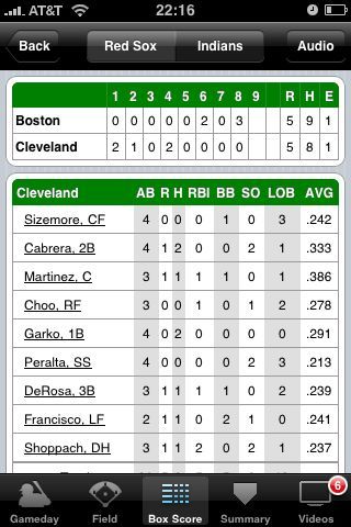
You can also see the box score of the game:

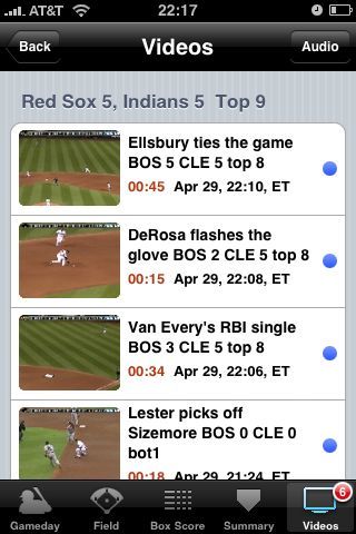
And view video highlights of the game:

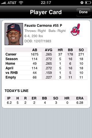
Finally, you can see stats for a particular player:

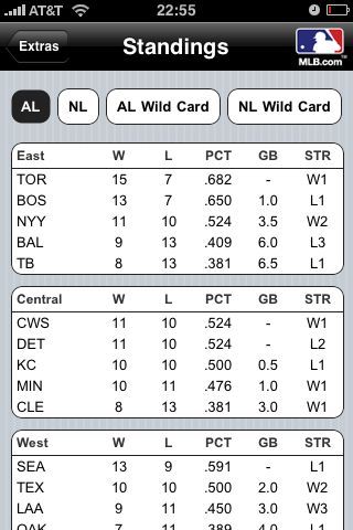
And view standings:

None of these features, however, were the selling point for me. Instead, my selling point was the ability to listen to a live radio broadcast of either the home or away team for any game. When I learned I could listen to Indians radio broadcaster Tom Hamilton via my iPhone, I had to have this app (if you’re from Cleveland and know Tom’s talent for calling a game and his animated excitement on those long fly balls, you’ll understand my nostalgia for listening to him on the radio).

Again, solid app, and definitely worth the purchase if you’re a baseball fan. If you’re like me, though, perhaps being able to listen to your hometown radio broadcaster is worth the purchase. In fact, as I write this, I’m listening to Tom Hamilton call the Red-Sox/Indians game live. Terrific!

“The Lost Symbol”

The title of the upcoming Dan Brown book featuring Robert Langdon.   From The New York Times:

The publisher remained cryptic about the plot or subject of the new novel, but in an author’s FAQ on Mr. Brown’s Web site, he answers the question “What are you working on now?” by saying that the work in progress finds Langdon “embroiled in a mystery on U.S. soil. The new novel explores the hidden history of our nation’s capital.” And on another page on the Web site, he notes that “the next Robert Langdon novel” is “set deep within the oldest fraternity in history … the enigmatic brotherhood of the Masons.”

Masons and the nation’s capital?   Sounds a little like National Treasure.   Still, I will be purchasing this book when it arrives!

And I’ll be seeing this movie when it arrives:

http://movies.apple.com/movies/sony_pictures/angelsanddemons/angelsanddemons-tlr2_h.480.mov

Controlling the NFL Draft

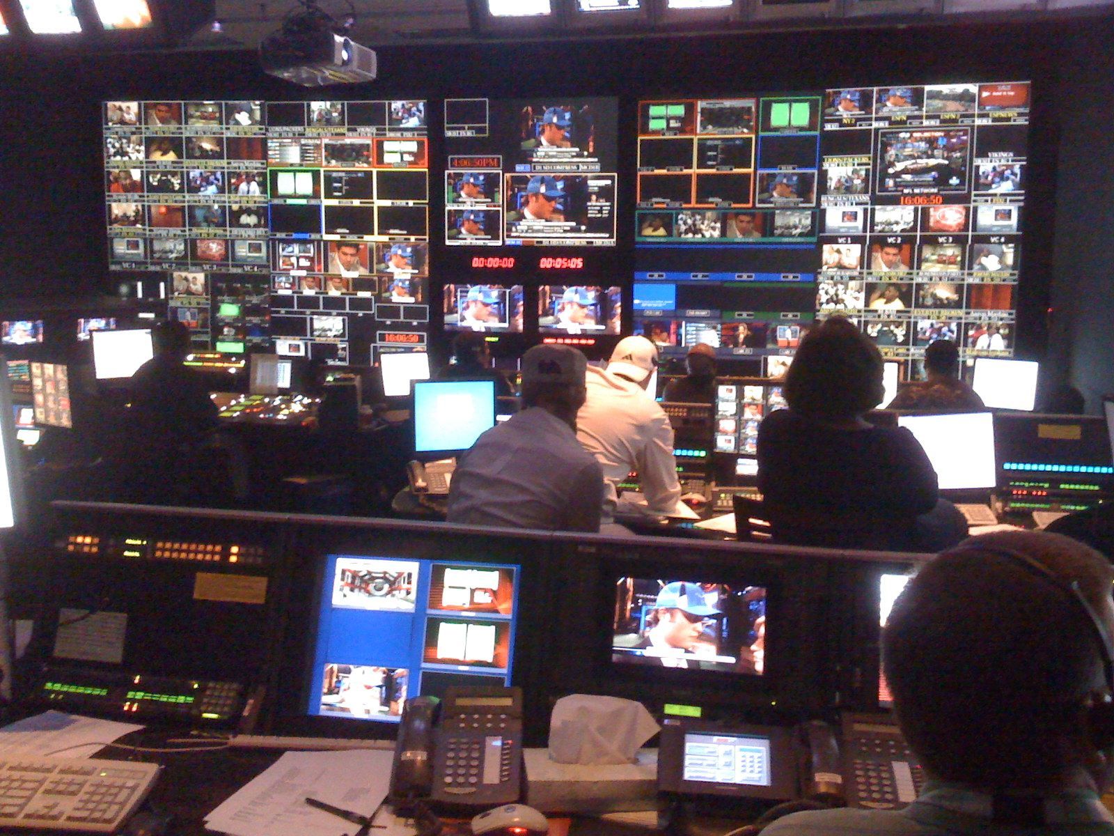
View from inside the NFL Draft control room at ESPN:

nfl draft control room

Barack-etology

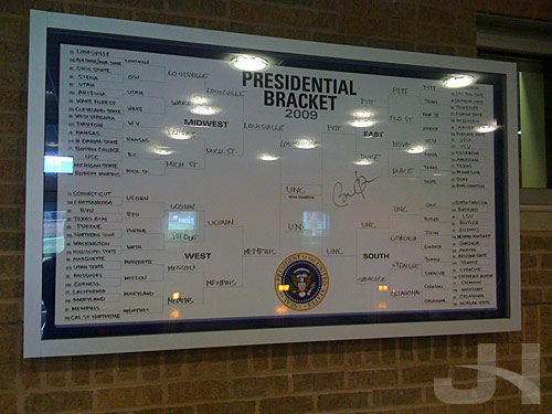
Back in March, SportsCenter aired an on-going segment titled “Barack-etology” that featured President Obama’s bracket for the men’s NCAA basketball tournament.   Here’s the initial segment with Andy Katz and Obama as he filled out his bracket:

http://www.youtube.com/watch?v=8fjHWJJeyBY

That bracket board now has a home in the ESPN cafeteria:

obama bracket

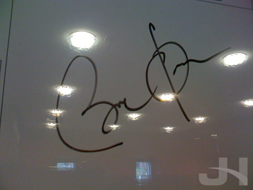
obama signature

Evolution vs. Revolution

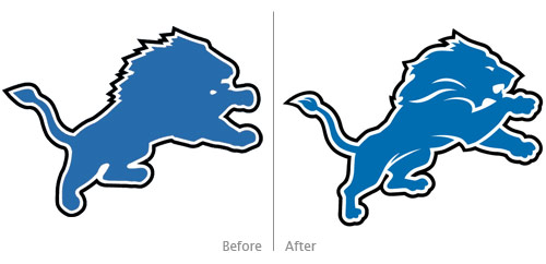
lions before, after

On Monday, the Detroit Lions revealed a “new comprehensive brand” that included a new team logo.   From the press release:

“We will consistently present the Lions as a first-class organization with a clear sense of mission and direction,” [Lions President Tom] Lewand said. “We have made several significant changes this offseason in accordance with that commitment. The introduction of this new brand identity is another element of that process. Today is an exciting and historic day for this franchise.

“The new identity retains many important aspects of our history in terms of our primary mark and our colors. However, the evolution allows us to present our Lions brand and visual identity in new, versatile and distinctive ways. We stand firmly committed to improving the team on the field. That success is always the most determinative factor of any NFL brand.”

The old logo was awful and in desperate need of an update as it sort-of had the shape of a lion, but the head was more of a blob trying to evoke a lion-like animal.   A huge improvement, the new logo is merely an update rather than an overhaul, but it adds much-needed definition throughout the illustration: which legs are in the foreground and which are in the background are clear, the paws have discernible digits, the lion can see now with its new eye, and the lion can now take a bite out of something or someone.

The new logo is a definite improvement, but did it go far enough?   If the aim of the “new comprehensive brand” were to revitalize the team, perhaps an overhaul was needed in the logo instead of these refinements that make the new logo more of an evolutionary change and not a revolutionary change.

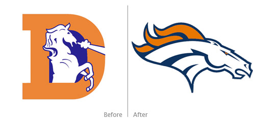
Past revolutionary changes to NFL logos include the Denver Broncos:

broncos before, after

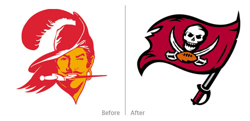
and the Tampa Bay Buccaneers:

buccaneers before, after

The evolutionary refinements to the Lions logo were badly needed, and they help make the logo more successful overall.   I still wonder, though, if a revolutionary overhaul to the Lions’ brand might roar some life and vigor into the struggling team.   A new logo can’t solve all the team’s problems, but the freshness could go a long way as the Lions prey for more success next season.

(Old Lions logo and Broncos and Buccaneers logos from sportslogos.net; new Lions logo from The Wiki)

I Spy Something Red

Kitty likes when the weather is nice and we can open the windows.   She can monitor the wildlife outside:

cat and cardinal

“Nobody Messes With Joe!”

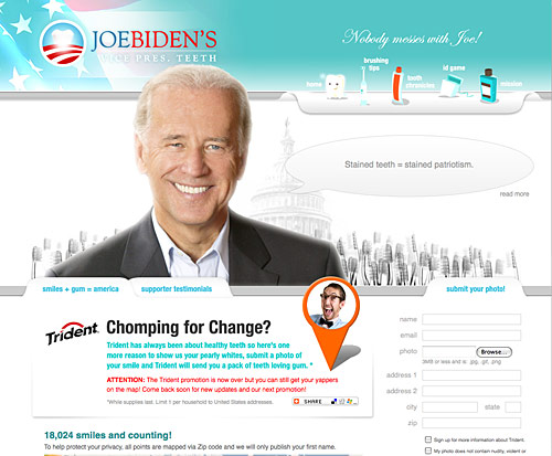
I don’t know where I found this website, but the satire and good-dental-hygiene message is terrific:

joe biden's teeth

I assume Trident gum has something to do with the site as they (for a limited time only) sent people a pack of gum for submitting to the site a photo of a smile.   The site is designed by and the domain registered to Eight Bit Studios.

All around the site are funny (haha) tidbits like this one:

Joe knew Scranton high would not be easy on his teeth. With all the vending machines, cafeteria food and bake sales, high school wasn’t going to get him a plaque on the wall but plaque on his teeth. Joe extended his reach across lunch room tables, shook hands with the cavity ridden and vowed to change America.

And this:

Joe Biden is not affiliated with joebidensteeth.com, but we bet his teeth love it.

Unappeeling Tropicana Cartons

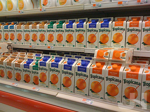
tropicana shelf

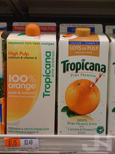
The Tropicana section of the orange juice aisle has been completely taken over by the old carton design.   The only new design left was the orange juice I buy, so I get to hang on to the new design for at least one more week.

tropicana high pulp

Alex Bitterman, a former design professor of mine, sent me an article by David Kiley at BusinessWeek’s Brand New Day blog.   Kiley quotes Advertising Age:

After its package redesign, sales of the Tropicana Pure Premium line plummeted 20% between Jan. 1 and Feb. 22, costing the brand tens of millions of dollars. On Feb. 23, the company announced it would bow to consumer demand and scrap the new packaging, designed by Peter Arnell. It had been on the market less than two months.

Now that the numbers are out, it’s clear why PepsiCo’s Tropicana moved as fast as it did. According to Information Resources Inc., unit sales dropped 20%, while dollar sales decreased 19%, or roughly $33 million, to $137 million between Jan. 1 and Feb. 22. Moreover, several of Tropicana’s competitors appear to have benefited from the misstep, notably Minute Maid, Florida’s Natural and Tree Ripe. Varieties within each of those brands posted double-digit unit sales increases during the period. Private-label products also saw an increase during the period, in keeping with broader trends in the food and beverage space.

Wow, Tropicana lost $33 million in sales by redesigning their cartons.   I guess I would be hard-pressed to argue for keeping the redesigned cartons, too.   Yikes.   I think I may have been one of only two people who actually switched to Tropicana because of the new designs.   But I certainly didn’t buy $33 million worth of orange juice to make up the difference.

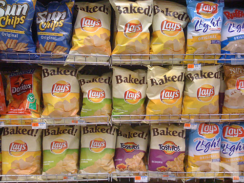
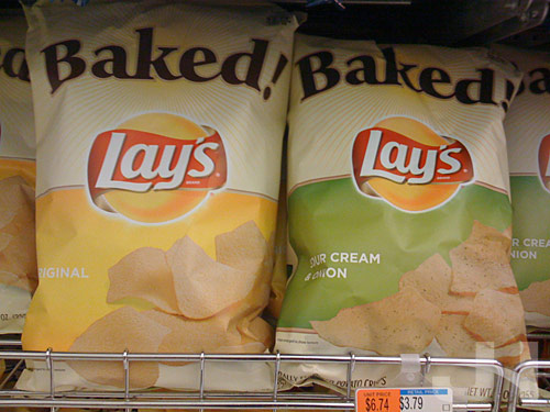
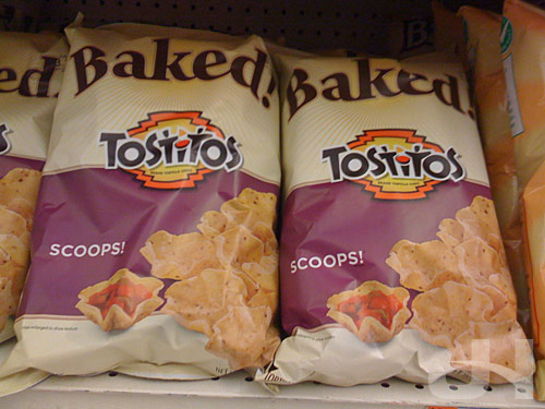
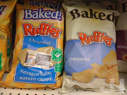
More Baked! Snaps

new baked packaging

new baked lays packaging

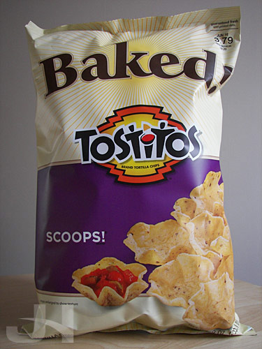
new baked tostitos packaging

old, new baked ruffles packaging

Angels & Demons & Hans

Oh my indeed!   Cinema Musica has posted snippets of Hans Zimmer’s upcoming score to Angels & Demons.   Sounds like Zimmer has expanded the use of his motif heard in “Chevaliers de Sangreal” from The Da Vinci Code.   And that makes me a happy listener.

Practice What I Preach Blog?

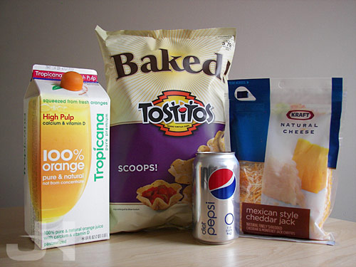
I’ve done much commentary on packaging redesign lately, but this past weekend I used several of the products I’ve blogged about. My happy family of packaging (taken with an actual camera and not my iPhone like my grocery store product shots):

redesigned packages

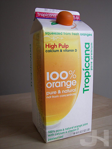
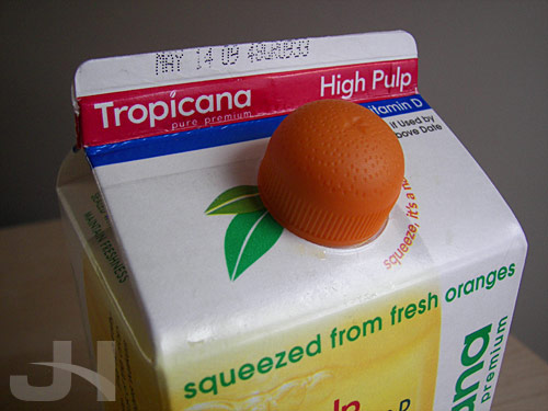
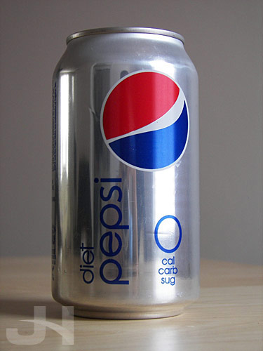
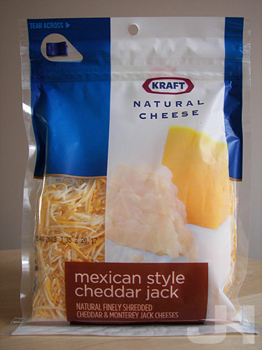
How did I acquire these packages you ask (ok, you probably didn’t ask that, but I’m going to tell you anyway)? Since the launch of the then-new Tropicana packaging, I’ve purchased Tropicana orange juice, so I always have a carton in my refrigerator. A coworker of mine drinks Diet Pepsi, and at lunch one day, I commented how much I liked the Pepsi rebrand and specifically the Diet Pepsi can, so he brought me a can. Finally, this past weekend, I made a taco dip. The dip is topped-off with shredded cheese, and I needed nacho chips for dipping, so naturally I decided to buy Kraft shredded cheese and Baked! Tostitos because of their new packaging.

So if the aim of the packaging redesign was to get casual shoppers like me drawn to the products, I suppose the redesigns succeeded.

Shots of the individual packages:

redesigned tropicana carton

closeup of redesigned tropicana carton

redesigned diet pepsi can

redesigned kraft shredded cheese package

redesigned baked! package

Hooyah!

pirate lifeboat

(Above: the lifeboat in which the Somali pirates held Captain Phillips.   Image source: U.S. Navy)

I was in awe yesterday at the news of the rescue of Captain Richard Phillips by U.S. Navy SEAL snipers off the coast of Somalia.   At work, a coworker and I discussed how this story could have been from a Hollywood film or a war-themed video game: pirates commandeer a ship, take the captain hostage, hold him for ransom, SEALs parachute in, and under the cover of darkness and on choppy seas, snipe the three pirates and rescue the captain.   Amazing.   Both the USS Bainbridge where the SEALs were shooting from and the pirates’ lifeboat were undulating in the water.   The SEALs had to shoot from a moving target at a moving target into an enclosed lifeboat.

From The New York Times:

The hard part was not the distance, 75 feet, an easy range for an experienced sniper. Far more difficult were all the moving parts: the bobbing lifeboat, the rolling ship, hitting three targets simultaneously in darkness and all without harming the hostage, Capt. Richard Phillips.

That was the consensus on Monday from former members of the Navy Seals who said they were impressed by the skills of three Seal snipers who aimed from the fantail of the destroyer Bainbridge and picked off three Somali pirates holding Captain Phillips in a small lifeboat that was being towed about 75 feet behind the destroyer.

Incredible.   Of course, though, larger questions loom:

Despite the operational precision of the rescue, however, the question of how to deal with the broader issue of piracy still looms large, with 111 incidents reported last year on the east coast of Somalia and the Gulf of Aden, according to the International Chamer [sic] of Commerce.

“Is there a way to deal with this in a systemic way that reduces the risk and brings the international community together in a productive way to deal with the problem?” [Secretary of Defense Robert] Gates said. “I think we’re going to end up spending a fair amount of time on this in the administration, seeing if there is a way to try and mitigate this problem of piracy.”

But for now, we can all say with the SEALs, “Hooyah!”

More Kraft Packaging Gets Shredded

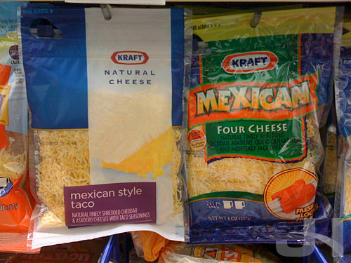
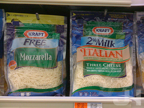
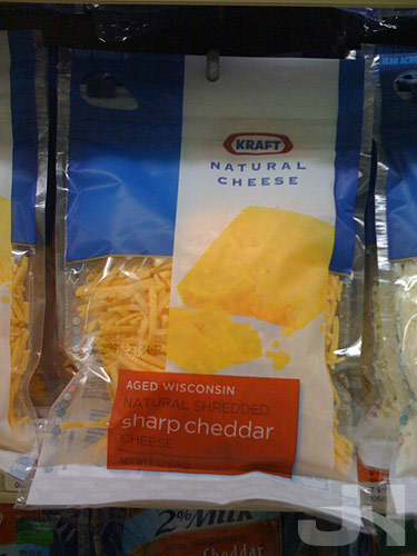
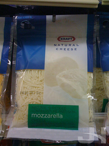
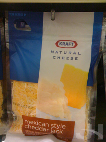
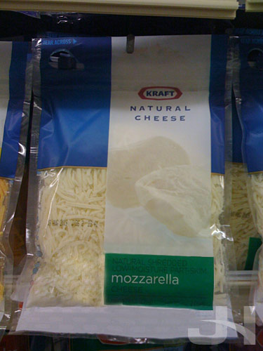
Walking past the cheese section of the dairy aisle this weekend at the grocery store, I discovered Kraft shredded cheese packaging was redesigned. On the left, the new design; on the right, the old design:

kraft shredded cheese new, old packaging

Here are two old-design packages:

kraft shredded cheese old packaging

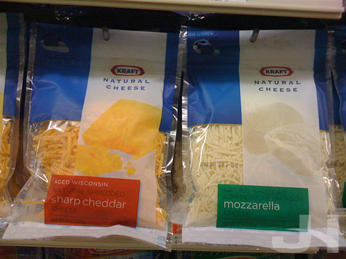
Two new packages:

kraft shredded cheese new packaging

Larger shots of the new packaging:

kraft shredded cheese new packaging

kraft shredded cheese new packaging

kraft shredded cheese new packaging

On the Kraft Foods website, I could’t find any more information other than this short blurb:

Kraft Natural Cheese has always given you the highest-quality pure cheese taste. Now you can get the same Kraft Natural Cheese you love in an exciting new contemporary package that puts the focus on freshness. We’ve even freshened up our on-pack recipes to offer great new ways for your family to enjoy delicious Kraft Natural Cheese. Look for our new package in your grocer’s dairy aisle now.

Another fine and successful redesign job for Kraft Foods following the Wheat Thins and Toasted Chips redesigns. In the old shredded cheese packaging, the packages for each cheese variety followed the same basic template, but typefaces and other design elements were wildly disparate. With this new packaging, however, the several cheese varieties now coexist in the same design with only slight modifications to differentiate the types of cheeses.

Showing something of a product before-and-after on the packaging is an interesting treat. We see the cheese on the packaging as chunks before it is shredded and through the packaging as the shredded end product.

One quibble I have is that the colored rectangle carrying the text of the cheese type seems mis-aligned, and if it were aligned with the white vertical rectangle carrying the chunks of cheese photography, I think the packaging would be visually stronger overall. I mocked this up (don’t mind the Photoshop skills here, I did this quickly):

kraft shredded cheese packaging tweak

Overall, though, the new packaging compared to the old packaging is cleaner and more unified across all the cheese varieties Kraft offers. To see another major brand shift toward simpler design is exciting. If this trend contiues in the Kraft Foods family, I can’t wait to see what’s next.

“At Least I Have Chicken”

One of my favorite YouTube videos.   So many quotable lines here that are good for “repeating, of course.”   Some language NSFW.

Old Toasted Chips Packaging Is Toast

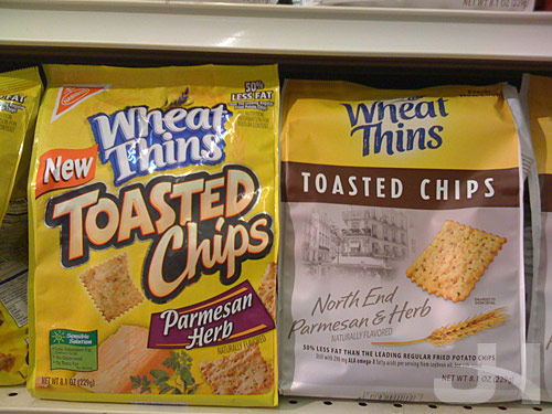
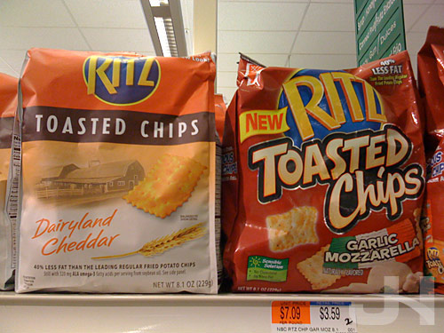
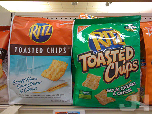
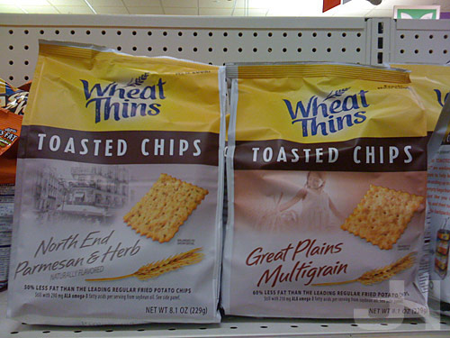
I assume when Nabisco, a Kraft Foods family member, rolled-out the Wheat Thins redesign, their Toasted Chips line was also redesigned.   Below, the old design on the left and the new design on the right:

toasted chips old, new packaging

New on the left, old on the right:

toasted chips new, old packaging

toasted chips new, old packaging

New design:

toasted chips new packaging

Much like the Snapple and Baked Lays redesigns, the Toasted Chips redesign steps-up the classiness of the packaging.   The photography and branding of each variety (“North End,” “Great Plains”) are a little curious as they don’t offer much, but the photography is nicely placed and unified with the other elements.

A few other curiosities: why does the sour cream and onion Ritz Toasted Chips packaging not feature green anymore?   Where did the Nabisco logo in the upper-left corner of the old design go?

Also, the bags appear to be made of a different material, and as a result are less shiny.

Overall, though, the new packaging is classier and simpler than the old packaging and is another welcomed step away from the over-designed boisterousness that plagues so much of American packaging design.

Block Annoyances, Browse Happy

Browsing The Internets in the age of pop-up ads was massively annoying.   Now that most ads get blocked and website advertisers know this, they, with the help of the websites they target, have moved their ads to the web pages, often cluttering page content and causing annoyances and distractions with their animated advertisements as they fight for your visual attention.   Enter Adblock Plus.

Adblock Plus is an extension for Firefox that does essentially what pop-up blockers do it blocks ads.   But instead of blocking external page ads, Adblock Plus blocks embedded page ads.

Once activated and your country chosen, Adblock Plus claims to block 99% of ads on every website you browse.   You can, however, chose to disable the blocker for a specific page or domain (other than webmaster testing purposes, not sure why you’d want to).

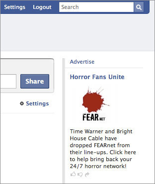
I installed Adblock Plus today, and I’m already amazed at the results.   You know those ads on Facebook?

facebook without adblock

Adblock removes them:

facebook with adblock

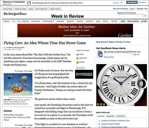
The New York Times with ads:

new york times without adblock

And without ads:

new york times with adblock

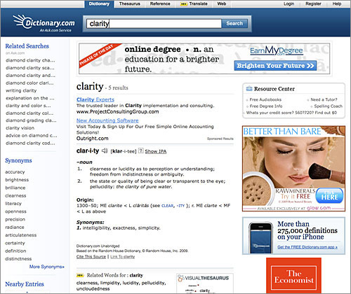
Dictionary.com:

dictionary.com without adblock

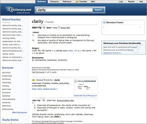
No more ads!:

dictionary.com with adblock

Adblock Plus changes web-browsing experiences and allows actual page content to be seen and focused on.   Definitely a must-have Firefox extension!

(Nod: Lifehacker)

More Fun at the Grocery Store

I went grocery shopping today, and I’d say at least half of my time at the store was occupied by taking pictures of products.   While I work on more in-depth posts, here’s this post for now of some miscellaneous snaps I took.

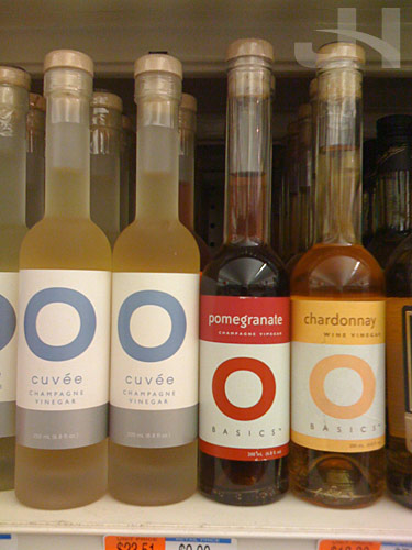
The simple design of O Olive Oil is stunning:

o olive oil

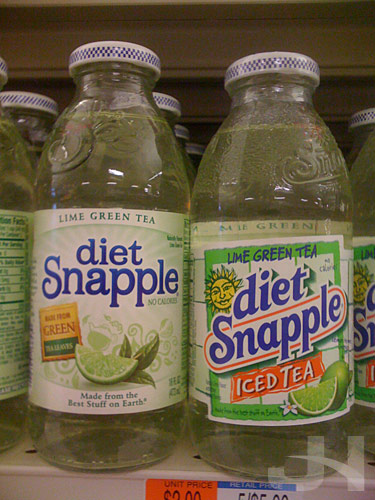
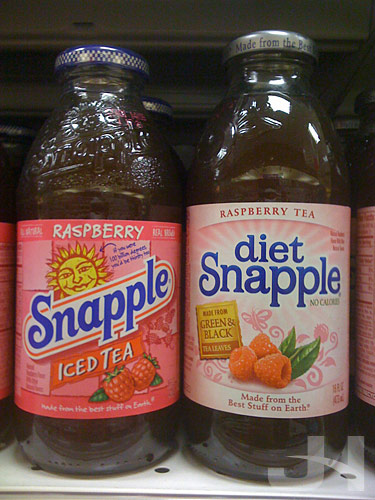
My favorite shots at the store are the comparisons:

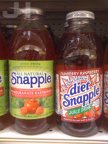
diet snapple lime green tea

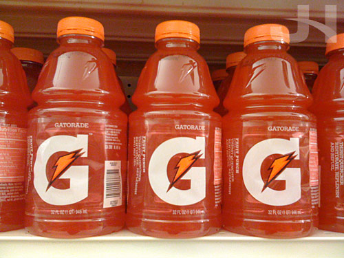
The new Gatorade packaging:

new gatorade packaging

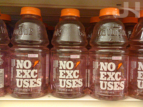
I find this Gatorade packaging curious.   While I like the idea of breaking up the text, I wonder if the phrase “No Excuses” was divided appropriately because if you just glance at the bottles quickly, you may read “No Uses”:

new gatorade packaging

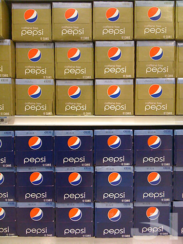
I’m still loving the Pepsi redesign:

pepsi

More later! :-)

Signs of Clear Viewing

If you’ve spent any time driving on America’s Interstate System, you’re no doubt accustomed to the system of signs informing you of upcoming exits, mileage distances, speed limits, local services, etc.   Until this decade, these signs have used a typeface in the Federal Highway Administration’s (FHWA) sanctioned series of fonts.   The typeface, referred to as Highway Gothic, was developed in the 1940s and today is still used on the vast majority of road signs.
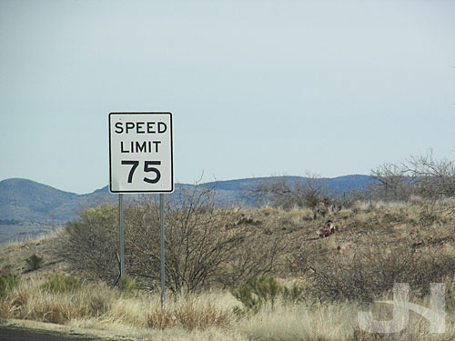
speed limit in highway gothic

In 2004, the FHWA approved the use of Clearview, a new typeface to eventually replace Highway Gothic on road signs across the country.   This isn’t new news, but my recent trip to Arizona reminded me of the typeface switch.

Clearview was developed as a custom typeface by Don Meeker, an environmental graphic designer, and James Montalbano, a type designer.   Joshua Yaffa at The New York Times wrote a must-read piece (if you’re a type, design, or sign buff) about the typeface and its development.

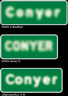
Much of the signage that uses Highway Gothic is in all-caps, which renders text harder to read, especially at 65+ miles per hour.   In addition, the counter-spaces (the hole in the ‘e’ or ‘a’) are small and make the letters harder to read.   At night, the reflectivity of the signs often cause the letters to blur past recognition for some drivers when head lights shine on the signs.

Clearview aims to change all that with larger counters, larger x-heights, and mixed-case words.

Example of halation (over-glow of reflected sign) with mixed-case Highway Gothic, upper-case Highway Gothic, and mixed-case Clearview (image from Clearview site):
blurred signs

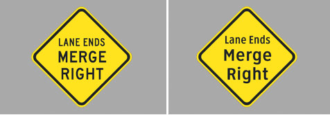
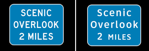
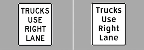
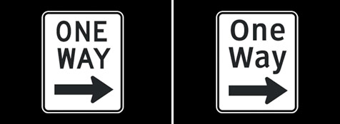
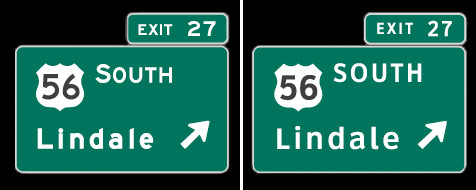
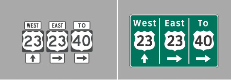
The development team recommends Clearview be adopted for all signage, not just guide signs.   Examples of suggested signage modifications, Highway Gothic on the left, Clearview on the right (images from Clearview site):
clearview concept

clearview concept

clearview concept

clearview concept

clearview concept

clearview concept

clearview concept

Seeing the two typefaces compared, I don’t think there is a comparison.   The clarity achieved with Clearview is astounding, and Clearview even manages to be a little more friendly at the same time (which when you’re a lost motorist looking to find your way, that friendliness might not be such a bad thing).

I mentioned earlier I was reminded of the switch to Clearview during my recent trip to Arizona.   On the intersections with traffic lights, the city of Phoenix has installed large, easy-to-see-and-read back-lit street signs above the road.   The typeface they use?   Clearview:
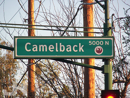
road sign in clearview font

Arizona has a good deal of newer highway and road construction projects, and in many cases, the signs use Clearview.
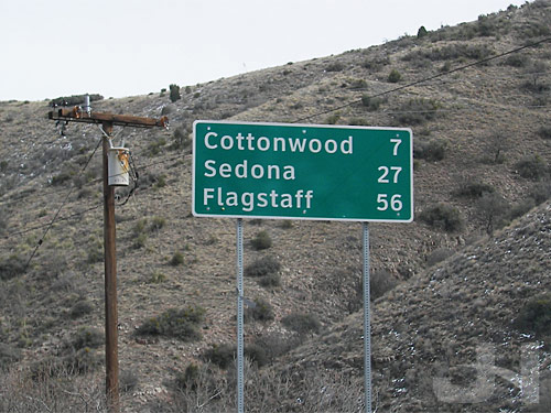
road sign in clearview font

Comparison shot: new Clearview sign on the left, older Highway Gothic sign on the right:
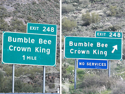
road sign comparison

Here in Connecticut, we’re still using Highway Gothic, but I eagerly await the arrival of signs of clear viewing.
Title Sequence: Quantum of Solace

http://www.youtube.com/watch?v=ygtE_E-dTFU

Designed by: MK12
Year: 2008

Yang, Can You Play Like This?

http://www.youtube.com/watch?v=HVGQIkYN2uI

More Snapple Snaps

What was that about me being obsessed with taking photos at the grocery store?

old and new snapple bottles

new snapple bottles

new snapple bottles

new snapple bottles

new and old snapple bottles

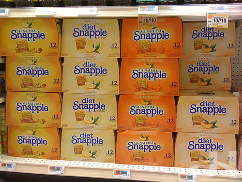
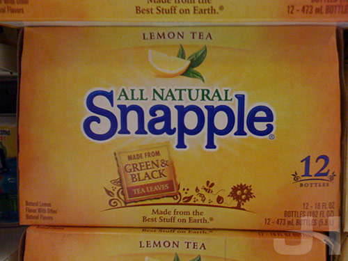
new snapple boxes

new snapple boxes

Stocked and Loaded

Listing to NPR on my drive home yesterday, I heard an interview with Johnny Durry, a gun shop owner in San Antonio.   In the interview, Durry talked about gun ammunition shortages since the election of President Obama last November.   People, he said, have been stocking up on half-lifetime- to lifetime-supplies of ammunition at one time.

The thing those anti-gun people don’t understand is the people are buying it to protect themselves.   They’re so scared of the socialist type of let’s take over the banks, let’s talk about take over the oil companies, let’s give all of this money to people without jobs, let’s reward all these people who are not working hard, and they said, “Well if the government is going that way, what are they going to try to take away from us now?”   And you know what the big concern is?   They’re worried about not being able to get any ammo and not being able to protect themselves.

This is only one shop owner’s story, but still, the message both frightened me and angered me.   What the hell do people need a lifetime-supply of ammunition for?   To protect themselves?   From whom or what?   Are they planning on a Canadian invasion?

Is it not reasonable to believe, if the government really were aiming to take away people’s guns as in coming to their homes and confiscating them, they’d take away the ammunition from them also?   So if an ATF agent knocks on their doors tomorrow, he’d be confiscating their ammo, too, no?   Unless they plan on using the lifetime-supply of bullets on the ATF agent?

Seriously, I fail to see the logic here.   This isn’t a decision by the Obama Administration.   Congress has to pass the law to ban guns, which seems unlikely, but Congress would first have to get around that pesky thing called the Constitution and repeal the Second Amendment.   Amending the Constitution would take 2/3 of both houses of Congress AND 3/4 of states.   Nearly impossible.   But for the sake of argument, let’s say Congress managed to outlaw personal possession of guns and had agents go door-to-door to seize them as these paranoid gun owners described in the NPR story seem to fear.   Why would they need a lifetime-supply of ammo?   First, they won’t have a gun to use the ammo with.   Second, the ammo would likely be seized along with the gun (unless they all formed a merry band of militia men and women and raised arms against the government then, of course, we have a bigger problem).

So I ask again, what the hell do people need a lifetime-supply of ammunition for?

Making the Kessel Run in Under Three Minutes

I Got the Black Lung, Pops

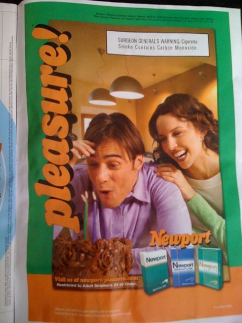
I was flipping through Entertainment Weekly just now, and I came across something I hadn’t seen in I-can’t-even-remember-how-long long: a cigarette advertisement. Looking at the ad, I can’t believe how ridiculous the premise is. Here’s the ad:

newport pleasure?

I’m not a smoker, so maybe I don’t understand the supposed appeal of this ad. Is this happy couple celebrating a birthday and the pleasure of spending their lives together? Or are they celebrating the pleasure of surviving lung cancer caused by smoking?

To whom is this ad supposed to appeal? Smokers or non-smokers? I’m not jumping off the couch to go grab a pack of smokes and start-up smoking because of this ad. But would a smoker of Newport cigarettes be reminded of how much pleasure they get and the feeling they have when they’re turning their lungs black with these cancer sticks?

The message must be a subconscience trigger to smokers: ooo, I see people enjoying themselves, taking pleasure in life… I like to do that… and I see a little picture of cigarettes… I like to smoke them… cigarettes… pleasure… CIGARETTES!… PLEASURE!… MUST GO GET SOME!!!