Baked Simplicity

I think I’m becoming obsessed with finding products at the grocery store to take pictures of.   While I was going up an down the aisles, I stumbled on these Baked Lay’s bags sporting a new design:
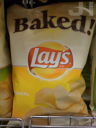
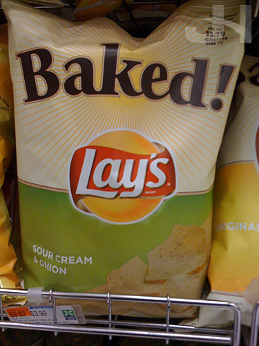
new baked lays packaging

new baked lays packaging

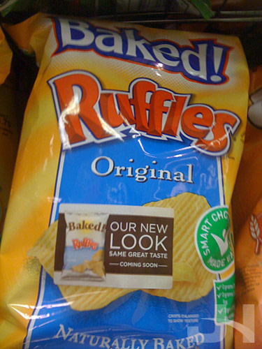
The announcement sticker on an old package of Baked Ruffles:
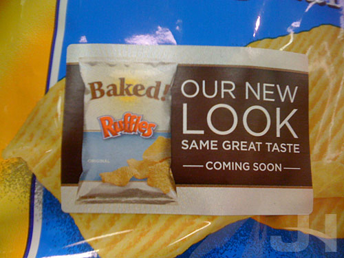
new baked lays packaging

old baked lays packaging

I only saw these designs at my grocery store, but after some research on The Internets, I discovered the entire line of Baked products is being redesigned.   From the FritoLay snack blog:

We redesigned the packages to improve their appeal to consumers looking for healthier products and to increase the snack’s visibility on store shelves.

I assume the new packaging coincides with the new Lay’s brand campaign:

Lay’s Classic Potato Chips America’s favorite potato chip has launched a new brand campaign with TV, print, and a redesigned lays.com. The campaign introduces a new theme line, “Happiness is Simple,” designed to celebrate Lay’s place in Americana and its role in bringing people together for life’s simple pleasures.

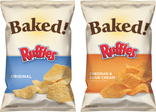
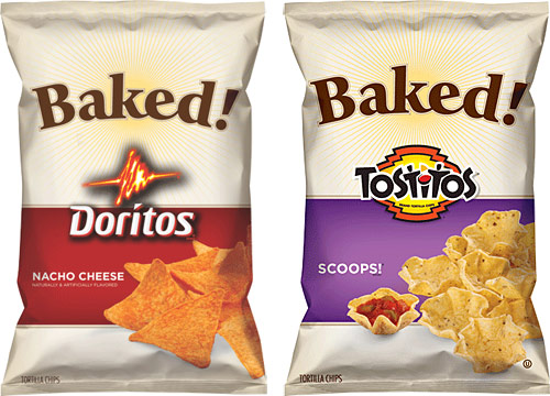
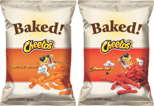
FritoLay is, of course, owned by PepsiCo.   The folks at Pepsi have been enjoying themselves lately, redesigning everything that isn’t bolted down.   Here is the entire Baked line from fritolay.com:
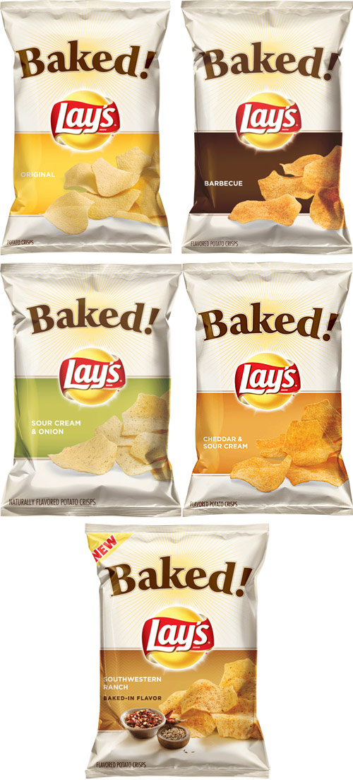
baked lay's

baked ruffles

baked doritos tostitos

baked cheetos

And from Twig & Thistle, the old packaging:
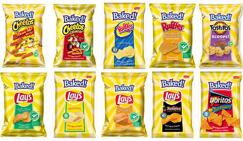
old baked packaging

The new packaging by Hornall Anderson is fantastic for several reasons.   First, the new packaging clearly pays homage to the previous design with the same general layout (“Baked!” at the top, product logo in the middle, product image at the bottom) and the sun burst.   Second, the new packaging is a simpler and more elegant execution.   By comparison, the old packaging looks crazy and is certainly not helped by the almost obnoxious sun burst, which in the new packaging is tastefully dialed-back.   Third, the new packaging has a greater cohesion across the several products.   While each product in the old package design followed the same basic layout formula, fonts, type treatment, and imagery were all inconsistent across each product (e.g. why aren’t the two Ruffles logos the same?).   The new packaging is more harmonious and consistent: all the product photos are spilling from the right, all the flavor text (“Original,” “Sour Cream & Onion,” etc.) is identical (except for the Cheetos flavor text).   Fourth, the new designs just make the product look and feel like a healthier snacking option than regular chips.

Terrific job.
Title Sequence: United States of Tara

Designed by: Unknown
Year: 2008

Snapping to a New Design

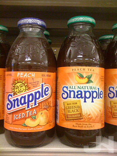
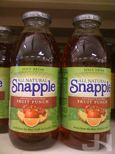
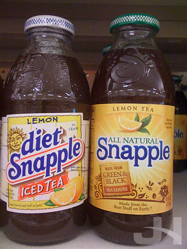
Brand New recently reported on the new bottle label design for Snapple teas and juices.   When I was at the grocery store yesterday, I made sure to investigate.   Overall, the new design took Snapple up a notch or seven on the classy scale.   The designs are solid and well-executed.   And that scary-looking sun is gone, which is a big plus.   Here are a few snaps of before and after designs.

snapple before and after

snapple before and after

snapple after

Number Crunching

Swing State Project has compiled the results of the 2008 presidential election by Congressional District, listing which candidate won each of the nation’s 435 districts.   Having this data along with state-by-state results, I can now fully update my thesis project with the 2008 election.   Stay tuned for an update soon!

(Nod: FiveThirtyEight)

Tales from myPhone, Episode 2

As I previously mentioned, I’ve made it a point since moving to Connecticut to take a road trip every month.   Last month I went to Old Saybrook, and this month I went to Essex.   Having my iPhone come along for the journey was helpful and allowed me to enhance my experience on the trip in ways not possible without it.

First, my iPhone was helpful in finding a place to eat.   In Old Saybrook, for restaurant advice called a coworker of mine who has been to the town, but he was unavailable at the time.   Since I needed to eat, I had to find a restaurant on my own.   In Essex, I didn’t know anyone who had been there, so I just needed to find some place.   For both situations, I used the app Yelp (iTunes link) to see what restaurants were in my immediate vicinity and to read reviews of the restaurants.   From there, then, I was able to pick good places both times.

Second, my iPhone proved useful in navigating both towns since, beside my phone, I don’t have a GPS device for my car.   In Old Saybrook, I wanted to find the shore, so via Maps and the built-in GPS support, I navigated my way to the coast.   In Essex, I used my phone to find a back-roads route home instead of taking the highway.   If I didn’t have an iPhone, I would have had to plan this route before I left my apartment, but with my iPhone in hand, I could travel along unknown roads with confidence knowing I wouldn’t get lost.   The scenic route gave me an opportunity to do more exploration and find different sites I wouldn’t have found via the highway.

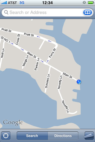
Knowing where I was in Essex:

essexmap1

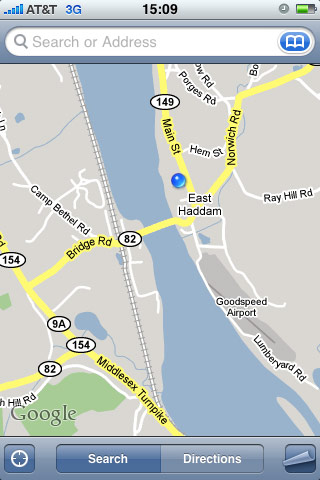
Knowing where I was while taking the scenic route home:

essexmap2

A find on the scenic route: the schoolhouse Nathan Hale taught at in East Haddam, CT:

nathan hale schoolhouse

Making Long-Distance Not So Long

Ars technica reports:

Skype might not be performing quite as well as parent company eBay would prefer a $2.6 billion acquisition to perform, but that hasn’t dampened worldwide enthusiasm for the VoIP service. Skype is so popular, in fact, that new numbers out from TeleGeography suggest that it has become the “largest provider of cross-border voice communications in the world.”

When I went to France last year, my parents and I used Skype to keep in contact.   For anyone traveling overseas and wishing to keep in contact with people here in the States, or for those who are here and wish to keep in contact with someone overseas, I highly recommend using Skype because the service is convenient and it’s FREE!.   Just download the free Skype application on your computer, setup your free account, and have the other party download and setup also, and you’re on your way to free audio and video chats.   Did I mention it was free?

(Nod: Just Another iPhone Blog)

Road Trip: Essex, CT

This month, my work schedule was adjusted so that I work Tuesdays through Saturdays and have off Sundays and Mondays.   Having yesterday off in conjunction with my goal of taking a road trip every month led me the town of Essex, CT on the Connecticut River.   After seeing the website describing the town as “the best small town in America,” I took a drive.   And I wasn’t disappointed.   Essex is a charming little town, perfect for a nice day trip to walk around and soak in some sun and small-town river life.

Downtown:

essex, ct

A peaceful spot for a rest or a picnic:

essex, ct

New England charm white picket fences abound:

essex, ct

Looking off into the river:

essex, ct

Blowin’ in the wind:

essex, ct

The Devil Is In the Details, and So Am I

As I was looking at the new Pepsi logo this afternoon, the gears in my little brain starting turning, and I arrived at an interesting thought.   Here’s the new Pepsi logo:

pepsi_logo_new

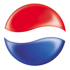
I was looking particularly at the ‘e’ in the logo and wondering about the wave.   Here’s the old Pepsi globe; notice the wave:

pepsi_globe_old

What if the wave in the ‘e’ of the new wordmark:

e_current

Was flipped horizontally to become a subtle reference to the old globe:

e_revised

So then, the Pepsi wordmark would be:

pepsi

The current wave in the ‘e’ is curious as to its purpose. Why not make it a straight bar instead? But if the wave should stay, why not give it a real purpose?   Just a thought.

I’m In Love with the Pepsi Packaging

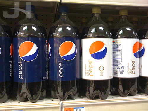
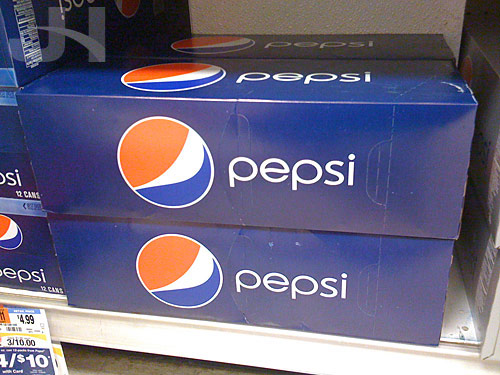
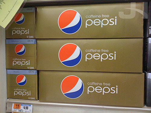
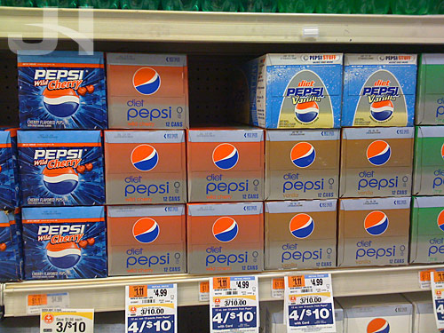
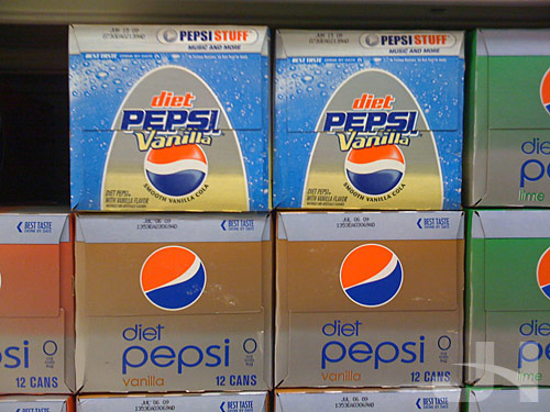
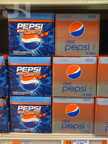
I was at the grocery store today and snapped these pics of the Pepsi packaging.   I’m in love with the minimalism of these designs. Absolutely gorgeous.

The bottles:

pepsi packaging

Can boxes, side view:

pepsi packaging

pepsi packaging

End view, both old designs and new designs:

pepsi packaging

Diet Pepsi Vanilla, before and after:

pepsi packaging

Wild Cherry Pepsi:

pepsi packaging

My hat is way off to the Pepsi team and the designers who took the packaging in this remarkable direction.   Awesome work.

A Tribute to John Williams

A friend of mine sent this video to me knowing how much I enjoy the work of John Williams.

For your enjoyment, “Star Wars” by moosebutter:

(Nod: Corey)

ESPN’s Magic Box

I’m late in commenting on this, but last month, SportsCenter on ESPN launched a new touchscreen graphic on their in-studio Perceptive Pixel touchscreen.   While they have been using their touchscreen since sometime in December, most notably with a telestrator graphic, this NFL Draft graphic marks their first appropriate (and cool) use of the technology.   I imagine we’ll be seeing more of this as the draft approaches.

16 February:

http://espn.go.com/broadband/player.swf?mediaId=3910857

11 March:

http://espn.go.com/broadband/player.swf?mediaId=3970534

Title Sequence: Fringe

http://www.youtube.com/watch?v=4YoIfv-rIpk

Designed by: Andrew Kramer
Year: 2008

Tales from myPhone, Episode 1

This will be an ongoing serial, dedicated to highlighting personal situations where having an iPhone proved to be highly useful.

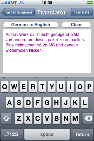
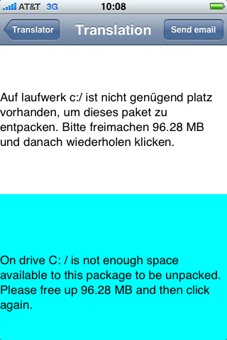
For starters, yesterday at work, my manager was installing software, developed by people in Germany and Austria, on a coworker’s computer.   During the installation process, an error message appeared in German.   My manager called me over to see it, but since none of us speak German, we had no idea what it said.   Excitedly, I said to my manager and coworker, “Hang on a minute.”

So, I pulled out my iPhone, went to the App Store, and searched for “German Translator.”   In the search results was the app “Free Translator,” so I downloaded it over the 3G network.   When the app was finished installing, I launched it, selected my source and target languages, typed the German error message, and hit the “Translate” button.   Boom, now we could read the error message.

translator

translator

iPhone OS 3.0 Wish List

iphone os3

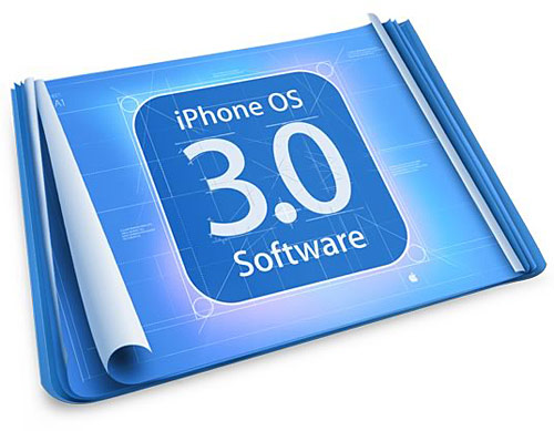
The Unofficial Apple Weblog, amongst others, reports on this coming Tuesday, 17 March, Apple will hold a media event to preview iPhone OS 3.0 software. Speculation has abounded as to what 3.0 might include. Here’s what’s on my wish list:

  • copy and paste: seriously, STILL not having this ability is both ridiculous and embarassing
  • background app support: some ability to run apps in the background; I hate using a radio app and then having to open my calendar or to-do list only to have the radio app close
  • Flash
  • turn-by-turn GPS directions
  • landscape Mail: viewing wide emails in portrait mode is painful; who likes to horizontally scroll?
  • more camera controls: how about focus modes (auto, distance, macro), white balance settings, exposure settings
  • consistent playlist-creation menus: when adding songs to a genius playlist, the alphabet scroll list is present on the right side of the screen (the list that enables you to touch a letter to jump to songs or albums beginning with that letter); when adding songs to an on-the-go playlist, the alphabet scroll list is not available, so trying to get to the end of the list is a pain
  • better way to organize apps: something like this
  • ability to change ALL the sounds on the iPhone: why can I change my ringtone and the new text message sound but not the new voicemail, new mail, etc. sounds?
  • ability to edit, delete, and save new playlists: this ability is available for genius and only the current on-the-go playlist; why not make it available to any playlist?
  • ability to change calendar colors: I liked the default iCal colors, but to keep consistent with the for-whatever-reason different calendar colors on the iPhone and iPod Touch, I changed my iCal colors to match
  • MMS: I’d like the built-in ability to send a picture to someone’s phone
  • animated scroll on super-long song titles: other iPods auto scroll the song title when it gets clipped because the title is too long to display in the space allotted; why not the iPhone, too?
  • video recording
  • search Mail
  • native dictionary/thesaurus: Mac OS comes with one; port it please

That all isn’t too much to ask, right?! :-)

The Recovery Begins With Government Graphic Design

Last week, President Obama unveiled logos for two new administration programs, Recovery.org, aka American Recovery and Reinvestment Act (ARRA), and TIGER (Transportation Investment Generating Economic Recovery):

recovery logos

NPR interviewed creative director Steve Juras about the logos.   Juras provides a nice overview and insight to the Recovery.gov logo development.

Armin at Brand New writes:

The ARRA emblem feels decidedly American, it might just be the stars and the blue, but it definitely has an American pride aura to it. The design is clean and simple and touches on three key aspects: America (of course), the environment, and the industry. The design of each element could probably be discussed ad nauseam and hundreds of alternative drawings could have been made, but as quick signifiers these work great. I’m not a fan of the rounded corners of the quadrants, but that’s just me. This logo probably looks kick-ass in all black too.

The logo for the U.S. Department of Transportation’s TIGER (Transportation Investment Generating Economic Recovery) program may feel a little corny, with its tiger stripes. But, let’s face it, sometimes it’s too tempting to forego the obvious and this logo creates a very identifiable visual. The thing I love about it is the combination of dark gray (or is it black?) that could stand for the asphalt that millions of people drive on each day throughout the U.S. and the orange that is emblematic of all the workers that are regularly out there working the roads. The type choice for TIGER is odd though: Kabel (slightly modified).

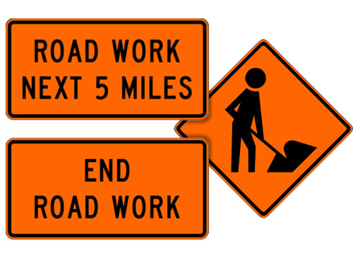
I can’t argue with clean and simple, and I particularly enjoy the symbolism in the TIGER logo.   Construction road signs are what colors?   Orange and black, so using these two colors in the logo representing the U.S. Department of Transportation (you know, the road crew folks) is fitting (images from the Manual of Traffic Signs):

construction signs

If this is just the start of the high level of design the Obama Administration is going to introduce to the federal government, hats off to them, because good graphic design was one of the many things missing from the Bush White House.   Steven Heller, graphic design extraordinaire, blasted the Bush Administration’s use of fonts on the banners that appeared behind the president during major speeches (the “Mission Accomplished” variety) in an article for AIGA:

Whatever one thinks about [the Bush] administration’s domestic and foreign policies, the White House’s garish type selections are so thoughtless they trivialize rather than enhance the rhetoric of our POTUS (no, not a synonym for doofus or that substance he used to smoke but rather the Secret Service’s acronym for President of the United States). While his handlers would never allow the leader of the free world to go out in public wearing a rayon leisure suit and white bucks, they nonetheless use clownish shareware typefaces with hokey beveled edges and cheesy drop shadows to represent his ideas.

So here’s to more good design work from the Obama Administration in the future.   And do the jobs of creating the logos count as stimulus-related job creation?   If so, the stimulus is already working.

Tropicana Squeezed by Consumers

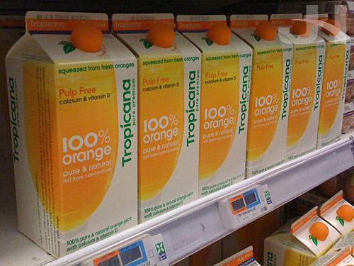
Tropicana

I’m very late in commenting on this story, but Tropicana recently announced it was un-designing its juice cartons.   What a shame.   When I wrote about the redesign back in January, I said:

The cleaner designs of Tropicana and Pepsi and specifically the minimal design of the Pepsi containers are a very welcome change in beverage packaging, proving once again less really is more.

But now those new, beautiful juice cartons are being replaced with the old, uninspired designs that preceded them.   Were the new designs perfect?   No, probably not.   But completely scrapping them in favor of the original designs takes seventeen steps backward.

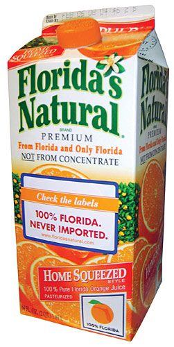
What set these new (I guess I should refer to them as the old designs now?) designs apart from other orange juice packages was that they were fresh and simple with their approach.   Some people have argued the redesign made the cartons look generic, but I think other orange juice cartons are generic-looking because they all are variations on the same design with only slightly-modified elements lousy font for the logo, check; the logo maybe in an upward arc, check; illustrated orange, check; plastered-on pulp- or squeezed-type text, check;   multitude of extraneous other text, check.   Instead of harmoniously- and smartly-designed packages, other cartons have become exercises in how much the “designer” can fit onto the carton.   Take this Florida’s Natural carton (from Global Package Gallery), for instance.   Just on the front, how many times does the word “Florida” appear?

Florida's Natural

Matt Everson at Astuteo makes the case that the new Tropicana cartons failed and details eight reasons why.   The first reason he lists is labeling, writing:

ORIGINAL: Text labeling appears along the top sealed edge and across the front, all knocked out of a large, tactfully positioned block of color indicating the type of juice. Product variations are easily distinguished at a glance.

REDESIGN: Text labeling of the juice type along the top and across the front is inconsistent – one is reversed and one positive – and the thin colored stripe is far less noticeable requiring a greater investment of time and concentration on the part of the shopper.

I’ve seen this argument elsewhere also, and it really bothers me.   For people to complain that they now have to actually read the carton is befuddling.   Shouldn’t that be a prerequisite before buying something anyway?   Or do people prefer to close their eyes and just grab something off the shelf, whatever it might be.   Are we now in the business of advocating laziness?

So with the old designs, locating the correct carton maybe took two seconds, but with the new cartons, locating the correct juice now takes five seconds?   The new cartons clearly state in a specific color-coded fashion what type of Tropicana orange juice you’re looking at.   But this isn’t enough for the average, lazy, too-hurried-to-actually-read-what’s-in-front-of-them, always-complaining-they’re-soooo-busy American who prefers this text to be blazoned across the carton in a manner that screams, “hey you moron, I’m ‘no pulp.'”

Maybe, though, the distaste I have for undesigning the Tropicana cartons and the reasons people cite as failures of the redesigns invoke larger questions and complaints I have about modern American culture, a culture that advocates multi-tasking, rushing through the day, and spending less time and focus on our tasks.

But I suppose that discussion is for another day.   Today, though, I can say I switched to Tropicana orange juice because I appreciated the package design immensely.   Once the superior redesigns disappear, maybe I’ll keep a carton around and keep filling it up with juice from the sub-standard, generic undesigns.

Public Service Announcement

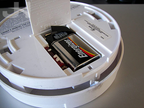
battery

Changing your clocks twice a year is also a good time to change the batteries in your smoke detectors.   From MSNBC:

Firefighters say 3,800 people lose their lives every year in house fires related to smoke detectors not working.

They are reminding you that by changing a few simple batteries, you’re greatly improving your chances of getting out of your home safely if a fire does break out.

I changed my battery.   Did you?

myPhone

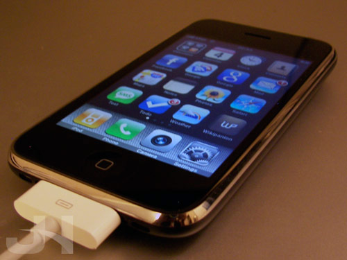
myPhone

Last month, I finally caved and purchased an iPhone.   The device is everything I was hoping for and even more.

When the iPod Touches were launched in October 2007, I was quick to snatch one up.   I was in awe at the iPhone but was still in a Verizon contract.   Over the next year, many separate functions or utilities of mine merged with my iPod Touch.   For instance, carrying around my Touch meant I had my address book, calendar, note pad, grocery list, checking account register, unit converter, English dictionary, and Spanish dictionary/conjugator.   When I was in a wifi zone, I had The Google, The Facebook, The Wiki, and The Internets at my fingertips.

But even with these features, I still craved an iPhone for a couple reasons.   First, it was time for a new phone, and if I stayed with Verizon and bought some iPhone-wannabe, I knew I would be sadly disappointed and would constantly compare the phone with my iPod Touch and by extension the iPhone.   I knew another phone manufacturer couldn’t match the level of usability afforded in the iPhone and iPod Touch’s menus and interface.   Second, I wanted to rid myself of a device.   In my pockets everyday everywhere I went were my phone and my iPod Touch.   If I were to get an iPhone, I knew I would then only have to carry one device (and not have to keep two separate address books, too).   Finally, being a fan of gadgets and touchscreen technology, I think the iPhone is an uber-cool device not currently matched by any other similar device.

With all these thoughts in mind, I made the jump to AT&T and purchased an iPhone and I don’t regret a thing.

Now, not only do I have all the capabilities of my iPod Touch, I have so much more.   If I want to look something up on The Wiki, I can without having to find a wifi spot.   If I want to take a picture of something and upload it to Facebook, I can.   If I want to check the directions to my destination while I’m in the car, I can.

I thought with the constant connection to The Internets I might find myself distracted often, but I haven’t been distracted at the level I thought I might be.   But having that constant connection for when I have a random question (like how long does a pace maker last) satiates my incessant thirst for answers.

Another aspect of switching to an iPhone I worried about was having to reenter or lose data saved in apps on my iPod Touch, information such as my favorited and custom grocery items, my checking account register entries, and Safari bookmarks.   When I was moving through the setup process in iTunes, however, I had the option to restore my iPhone from an iPod Touch backup, so all of the app data saved on my iPod Touch was transferred to my iPhone.   Genius!

Overall, I am delightfully pleased with my purchase.   My iPhone is easily one of if not the best thing I’ve ever bought.

Is It Spring Yet?

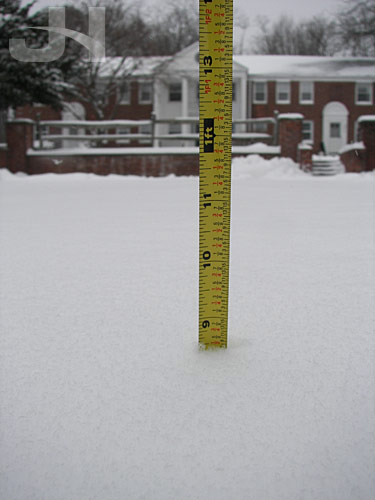
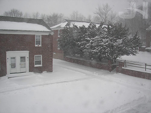
Winter Storm “Demi,” as one local news station named it, came through on Sunday night and Monday morning, dumping about 8.5 inches where I am.   Driving wasn’t as bad as the last storm.   Interstate 84 was partially drivable this time, so thank you to the CT DOT.

Seriously, though, I think we’ve had enough snow now, thank you.   Thankfully, the sun has been shining in a clear, blue sky the past two days so the snow is slowly melting away. :-)

winter storm demi

Before the storm:

winter storm demi

During:

winter storm demi

Oh Joy, More Snow

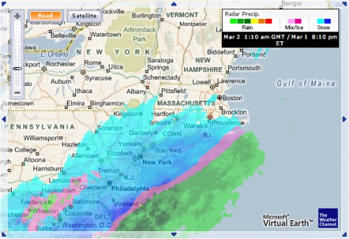
We have a lovely winter storm moving up the east coast.   Oh joy.   It has arrived:

radar

My area is forecast to receive 8 to 12 inches.   Thanks, Mother Nature, but I’m done with winter.   Please send your snow someplace else.