Designed by: Jamie Caliri
Year: 2004
I saw the latest Jason Bourne James Bond film this weekend. Although not as much as Casino Royale, I thoroughly enjoyed Quantum of Solace, and I will be seeing it again. What follows are some lengthy thoughts and reactions.
Since any cinematic experience for me heavily involves the music, I’ll begin there. The title song, “Another Way to Die,” was written by Jack White and performed by White and Alicia Keys. While hailed as the first duet in Bond music history, the song is terrible. When I first heard the song several weeks ago, my first listen left me cringing and shuttering in disbelief. The song has grown on me significantly, though, and I actually enjoy listening to it. As a Bond song, however, it’s only slightly better than Madonna’s atrocious “Die Another Day.” White’s and Keys’s voices during the song don’t mesh well, and because they cover about the same vocal range with slightly different timbres, they seem to almost clash with dissonant cacophony. Instead of singing the chorus, they shout it; the orchestrations throughout are barren, and in the full version of the song, the intro meanders almost incoherently while stealing the same notes from “You Know My Name,” the title song from Casino Royale. Aspects of the song are catchy, hence my continual listening to it, but overall it fails.
Performance aside, though, the most damning aspect of the song is the lack of a usable, discernible melody to use with the film’s score. The best Bond title songs are those which can be weaved into and interpolated throughout the score proper. When this extended use happens, the song becomes more than a seemingly-disjointed, tacked-on prefix to the film; instead, it becomes a more intricately developed musical identity to the film. Composer David Arnold returns to write his fifth Bond score, his first being Tomorrow Never Dies in 1997. Throughout his tenure, he has had (at no fault of his own) mixed success with song melody utilization. For Tomorrow Never Dies, he wrote a classic Bond song titled “Surrender” (performed by k.d. lang) that was skillfully and successfully woven into the score. The song’s melody served as a propulsive base to several action cues throughout the score. The song, though, was replaced at the last minute by a sub-par song, titled “Tomorrow Never Dies” and performed by Sheryl Crow; “Surrender” survived, though, to appear during the end credits.
For The World Is Not Enough, Arnold wrote a song performed by Garbage. This song remained in the title sequence and, although not as often as “Surrender,” appears during the score.
Die Another Day was a musical amalgam of awfulness. Arnold had nothing to do with the song; instead, Madonna wrote and “performed” the song, which was nothing more than a cesspool of techno filth (and the words “die another day” were spoken a sure-to-make-anyone-say-enough-already sixteen times). Arnold, slowly descending into techno madness from his brilliantly modern-yet-classic-Bond score for Tomorrow Never Dies to his not-as-good-but-still-enjoyable score for The World Is Not Enough to his disappointing score for Die Another Day, seemed to attempt to out perform the song’s techno nonsense. Because of the overly techno feel and the absence of a strong melody, other than the “James Bond Theme,” to focus on, the score suffered immensely.
But for what Die Another Day lacked musically, Casino Royale more than made up. Arnold collaborated with Chris Cornell to write “You Know My Name.” The song was a fitting answer to the “re-invented” Bond, giving him a modern, harder edge song to fit his new rougher, edgier persona. Several melodies found themselves masterfully sprinkled in the score numerous times, and the way the song melodies intertwined with the classic four-note Bond chord progression made their appearance in the score better than the appearances from “Surrender” in the Tomorrow Never Dies score. The song served as more than just a song to accompany a beautiful title sequence; it served as a musical identity to the rest of the score and therefore the film as a whole.
The score for Quantum of Solace shares much of the same musical identity with Casino Royale except for a strong melodic line to create a cohesive whole. The action pieces, the reflective pieces, and the sleuthy pieces all are strong and enjoyable, but the score could have been stronger and more enjoyable with a unifying melody. While two cues on the soundtrack quote a “melody” from “Another Way to Die,” the quotation is relegated to a softer, sleuthy rendition, far from the outstanding usage of song melody in Tomorrow Never Dies and Casino Royale.
What I find most interesting about my reaction to the Quantum of Solace score is regardless of how much I love the theme, I don’t miss an outright, bombastic performance of the “James Bond Theme.” A statement of the theme like its abundant usage in Tomorrow Never Dies just doesn’t seem to fit with this new Bond. Is that good or bad, though. If you consider the Bond theme to be overused, then I suppose its absence, save for the several skillful additions of the Bond chord progression and the famous guitar line rendered for strings, is welcome and allows for other musical ideas to take shape and precedence. Like Casino Royale, though, the end credits feature a rousing rendition of the theme.
The title song, if not a part of the score, is, of course, the underpinning of the Bond title sequence. Since GoldenEye in 1995, Daniel Kleinman has created the stylized and themed title sequences. I was shocked to learn he had been replaced for Quantum of Solace but was cautiously optimistic that MK12, who designed the wonderful end title sequence and in-film motion graphics pieces for Stranger Than Fiction, was designing the sequence. Unfortunately, though, the Quantum of Solace title sequence was underwhelming. The sand and desert theme is an appropriate and obvious tie-in to the film’s climax location, and the women emerging from the sand was an interesting effect. Unlike previous title sequences, the names of the cast and crew didn’t just fade on, they had a cool animation to bring them on screen, and the best name animation was for Dame Judi Dench (her name appeared from circles animated identically to those of the gun barrel sequence). But the sequence as a whole meandered and wandered through its desert-like setting. The latter half seemed to throw a non-congruent slew of swiftly animating elements, from silhouettes of naked women to lines in the shape of a globe amongst some stars. Unlike the Kleinman sequences, this sequence seemed at a loss for a driving purpose and focus.
In addition to the title sequence, MK12 designed the in-film motion graphics associated with the Microsoft Surface touchscreen and the satellite-phone-call/villain-database-search wall in M’s office. These animations were superb and inspiring.
But enough with the music and the design. What about the rest of the film? Overall, the film was good, but not on the same level as Casino Royale. In Quantum of Solace, the film seemed like a never-ending chase sequence; there was a car chase, a foot chase, a boat chase, and an airplane chase. All this action is great, but there could have been some more exposition and character development (especially since the film shockingly came in under two hours). A few scenes (the ending comes to mind) could have benefited from a couple more minutes to explain the unanswered questions that arose from them. The action sequences, though, were great, and the stunts performed were top-notch. Several times I cringed at the intense physicality Daniel Craig put himself through for the role.
Although the scene didn’t involve intense action, one of the highlights of the film was the Tosca opera scene. Bond is doing some actual spying, trying to discover what he can about the mysterious group who wear “Q” lapel pins (fashioned in the same font as the film’s title). After Bond finds out what he needs to, he encounters the bad guy and the sound drops from the film. Instead of bullet firings, shouts, and destruction, we only hear the music from the opera sung over the scene of Bond fleeing resulting in an unexpected and incredible scene.
The main Bond girl Camille, played by Olga Kurylenko, was an interesting psychological counter to Bond. Both are seeking revenge, but what Bond learns from Camille helps shape him into the more familiar Bond character. Mathieu Amalric as Dominic Greene played a non-typical Bond villain. Instead of the supervillain intent on seeking world domination, Greene was a philanthropist-posing, dastardly-scheming corporate boss, and he played his character well. But for me, other than Craig as Bond, the best performance came from Dame Judi. She, apparently being the only authority figure in Bond’s life, was crisp, forceful, and yet funny. One of her best lines (and I’m paraphrasing, as I don’t remember the exact quotes): she, through her aide on the phone with Bond, asks about someone Bond was to investigate; he responds the guy was a “dead end”; M, in an outburst of surprise and fury, says, “that means he killed him!” The delivery of this line and several others made me laugh. When producers decided to reboot the series with Casino Royale, I’m very pleased they kept Dame Judi as M.
Also with the rebooted Bond came a more Jason-Bourne-like persona. While I’m sure this persona will get mixed reactions, it doesn’t bother me. Like Bond, Bourne is a spy; and now like Bourne, Bond deals in a more realistic, edgier world than the old Bond did. No invisible cars here. Thankfully.
Couple other notes: as with Casino Royale, I fail to comprehend why one of M’s aides couldn’t have been Moneypenny instead; I hope we see more of Felix Leiter in forthcoming films; the Goldfinger reference with Fields was outstanding; Mathis and the dumpster was disturbing; the gun barrel seemed tacked-on and lacked the sophistication of Kleinman’s Brosnan gun barrel sequences; and Universal Exports makes a Bond-geek-pleasing return.
And, as customary, the credits end with “James Bond Will Return.” I’ll be eagerly waiting. I just hope that Q, Moneypenny, Daniel Kleinman, and David Arnold as title song composer return, too.
Strange Maps posts this very interesting two-part map. The red and blue are the county-level results from the 2008 presidential election. The overlayed black dots represent where 2,000 bales of cotton were produced in 1860 (larger image):

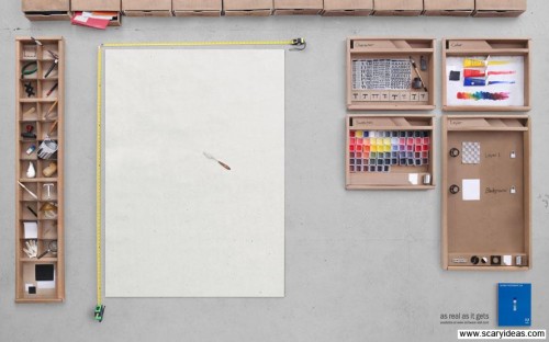
Scary Ideas posts this awesome real-life recreation of Photoshop (larger image):
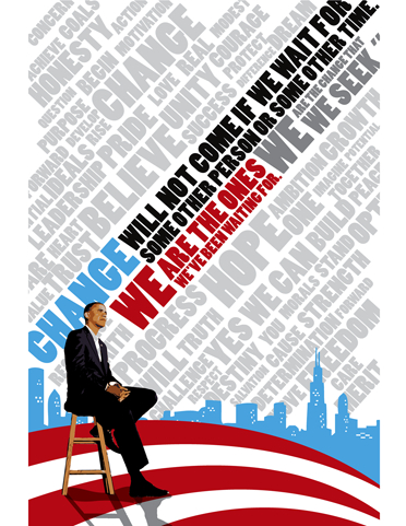
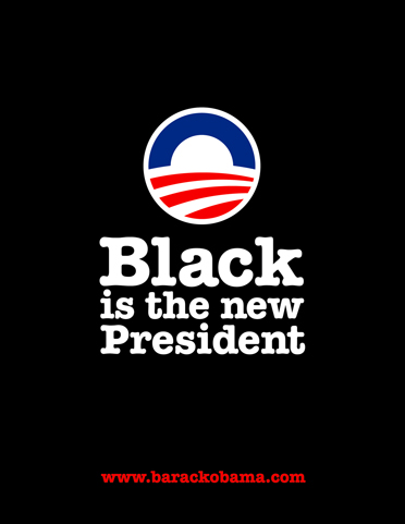
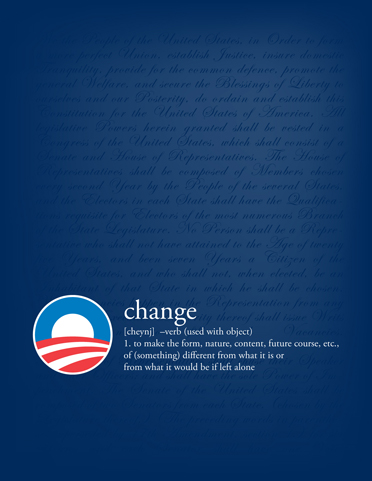
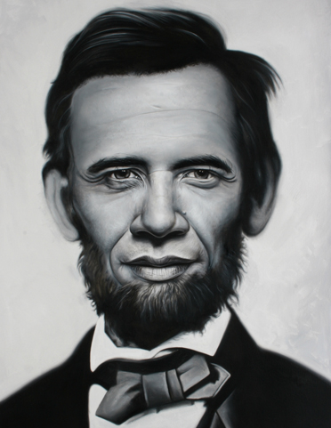
Barack Obama’s campaign spurned some great design work from both the campaign itself and from independent designers/supporters. DesignForObama.org catalogs some of the artwork inspired by the candidate:
(Nod: Alana Taylor)
Diego Doval writes on his blog an abridged script for Quantum of Solace. If you’ve seen the film and only if you’ve seen the film check out this hilarious spoof.
ChannelWeb reports on the possibility of iPhone firmware 2.2 including something that has eluded iPhone and iPod touch users thus far:
Apple is set to release version 2.2 of the iPhone operating system on Nov. 21, according to a Greek language post in enthusiast blog iPhone Hellas.
In addition to a redesigned MobileSafari interface, the iPhone 2.2 update will reportedly add Google Street View, transit route information, walking directions and over-the-air podcast downloads, according to Gizmodo, which described iPhone Hellas as “consistently reliable.”
Gizmodo noted that because the 2.2 feature list hasn’t changed from previous beta versions, it’s possible that Apple could decide to sneak copy/paste into the 2.2 update, a development that could lead to a collective outcry of joy from iPhone users who’ve long been clamoring for this basic functionality.
If I only had copy and paste on my iPod touch, I could have written this post on my iPod with the copied and pasted quote from the article. Sigh. Seriously, though, how much longer do we have to wait?
(Nod: Patrick)
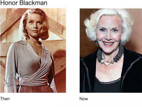
Brandnoo has a great post of Bond girls then and now. It’s interesting to see which actresses still try to embrace their former character, even years or decades after the role, and which have moved on. Pussy Galore from Goldfinger:
This is a repost, but in keeping up with my countdown to the new Bond film, here is Daniel Kleinman’s (so far) last and best title sequence (MK12 designed the sequence for Quantum of Solace).
Designed by: Daniel Kleinman
Year: 2006
Paul Lukas at ESPN’s Page 2 has a very interesting article on the uncredited designer of the MLB logo. He ends with this note:
He’s got a right to feel proud it’s a sensational design. And the more you learn about people like Dior and Sherman extremely talented creative professionals, most of whose work is done anonymously the more ridiculous it seems that designers don’t have higher public profiles. Here’s hoping this is one case where the designer finally gets the recognition he deserves.
Yes, save for a few “rock stars,” those of us in the creative industry remain anonymous. Such is the life we chose.
(Nod: Brand New)
Adopt a Pet launched presidential-pooch-pardon.com aimed at convincing the Obamas to adopt a shelter dog for that puppy that will accompany them to the White House. Someone did a great job with all the campaign design parody: “pal around with terriers.” Priceless.
(Nod: Campbell Brown)
Designed by: Daniel Kleinman
Year: 2002
Marc Ambinder has an outstanding article on the secrets of Obama’s success. One such secret:
Scale / Force Of Numbers: No matter how you measure this election, the Obama campaign was able to do so much because it had so much. What ifs abound. What if they were limited to the federal match? What if they weren’t able to raise as much money? What if they didn’t spend more than $150 million on field? Can this possibly be replicated? Can the Democrats ever again have hundreds of paid staff in states like Ohio weeks before election day? Can they ever find two million active volunteers?
Going into the election last Tuesday, ProPublica, “an independent, non-profit newsroom that produces investigative journalism in the public interest,” reported there were eleven Congressmen under investigation who were also seeking reelection. And how many of those eleven were reelected? Nine of them. Nine! Here’s the list:
- Sen. Ted Stevens (R-AK)
- Rep. William Jefferson (D-LA)
- Rep. Ken Calvert (R-CA)
- Rep. Jerry Lewis (R-CA)
- Rep. Alan Mollohan (D-WV)
- Rep. Gary G. Miller (R-CA)
- Rep. Timothy F. Murphy (R-PA)
- Rep. Don Young (R-AK)
- Rep. Charles Rangel (D-NY)
ABC notes some of these lawmakers’ troubles.
What is amazing to me is that how ever much people complain about an unethical Congress or corrupt system, people are willing to reelect Congressmen with dubious ethical standards. Why? Because:
“I’ve got to believe that the reason why [they’re reelected] is that they’ve developed this network of support that’s based on bringing business opportunities and earmarks to the community,” said Craig Holman, a campaign finance lobbyist for the watchdog group Public Citizen. “The more they develop a network in their communities, the more likelihood they can survive a criminal investigation or indictment.”
Somehow, I feel it should be a red flag when your Congressman is found hiding $90,000 of cash in his freezer. Just saying.
(Nod: Ben Smith)
Designed by: Daniel Kleinman
Year: 1999
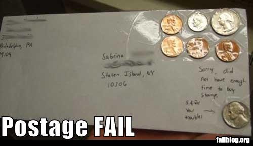
From the Fail Blog:
Designed by: Daniel Kleinman
Year: 1997
Gregg Merksamer at the New York Times reports President Obama will be riding in a new limousine, seen here unfinished and on a road test:
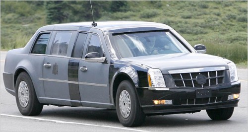
Speculating on some of the armament, Merksamer says:
[…] television clips showing George W. Bush entering and exiting the rear doors of his limos indicate that the windows are at least 5 inches thick, nearly twice the depth of what was used on presidential limousines in the 1980s and ’90s.
While I do not know what type of weapons such thick windows are designed to guard against, a half-inch of transparent armor is enough to stop a .44 Magnum round at point-blank range; at a thickness of 1.25 to 1.5 inches, the same material can withstand higher-velocity bullets fired from military assault rifles.
Were an attack to occur, the ballistic forces of bullets fired into the windows would be absorbed within a succession of glass and plastic layers, after which a flexible inner coating known as an antispall shield would keep glass from entering the passenger compartment.
The Times also has a gallery of past presidential rides. Interesting to see the progression from car to tank.
As always, the major networks tried to out-technology each other on election night on Tuesday. Some things worked, some didn’t, and some just didn’t need to happen.
CNN started the touchscreen bonanza with John King’s “Magic Wall,” a touchscreen developed by Perceptive Pixel. On MSNBC, Chuck Todd uses a Microsoft Surface touchscreen. One engineering difference between the two machines is that the Surface screen sits horizontally like a table and the Perceptive Pixel screen sits vertically like a big screen television. Prior to election night, Todd’s Surface was linked to a large monitor so we could see what he was doing:
http://www.youtube.com/watch?v=Gvpc30G3EtsBut on election night, he had a slightly more ambitious setup: a virtual set. Instead of the Surface linked to a large monitor to see the results of Todd’s interactions with the Surface, it was linked to a giant virtual graphic amidst giant virtual columns. There wasn’t actually anything behind Todd; this was a composite shot similar to a weather reporter standing in front of a green screen with a composited weather map and was MSNBC’s effort to out-perform the other networks:
The virtual set was an interesting idea, but there is, though, an inherent flaw with the Surface screen: we as viewers cannot see both the screen and the anchor at the same time. This is where MSNBC’s setup fails. With CNN’s screen, we see John King directly interacting with the screen and the results of the interactions; we can see things animate or change color when King touches them.
When King tells us to take a look at Chester county in Pennsylvania, we can see him touch the county, so we know which county it is and where it is on the map. When Todd does the same thing with Miami-Dade county in Florida, we can only see the results of the interactions. Todd highlights or points to a county on his screen, but when the camera is focused on the virtual screen, we can’t see what he’s pointing to and thus have a lack of correlation. Without seeing what the anchor is doing, we’re left with a fullscreen graphic, so why even have the anchor on the set with the screen and interactions we can’t see? Furthermore, in the first video, if we were to focus our attention on Todd, we would miss the results of his interactions on the large monitor. If we’re watching Todd while he is talking to us, we miss seeing Nevada and Florida changing colors on the large monitor. The director can try to compensate for this by giving us an overhead shot of Todd’s screen, but then we’re left with a pair of hands touching a screen instead of the whole anchor visibly and visually telling the story. Not seeing Todd point to where or what he is talking about is akin to a weather reporter showing us a weather map with fronts, storms, and temperatures but not being on screen to point out what he is talking about. Maybe not such a big deal if we didn’t see the weather reporter, but we’ve come to expect the visible instruction. The Surface setup fails to take this expectation into account. With CNN’s Perceptive Pixel screen, however, we can see the anchor’s direct interaction with the map making it superior to the Surface screen.
Like Chuck Todd, John King on CNN had some of his own virtual graphics. For an explanation on the balance of power in the Senate, King highlighted key Senate races with a virtual Senate-floor layout:
http://www.youtube.com/watch?v=OOymkvccsxYWhat made this graphic good was the format. The 3D virtual graphic on the looked great, and the tracking with the camera was well done. Even though John King wasn’t in the camera shot physically showing us what he was talking about (like Chuck Todd), he didn’t need to be. This particular graphic didn’t need the physical presence of the anchor to instruct viewers what he was talking about.
But not everything CNN did on election night was good. In what was the ultimate bid to out-perform the other networks, CNN turned two interviewees into “holograms”:
Of course, though, they weren’t actually holograms; they were a series of green-screened images composited to look like a hologram.
From a technology standpoint, CNN wins the battle with their seemingly constant drive to advance on-screen broadcast technologies. During the primaries, they were the first to unveil a highly interactive touchscreen that the other networks now try, unsuccessfully, to emulate. What will be interesting to see is how this technology is used again and how it advances. Like the virtual election maps, the “hologram” was a composite shot, so Wolf Blitzer couldn’t actually see Jessica Yellin. Perhaps the next step is actually creating a true Star-Wars-like hologram with on-set video projection so the interviewer can physically see the hologrammed interviewee on the set?
From an information-delivery standpoint, though, the “hologram” was ridiculously unnecessary, and the developers behind it seemed to concede the presentation is more important than the information being presented. What was the point of the “hologram”? What did it achieve that a standard two-panel video graphic or a cutaway would not? If she or will.i.am were amidst the excitement of crowds, why not show the excitement?
Whatever the rationale behind some of this technology, the technology is here to stay. And with the technology comes the wars between the networks to out-do each other. I hope, though, that we in the broadcast graphics field can learn from what each other do and serve the viewers better by realizing information is more important than the presentation of it. I fear, though, that we’ve permanently crossed the line, and it is more important to dazzle than it is to inform.
Designed by: Daniel Kleinman
Year: 1995
Fumin Yang, a good friend of mine from undergrad, recently started a blog. Originally a native of China, he had this to say on election day:
I personally don’t believe that the presidential election has the sole purpose of choosing an American President. The United States is such a prominent figure on the world stage, in which direction this country is heading to will have direct impact on rest of the globe. When the US economical engine is running at full speed, other countries benefit too. I’d like to see an electoral college map based on the entire global population, and then see what kind of result we’ll be getting. […]
Don’t think having a new guy in the oval office will fix everything. He can only do so much. To turn this country around is a responsibility of every American people. Hope doesn’t come from Barack Obama, hope comes from thousands and millions of Americans who are eager to see change and willing to work together and work hard to make the change happen.
Agreed. And the message of “yes we can” was the central tenet to Obama’s campaign. This election wasn’t about him; it was about the power and willingness of the people to effect change.
Welcome to the blogosphere, Fumin!
Please may we have debates that don’t devolve into recitations of talking points?
With all the talk about Joe Six-Pack, Joe the Plumber, and Joe the Vice-Presidential Candidate, how about this little piece of Joe trivia: Joe Biden marks the first time in American history that a Joe president or vice president will occupy the White House. Now that’s change I can believe in.
